
Introduction
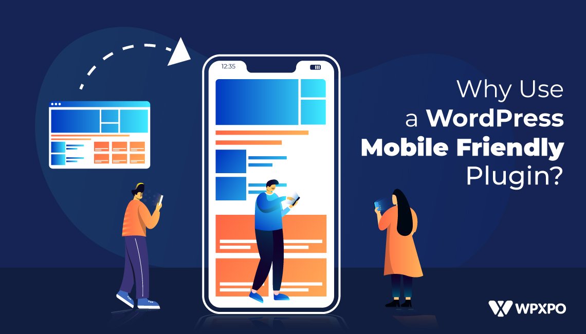
Why use a WordPress mobile friendly plugin in 2021?
Well, for starters, you can’t ignore the fact that over 5.2+ billion people around the world use mobile phones. Of this population, more than 60% of users are smartphone holders.
On top of all that, on average, a user spends more than 6-hours on his/her mobile devices. And that’s ¼ th of an entire day.
So, you get the picture right?
In 2021, if you’re website is not mobile friendly, then the possibility of you not getting enough traffic is like the words written on stone! If your site isn’t accessible properly from a mobile device, then it is highly unlikely that users will stay on your site.
And that may not treat you well!
In 2021, if you’re on WordPress, then it is crucial to use a plugin to make WordPress site mobile friendly. As it is possible that you’ll be using a lot of plugins at once [we will be discussing this in detail], it is probably best to go with a proper mobile friendly plugin for WordPress.
And that’s what we’re here to discuss today.
First of all, we will be talking about the importance of a mobile friendly website, then we’ll dig deeper into the matter and try to show you some possible solutions to make your WordPress site mobile friendly.
In the end, we will be sharing a list of the best mobile friendly WordPress plugin options for 2021. If you choose to use these plugins, then it’s possible that your website will load faster on mobile devices. Also, customers who are searching for you with their smart devices will appreciate it!
3 Reasons Why You Need A Website that’s Mobile Friendly?
You need to understand the importance of a mobile friendly website before moving further.
Mobile Users Everywhere
As mentioned earlier, a big chunk of mobile phone users (more than 60%) access the internet via their smartphones. It’s highly likely that people are visiting your website from a smartphone.
Clearly, you wouldn’t want to miss out on such a huge audience!
***Google now puts special attention to sites that are not mobile responsive. It means if your WordPress site is not fully usable from a mobile device, it’s highly likely that you won’t rank higher on the Google SERPs (Search Engine Results Page). This is also true if you’re not using a mobile responsive WordPress plugin.
Customer’s Trust a Mobile Friendly WordPress Site
Research shows that customers are more likely to trust a site with better mobile readability than an unoptimized site.
This is a huge insight, as a lot of the companies are still clinging to the ancient practices. So, you should make the most of this opportunity to gather more users from the web. Building your site with a mobile-optimized WordPress theme can help you out here.
More Visitors
You can’t go wrong with a mobile friendly WordPress site.
In general, Google is working to bring users to Mobile friendly devices by ranking them to the top of the SERPs. As mentioned earlier, the more optimized a site is for a mobile device, the better it performs on Google Search Results.
So naturally, you will get more visitors to your website.
These are the benefits of a mobile-optimized website.
So, you now know why mobile optimization is important. Now, let’s talk about the key characteristics of a mobile friendly WordPress site.
Characteristics of a Mobile Friendly Website: User Friendly or Mobile Friendly?
User-friendliness and mobile-friendliness are interchangeable terms. Because both of them mean the same thing.
Users can interact with the website from any device, especially from a smartphone!
So, the characteristics of a mobile friendly WordPress site will be synonymous with a user-friendly website.
So, what characteristics would you want?
1.Excellent Navigation
If a user is unable to navigate to content he/she likes, then he/she will most likely leave the site as quickly as possible.
So, it is crucial for you to make navigation as smooth as possible. Fortunately, with WordPress, building easy navigation with icons in super easy. You just have to add some items to the menu and the theme will add them for you.
2.Lightweight Theme
Speaking of navigation, you need a lightweight WordPress theme to make it happen. If the site takes too long to load, then the user will not even bother to get into your website. He will be on his way.
Lightweight WordPress themes are very minimal. They have a simple interface with clean coding. As the file sizes are small with these themes, they load a lot faster than the usual plugins on the market.
There are excellent WordPress themes out there that are very light and load very fast (we will be talking about site speed in the coming sections).
3.Smooth Swiping and Gesture Controls
Most of the web surfing is done on smartphones. So, it is only natural that users would like to have proper gesture controls.
So, make sure to infuse proper gesture controls to your WordPress sites to ensure a better user experience.
4.Clean Animations
If you’re using animation on your WordPress site, make sure to make them as lightweight as possible. Animations will help you grab the attention of your mobile customers in the long run.
5.Natural Interface
Since we’re using WordPress, it’s going to be easy to implement natural interfacing. But you may want to optimize it or use mobile friendly plugins to handle this matter.
6.Clean Content Formatting
Clean content formatting can help with a better user experience.
Research indicates that the average user spends around 45-seconds on a website. So, if you want that time to increase, then there is no alternative to clean formatting.
7.Mobile Friendly Plugin
You may be thinking we have veered from the topic of ‘Why Use a WordPress Mobile Friendly Plugin?’ Well, we wanted to give you some background information first before jumping on to the best mobile friendly plugin options.
We will be giving you a complete list of the best WordPress plugins for mobile optimization in the coming sections. We will be talking about the key features and find out why they’re special.
8.Super Fast Load Times
WordPress speed optimization is a key aspect for a site to be mobile friendly.
On average, your website on a mobile device can take up to 22-seconds to load. But Google suggests the site speeds should be around 4-6 seconds. If it’s under 3-seconds, then it would be great for your WordPress site.
You need fast loading times for converting users to customers. In general, 60-70% of the users are likely to become your customers if the site speed is standard. And that’s counting the fact that the user takes less than ½ a second to form an opinion.
9.Error-free Markup and Code
This consideration is particularly important for WordPress mobile friendly plugin options.
If the code is not minimal, then it takes more time for the site to load. And if the site loading times aren’t standard, then there is the possibility of losing potential customers. And that is not going to help you with your conversion rates.
10.Effective Info Planning
‘Content is King’-we are all familiar with this expression.
But if you don’t plan it properly, then you may have issues. Because no matter how optimized your site maybe, if the content isn’t well-planned and organized, then it’s of no use.
Other than using a WordPress plugin to make website mobile friendly, you need to give a lot of emphasis on planning your content. That way, you can turn your users into customers more effectively.
11.Clever Use of Colors
Don’t take this consideration likely.
Popping colors can help attract and convert users to customers. So, you may want to be extra careful when choosing a color palette for your WordPress site.
In general, blue is by far the most popular color to use on a website. It exudes confidence, friendship, and hope. Purple is also up there. Purple exudes a strong personality.
All in all, when you’re choosing colors, you may want to understand the philosophy behind the color. That way you can show your personality on your site.
So far, we’ve given you a lot of information on mobile friendly websites. Now, we will dive into the main topic of our discussion, which is about the best WordPress mobile friendly plugin options for 2021.
Plugin to Make WordPress Site Mobile Friendly: Plugin Roundup for 2021
We’ve been through the characteristics of a proper mobile friendly wordpress website. Among the considerations, using WordPress mobile friendly plugins was a major one. All of the plugins we will talk about now have one thing in common.
They are all well-optimized for mobile usability. All these plugins have a minimal and highly mobile optimized footprint. So, you’ll not feel your site slow down if you use these plugins.
We will now go through each of the choices of the plugin to make a WordPress site mobile friendly.
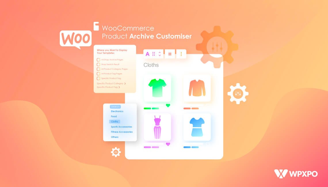
1.PostX-Gutenberg Blocks Builder
PostX is a Gutenberg blocks builder with simplicity in mind. You can pretty much build a fully functional website with just a few clicks of the mouse.
PostX comes with mobile friendly starter blocks and layouts for you to get started quickly and smoothly. These block builders and layouts have minimal coding with proper optimization for your site to load faster.
Other than the fast load times, PostX comes with a lot of cool features like an in-built archive builder and support for shortcodes. It’s a fast WordPress mobile friendly plugin that’s got all the bells and whistles for a complete experience.
2.ProductX-WooCommerce Blocks Builder
This next mobile friendly plugin for WordPress makes your WooCommerce site load extremely fast.
ProductX is a WooCommerce blocks plugin that’s particularly built for speed and precision. Users love it simply because of the fast loading times and easy-to-use interface. Just like PostX, you can quickly get up and running with an online store in no time.
All in all, we strongly believe it’s a solid plugin that can offer a solid user-friendly experience to your users and customers.
ProductX is now WowStore! We’re very excited to bring you this experience, packed with unique features. Please note that the features, blocks, starter packs, etc. all work the same. If you have used ProductX, you’ll feel right at home with WowStore.
3.WPtouch-Code-free Theme Adder
WPtouch is a unique plugin to get your WordPress rating up in the eyes of mobile users.
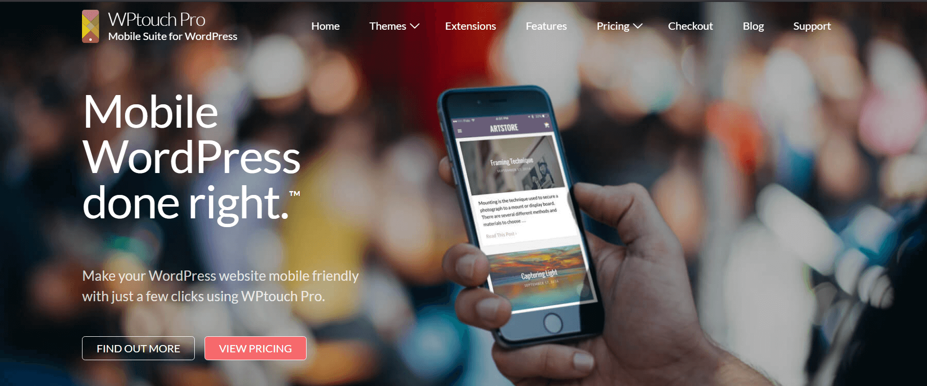
WPtouch simply adds a mobile friendly theme to your website. So, mobile users who access your site will see the mobile page, faster and more agile than the web version. This also helps out to get your WordPress site higher in the rankings.
WPtouch has a free tier and a paid tier. You can get up and running with the Free tier if you want to check out the plugin. It’s a handy little plugin to make your site more user-friendly.
4.JetPack-The All-in-One WordPress Solution
The makers of WordPress, AUTOMATTIC have come up with the JetPack all-in-one WordPress solution.
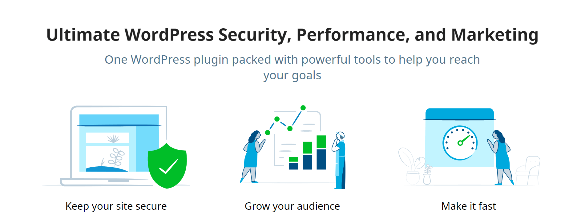
It’s pretty much a complete solution that shows how your site is performing on the web. Also, you get features like image lazy loading, CDN (Content Delivery Network) support, and much more.
Above all, it gives you important insights into the website’s mobile usability. All in all, if you’re worried about how your website performs in the mobile-friendliness field, this is plugin is pretty much a no-brainer.
5.AMP for WordPress
As a WordPress mobile friendly plugin free option, AMP for WordPress has a lot to offer. The free tier is mostly all you’d need to give your users a proper mobile friendly experience.
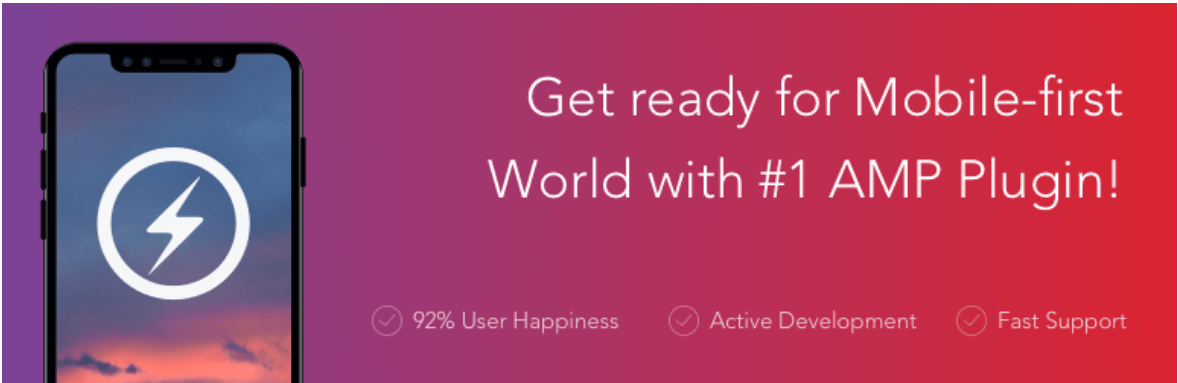
AMP or Accelerated Mobile Pages is an HTML framework that adds and improves your WordPress site. It adds Google’s mobile friendly site features to your website, making it more eligible to appear at the top of the Google SERPs. Moreover, the paid tier has some cool extensions that can offer extra benefits in making your site more user-friendly.
Overall, this plugin has a lot to offer in terms of your site’s mobile-friendliness. It can be a worthy addition to your WordPress website.
6.Smush-WordPress Image Optimizer
Large image files are very bad for your WordPress site. It’s simply because of the fact that large image files do not help your website load faster.
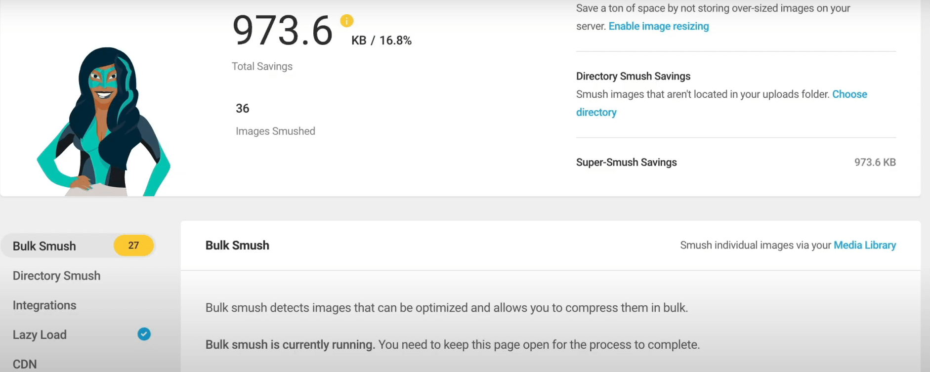
Smush is a handy WordPress mobile friendly plugin that takes these images and shrinks them down to a smaller size. It also adds lazy loading, which helps the site load a lot faster.
This mobile friendly plugin for WordPress gives your site an extra boost in loading performance, which translates to better overall results. But if you want to remove restrictions on the image compression size, then you should probably go with the paid version.
7.WP Mobile Menu-WordPress Menu Plugin
It’s another useful mobile friendly plugin that creates an optimized menu for mobile devices. The user interface is simple and doesn’t have too steep a learning curve.
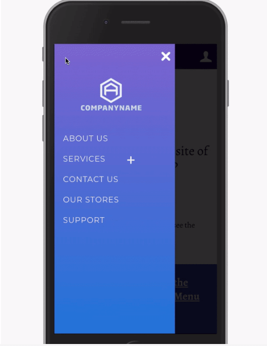
You can quickly and easily come up with a WordPress menu and have it display the way you want. The plugin creates a mobile menu that can hide content on the mobile device when it’s not in use. Also, the loading times are satisfactory as well.
Overall, for menus on mobile devices, this plugin does make a solid case for itself. But the only bummer is the fact that you need to go with a higher-tier option to get WooCommerce compatibility.
Mobile Optimized Plugin: Honorable Mentions
These plugins are our honorable mentions for the best WordPress mobile friendly plugin options.
8.Humming Bird-WordPress Caching Plugin
Humming Bird is a caching plugin that loads cached pages faster.

Among other features, Humming Bird enables lazy loading for images, minifies code, and offers important insights for your site to be more mobile friendly.
The free version of th plugin does have some limitations. But it’s super useful and is suitable for small blogging sites. However, with the pro version, you get better image compression and site uptime metrics. You do get a lot more with the paid tier.
9.AppPresser- WordPress Mobile App Framework
AppPresser is a unique WordPress Mobile friendly plugin. It takes your WordPress website and turns it into an app that loads much faster on mobile devices.
Although the feature set of this plugin is top-notch, the pricing is a bit of a bummer. And the usability of this plugin may be questionable at times.
But the fact that it gives your WordPress site the functionality of an app is amazing. And that makes it a very compelling option for high-end WordPress businesses.
Frequently Asked Questions
Here are some quick answers to some of the frequently asked questions.
Q: What is Google Mobile-first indexing?
Ans.: Google’s mobile-first indexing refers to the fact that your site’s mobile pages will now have an impact on how your website shows up in SERPs.
If you don’t have any idea about what we’re talking about, SEMRUSH has an excellent piece on Google’s Mobile-first Indexing update.
Google also has a mobile-friendly testing module, which can help you find how your site is doing in terms of mobile usability.
Q: What is Lazy Loading?
Ans.: Lazy loading tones down the load times on specific web assets (images, content) on a particular website.
Let’s say you visited a website. If lazy loading was enabled on that site, then the essential settings would load first. This can cut down page loading times in important scenarios.
Q: What is site speed?
Ans.: In simple terms, the site speed refers to the time of how quickly a visitor sees your site. On average, the best loading sites have a loading speed of less than 3-seconds.
Also, site loading speeds are a crucial ranking factor. So, using a WordPress mobile friendly plugin can be a good idea!
Q: What are the characteristics of lightweight themes?
Ans.: Lightweight themes have minified coding and scripts that help the site load faster. As the name suggests, they have a small file size, making them load much faster.
Q: What is more important? Site Speed or Responsive Design?
Ans.: Although both of them are crucial for the Search Engine Results Page (SERPs), site speed is more prominent than having a responsive design. For mobile usability, site speed remains more important than responsive design.
Q: What does a WordPress Caching Plugin do?
Ans.: A caching plugin saves generic HTML files of a website on your server. So, the next time you visit that website, the cache loads up the HTML image of your site. This cuts down site load times by not accessing the heavy PHP scripts on your website.
Q: What are the ways to increase WordPress mobile site speed?
Ans.: Here are some quick tips on increasing the site speed:
- Make sure the images on your website are small in size.
- Minify coding for your website.
- Use lightweight, mobile friendly WordPress plugins and themes.
- Use a CDN (Content Delivery Network).
- Take advantage of browser caching.
- Make sure to reduce the number of redirections on your site.
Q: Is it better to change code snippets on your WordPress site than using a plugin?
Ans.: When you have too many plugins on your Website, your site needs to load too many scripts. This can slow down your WordPress site, even if you are using a mobile friendly wordpress plugin.
So, in cases like these, you may want to optimize the theme properties to change a function on your website. For instance, we did a piece on how to change the “Add to Cart” button text on WooCommerce.
You can check it out to get an idea of how to manipulate theme functions on WordPress. This does not leave an effect on your WordPress site.
Final Thoughts
If you’ve made it this far, then kudos to you.
So far, we’ve given a lot of reasons to use the best WordPress mobile friendly plugin options. We’ve also shed some light on the key features of some mobile friendly plugin options for WordPress.
If you plan on using any of these plugins, then rest assured, users will love hanging around your WordPress site.
And if you have any thoughts regarding this, make sure to sound off in the comments below. We would love to hear from you.
Cheers!