ProductX is now WowStore! We’re very excited to bring you this experience, packed with exciting features. Please note that the features, blocks, starter packs, etc. all work the same. If you have used ProductX, you’ll feel right at home with WowStore.
When selling them in an online store, it is important to display the right products in a well-thought-out layout. Displaying your product categories in a grid style allows you to do so in a visually appealing and user-friendly way.
WooCommerce, a plugin for WordPress, is the most extensively used and well-liked solution for running an online store. It helps clients run their online store effectively by providing them with many grids for browsing products by category. However, you can’t customize them, and they are very basic. And that’s where ProductX comes in, which lets you add different category grids and customize them to the core.
In this article, we’ll look at ProductX’s newest addition: product category #3, and how you can use it to display the WooCommerce product category in a trendy way.
What is ProductX Product Category #3?
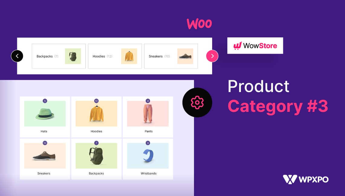
ProductX Product Category #3 is the latest addition to category grids that displays product categories in a grid or slide format on the shop page (or any other page due to ProductX’s vast customizability). This plugin makes it easy to organize and display product categories in a visually appealing manner.
It uses the product category’s featured image. It allows you to customize the grid display with various options, including image sizes, column widths, and product category display orders. It also includes an optional ‘Read More’ button for users to view the items in that particular category.
Why ProductX Product Blocks are The Best?
There are various areas to set up a product grid on ProductX, allowing it to be used in various circumstances. This gives website creators many ways to enhance the appearance of their websites. With ProductX, you can display grids of WooCommerce product categories.
ProductX is one of the best ways to set up how you want your products to be displayed on your website. This is because ProductX offers many customization options and provides some of the best out of WooCommerce’s Gutenberg product blocks. This is one of the things that makes ProductX one of the best options.
You can make fine-tuned changes to any part of the block using the configuration options. You can change the block’s title, font, padding, and radius of the block’s borders, among other things. You can also change several other essential parts. With ProductX, you can use a product grid to cover any part of your website, giving you even more freedom.
ProductX has just dropped WooCommerce Product Category #3, allowing you to display specific items in an organized and visually appealing way.
How to Add WooCommerce Product Category #3?
Let’s dive right into it! We were discussing product category #3, and you’re wondering how to add it to your website. We’ll show you how to add and display the WooCommerce product category grid, so let’s not waste any time.
Install ProductX
You can’t add category grids in WordPress by default. To make it work on your website, you need a plugin like ProductX. It is one of the most outstanding plugins for making a grid in a WooCommerce store, so it is an excellent option. As a first step, let’s get this plugin set up.
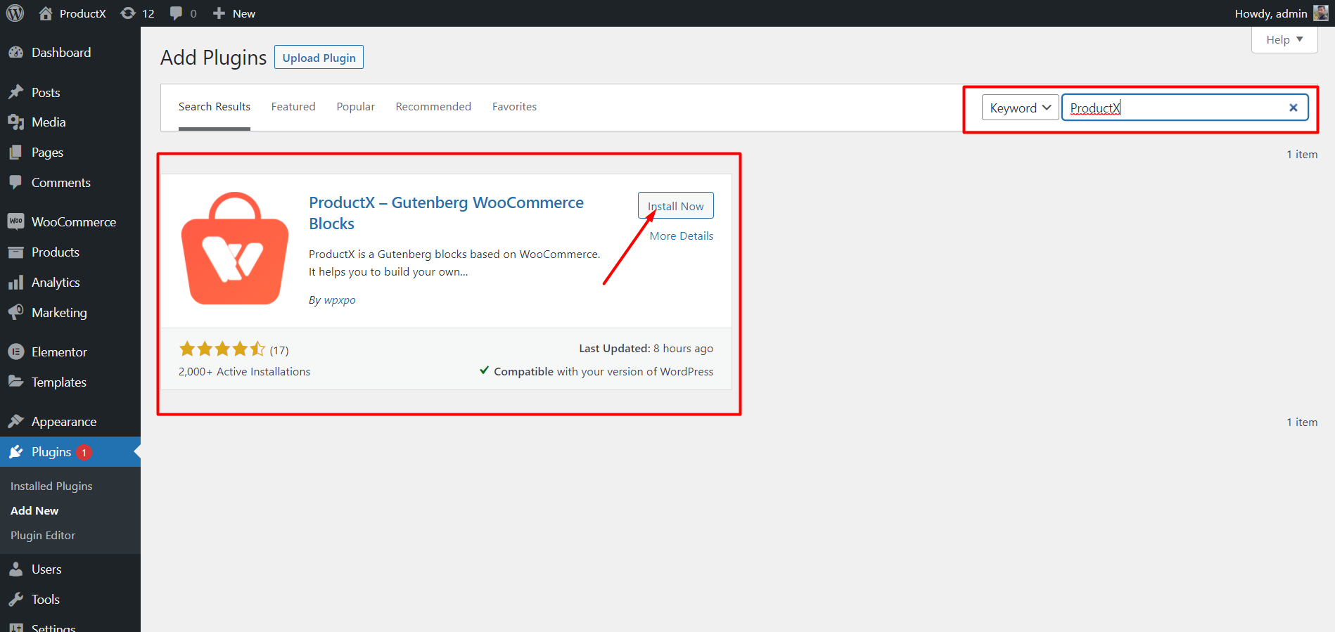
- Open the Plugins menu in the WordPress Dashboard.
- Next, install the plugin by clicking the “Add New” option.
- Try typing “ProductX” into the search bar and then press the “Install” button.
- Click the “Activate” button after you have installed it.
Upload Images to Categories
The categories can be customized to include any photos and colors you choose. Let’s go to the Categories menu and modify a category. We will find that, in addition to the basic WordPress category modification choices, we will also have access to thumbnail options. From there, we can upload images for a specific category.
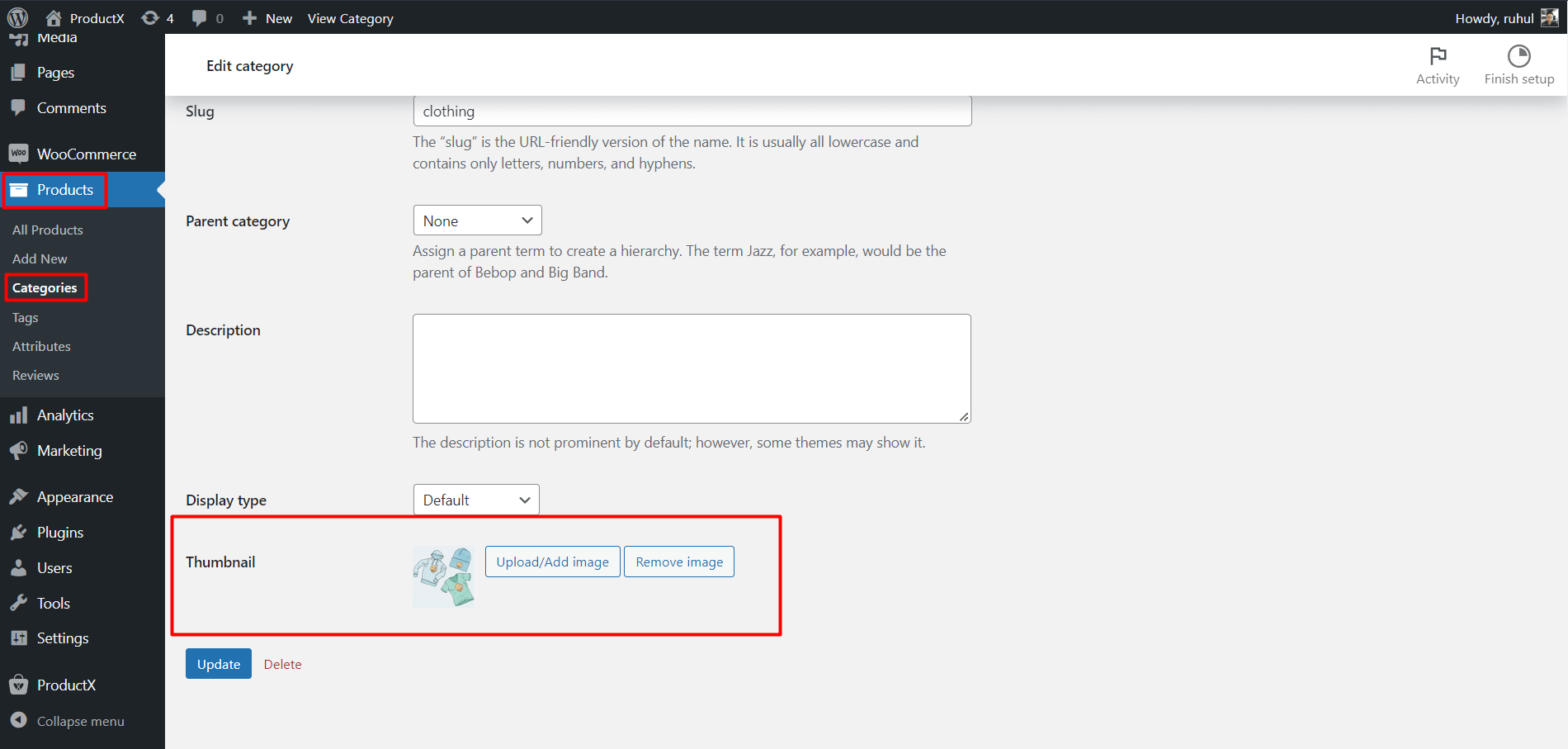
- From your WordPress dashboard, click Products.
- Then select Categories to access your categories.
- Then click Edit of the category you want to add an image to.
- Go to the Thumbnail and click ‘Upload/Add Image.’
- Once you add the image, click the Update button on the page’s bottom.
Add WooCommerce Product Category #3
Now comes the main part: adding product category #3.
To do that:
- Navigate to the WordPress Dashboard.
- Go to the page where you want to add the WooCommerce product category #3.
- Alternatively, you can create a new page by selecting the ‘add new’ button.
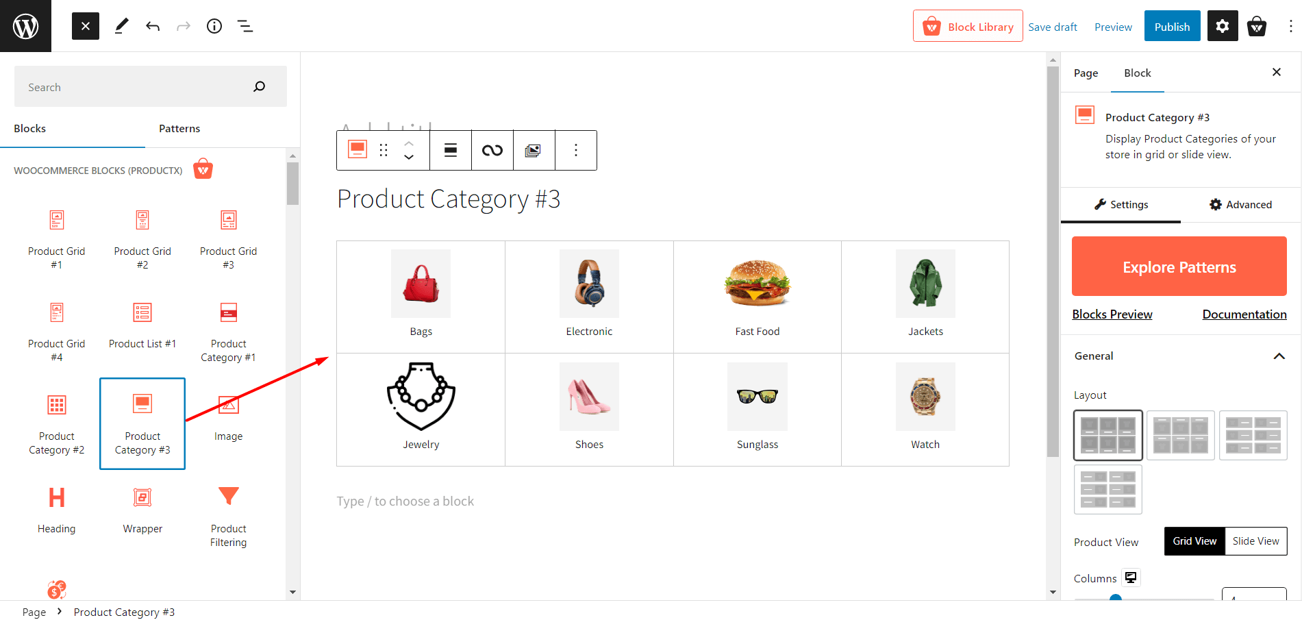
- After going to the page, click the plus symbol to add blocks.
- Choose product category #3 or drag it on your page.
And you have successfully added the WooCommerce Product Category #3 to your page.
Note: While we are showing you how to add product category #3 to a page, you can use the ProductX Builder to add this new category grid to the homepage, shop page, cart page, and every other page as well.
Customization of WooCommerce Product Category #3
Adding processes are completed once Product Category #3 is included. Moreover, you unlock a variety of customization options for showcasing your items.
ProductX provides a wide variety of customization possibilities, from modifying the most fundamental elements like columns, gaps, descriptions, and so on.
For instance, you’re not limited to choosing just one category; you can pick multiple if you want. WooCommerce product category #3 allows you a great deal of personalization, including title, color, size, padding, and more.
Here are what customizations you’ll get for the ProductX WooCommerce Product Category #3:
Explore Patterns
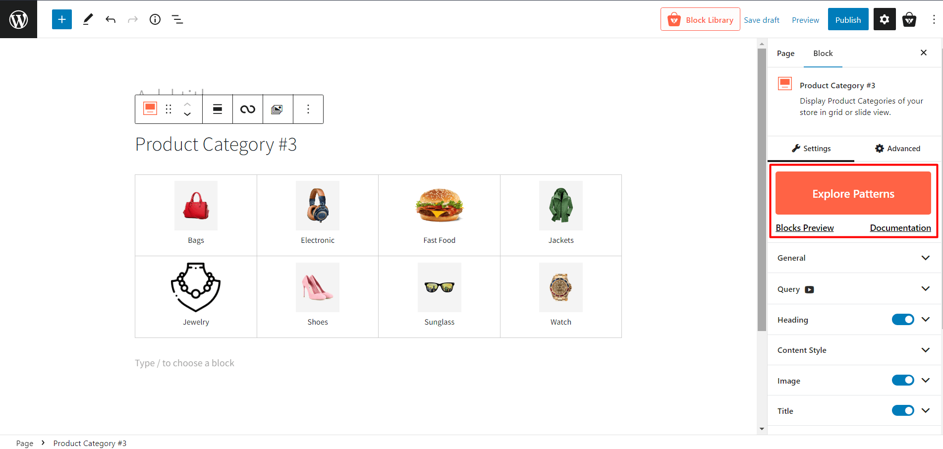
ProductX offers premade templates for most blocks, and Product Category #3 is no different. You will get one click ready to import presets for this block, that’ll reduce your customization time.
General Settings
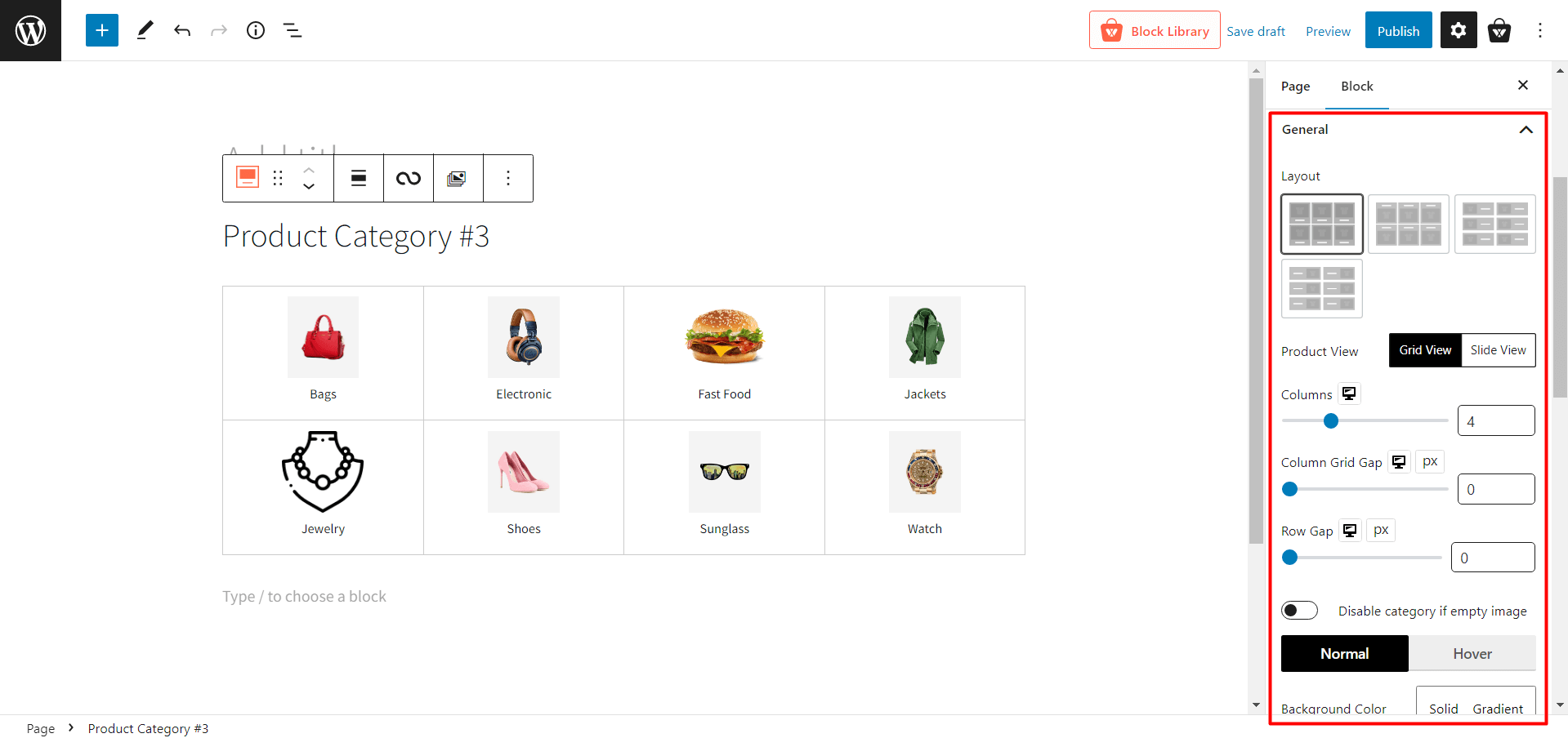
- Layout: 4 design layouts to choose from. You can pick the one that’s perfect for your style.
- Product View: Select between Grid View and Slide View. Also, each view has different modification settings.
- Grid View
- Columns: Adjust the column number of grids using a slider or type the number of the grid columns.
- Column Grid Gap: Adjust the column grid gap using a slider.
- Row Gap: Adjust the row gap using a slider.
- Slide View
- Column Gap: Adjust the column gap using a slider.
- Slides To Show: Change the number of slides to show.
- Auto Play: Enable or disable the autoplay of the slider.
- Slide Speed: Adjust the sliding speed of the product category.
- Disable category if empty image: Toggle on/off the category which does not have any image.
- Background Color: Change the background color of category blocks.
- Border: Change the border color of category blocks.
- Border Radius: Adjust the box radius of top/bottom/left/right.
- BoxShadow: Change the color of the box shadow.
- Padding: Adjust the padding for top/bottom/left/right.
- Alignment: Change the alignment to left/mid/right.
Query Settings
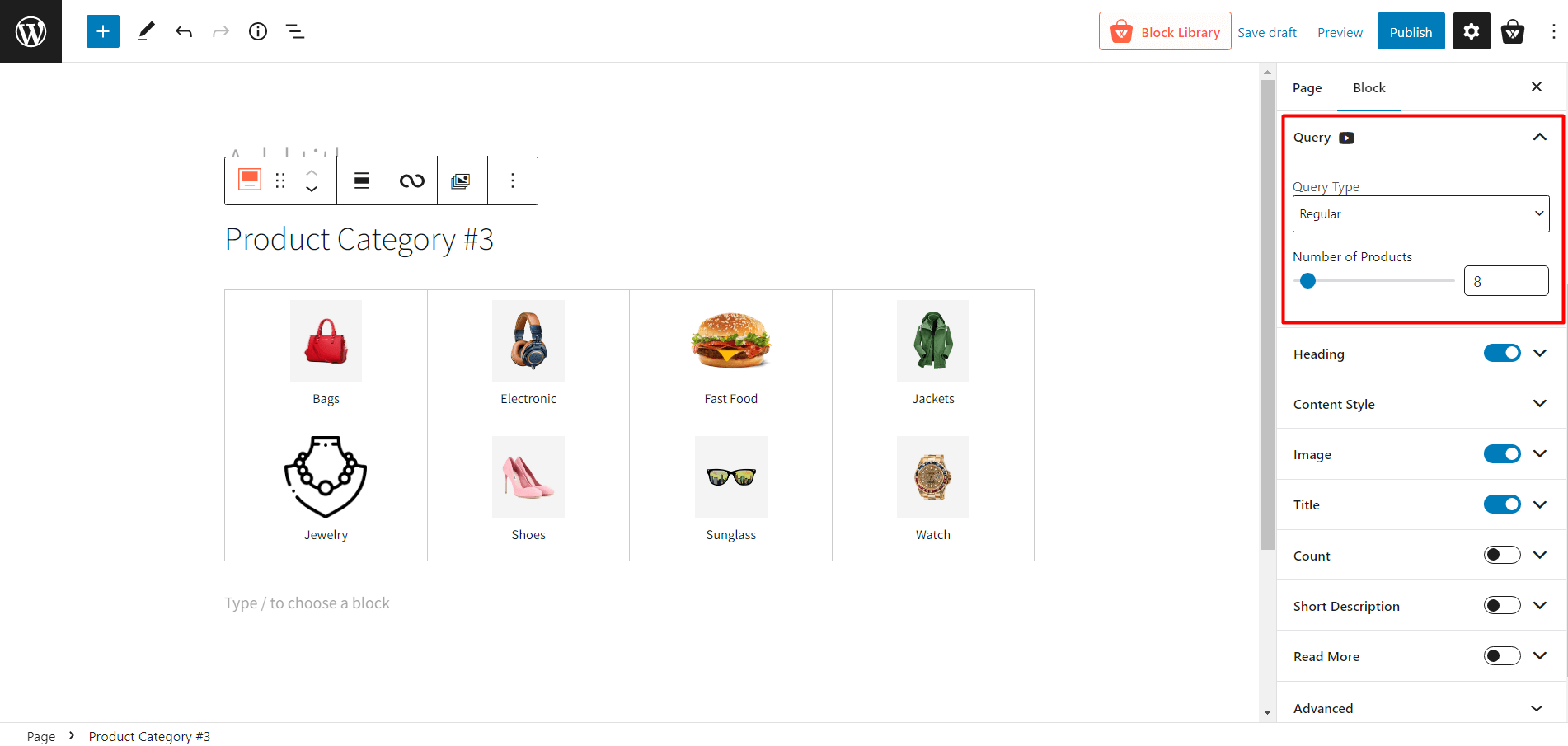
- Query Type: Choose what to display: category, subcategory, or custom by selecting the following:
- Regular
- Child Of
- Parent
- Custom
- Number of Products: Select the number of categories you want to display.
Heading Settings
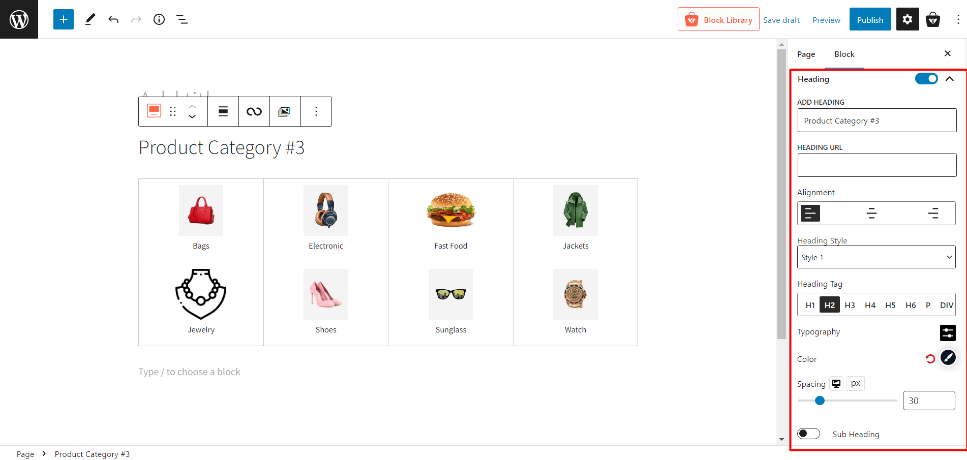
- Heading: Show/hide heading.
- ADD HEADING: Change Heading text.
- HEADING URL: Add heading URL.
- Alignment: Change heading alignment to the left, mid or right.
- Heading Style: Choose between 20 different premade heading styles.
- Heading Tag: Change the heading tag from H1 to H6.
- Typography: Change fonts, font size, height, spacing, and similar settings.
- Color: Adjust the heading text color.
- Spacing: Adjust the space between the heading and category grids.
- Sub Heading: how/hide subheading.
- Sub Heading Text: Add texts to show in a subheading.
- Typography: Change fonts, font size, height, spacing, and similar settings.
- Color: Adjust the heading text color.
- Spacing: Adjust the space between the heading and category grids.
Content Style Settings
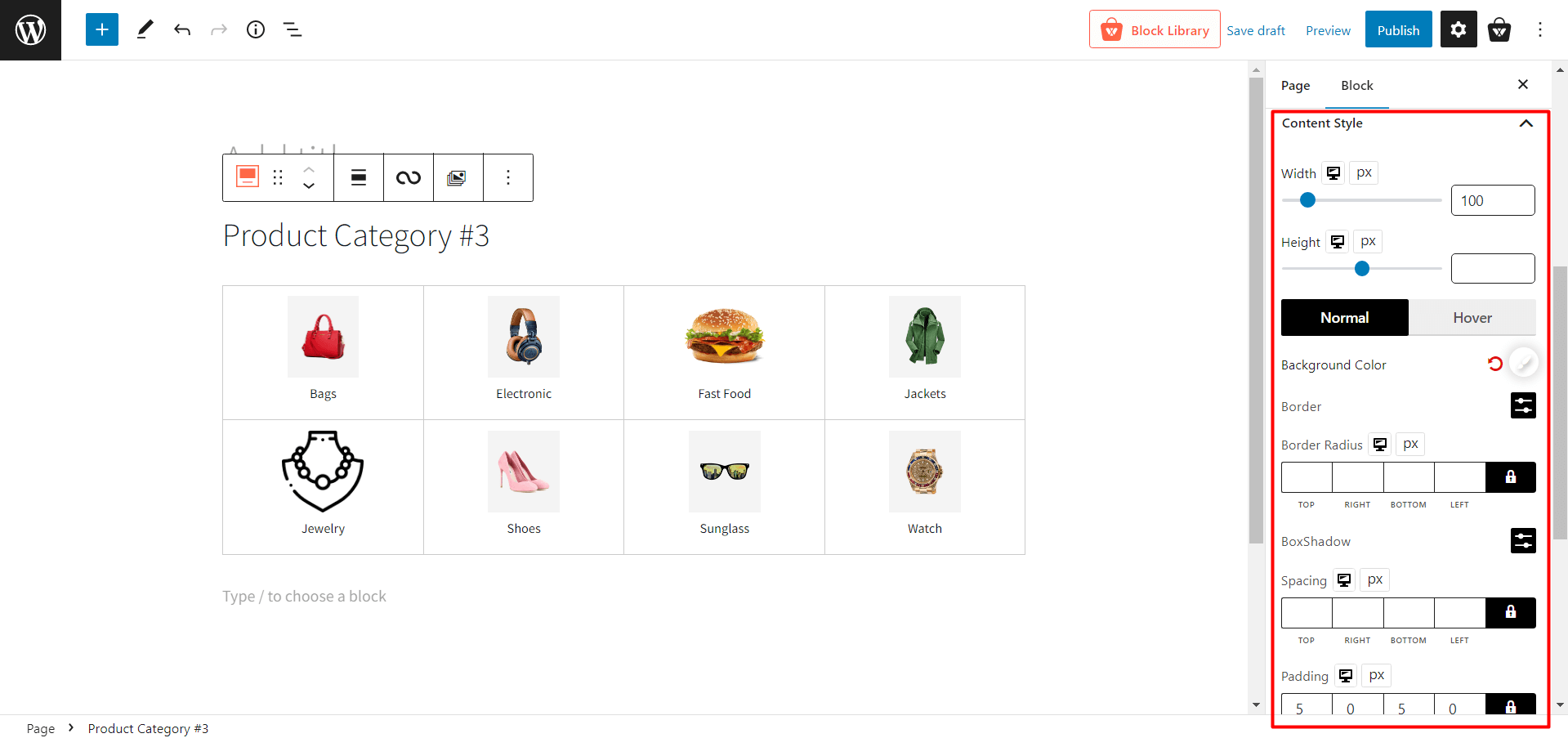
- Width: Adjust the width of the category name.
- Height: Adjust the height of the category name.
- Normal: Select the normal color-related settings.
- Background Color: Change the regular background color of the category name.
- Border: Change the regular border color of the category name.
- Border Radius: Adjust the border-radius.
- BoxShadow: Change the color of the box shadow.
- Hover: Select the hover color-related settings.
- Hover Bg Color: Change the background color of the category name when hovering.
- Hover Border: Change the border color of the category name when hovering.
- Hover Radius: Adjust the border-radius when hovering.
- Hover BoxShadow: Change the color of the box shadow when hovering.
- Spacing: Adjust the spacing of borders.
- Padding: Adjust the padding of borders.
Image Settings
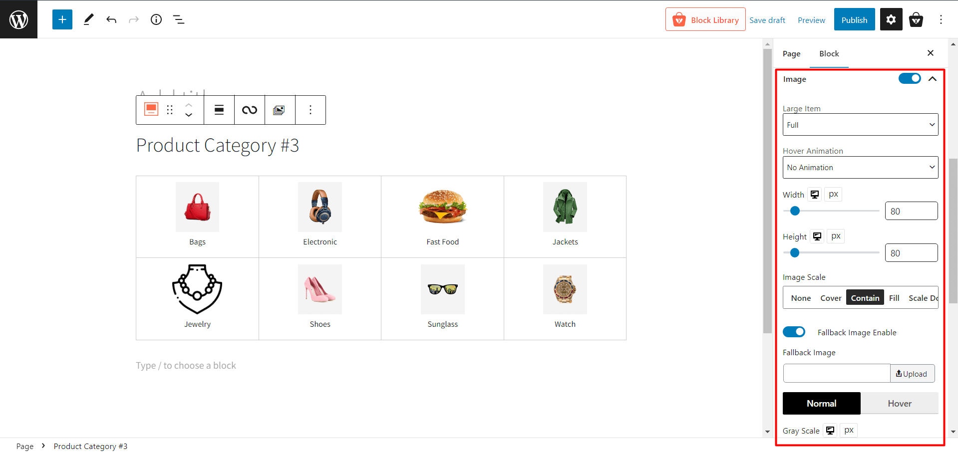
- Large Item: Change the image size when a category has a large image.
- Hover Animation: Select different animations when hovering over a category.
- Width: Adjust the width of the category image.
- Height: Adjust the height of the category image.
- Image Scale: Modify the scaling of category images.
- Fallback Image Enable: Enable or disable the fallback image when the category has no image.
- Normal: Select normal image-related settings.
- Gray Scale: Adjust the gray scale percentage of the category image.
- Radius: Change the regular radius of the image box.
- BoxShadow: Change the regular box shadow color.
- Hover:
- Hover Gray Scale: Adjust the gray scale percentage of the category image when hovering.
- Hover Radius: Change the radius of the image box when hovering.
- Hover BoxShadow: Change the box shadow color when hovering.
- Margin: Adjust the margins of each category box.
Title Settings
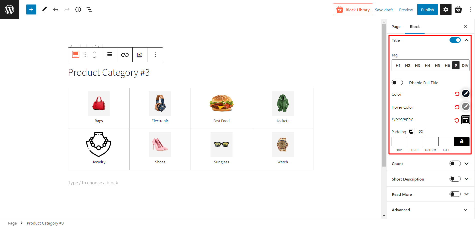
- Title: Enable or disable the category title.
- Tag: Change the tag of the category title.
- Disable Full Title: Enable or disable the full title (used for the long category name.)
- Color: Change the color of the title text.
- Hover Color: Change the color of the title text when hovering.
- Typography: Change fonts, font size, height, spacing, and similar settings.
- Padding: Adjust the padding of the category title text.
Count Settings
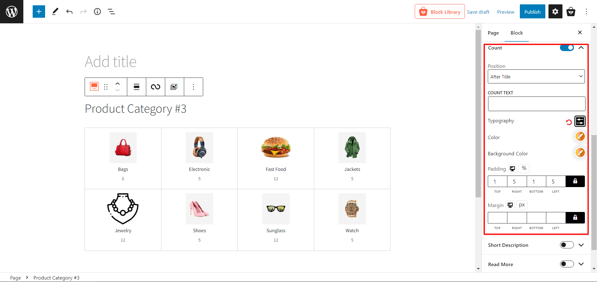
- Count: Show or hide product count on specific categories.
- Position: Change the position of the product count.
- COUNT TEXT: Add a text after product count.
- Typography: Change fonts, font size, height, spacing, and similar settings.
- Color: Change the color of the count text.
- Background Color: Change the background color of the count text.
- Padding: Adjust the padding of the count text.
- Margin: Adjust the margin of the count text.
Short Description Settings
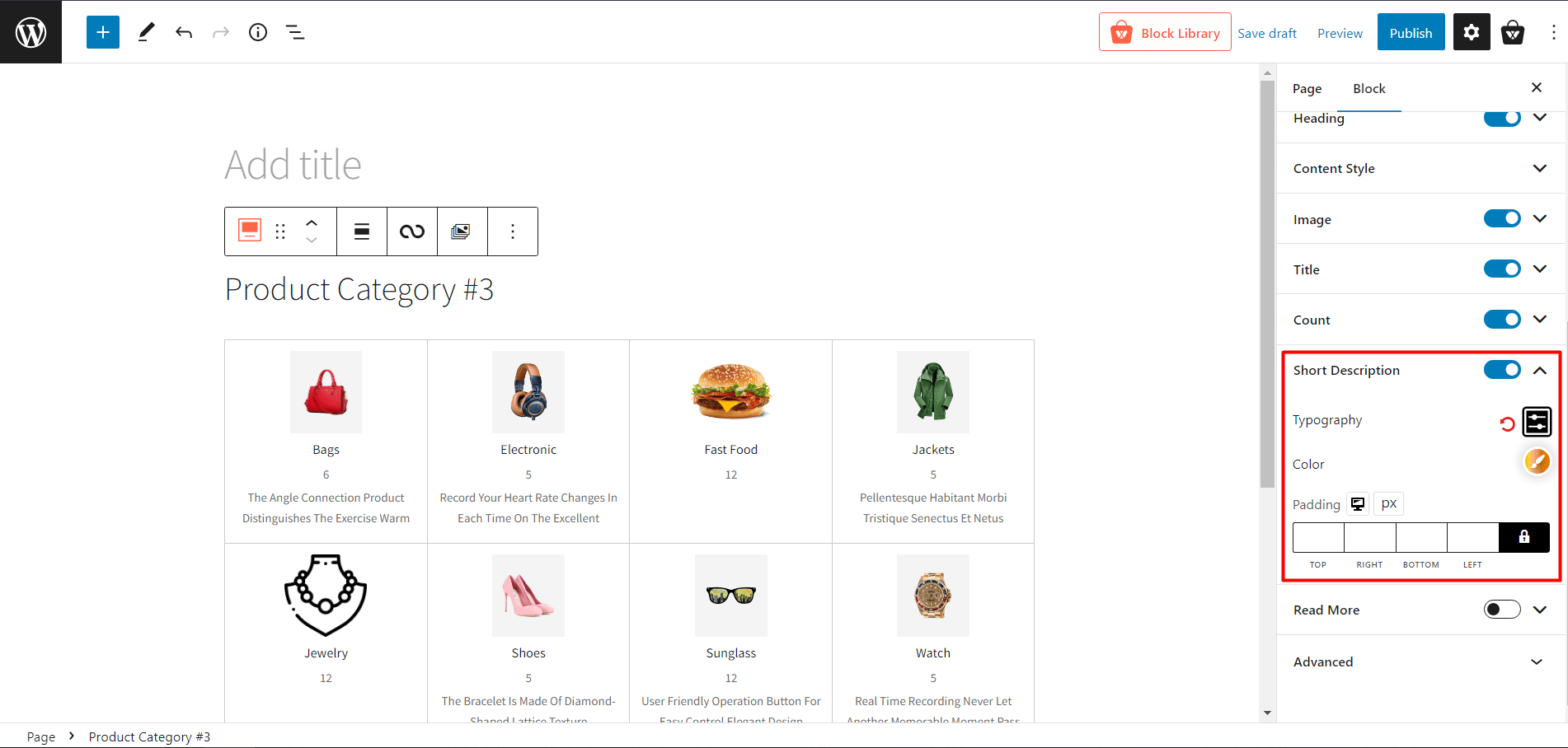
- Short Description: Add a short description of the category.
- Typography: Change fonts, font size, height, spacing, and similar settings of the description text.
- Color: Change the color of the description text.
- Padding: Adjust the padding of the description text.
Read More Settings
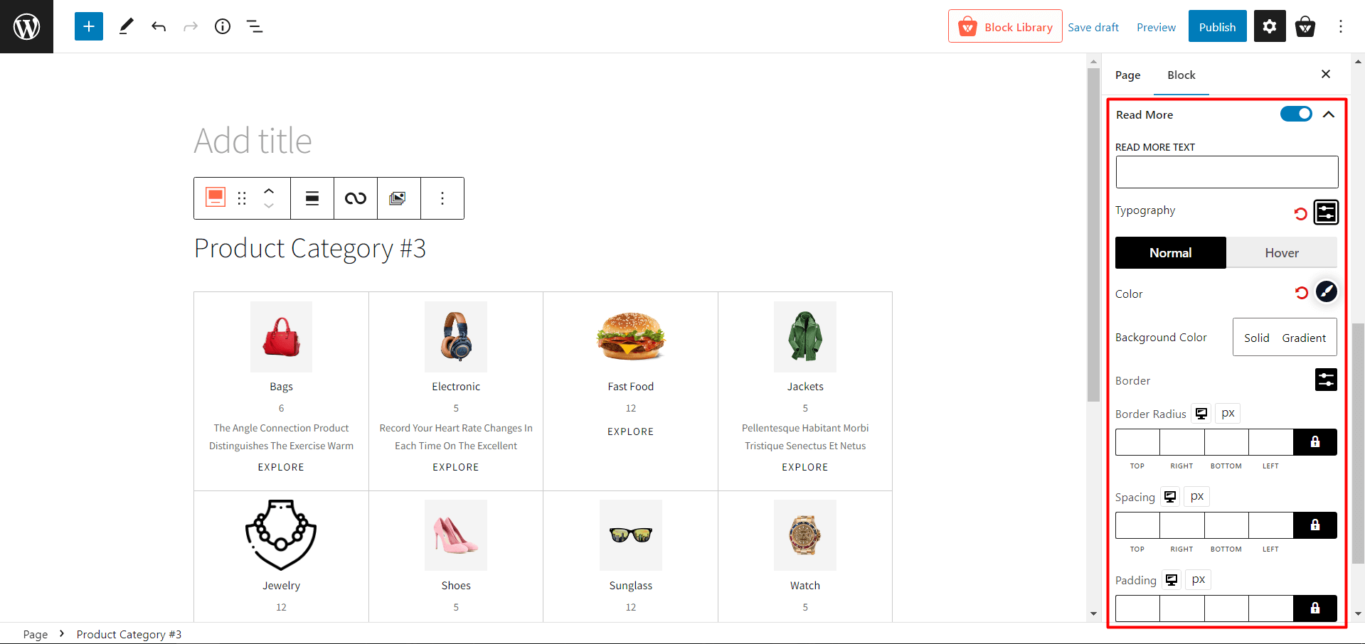
- Read More: Enable or disable the read more text of a category.
- READ MORE TEXT: Change the read more text of a category
- Typography: Change fonts, font size, height, spacing, and similar settings of the read more text.
- Normal
- Color: Modify the read more text color.
- Background Color: Modify the read more text background color.
- Border: Add and change the border color of the read more text.
- Border Radius: Adjust the border radius of the read more text.
- Hover
- Hover Color: Modify the read more text color when hovering.
- Hover Bg Color: Modify the read more text background color when hovering.
- Hover Border: Add and change the border color of the read more text when hovering.
- Hover Radius: Adjust the border radius of the read more text when hovering.
- Spacing: Modify the spacing of the read more text.
- Padding: Modify the padding of the read more text.
Advanced Settings
- ADDITIONAL CSS CLASS(ES): Add CSS classes (optional).
Conclusion
Your WooCommerce store may be home to the finest products in the world. However, if they are not displayed properly, most of your customers will not perceive that they are there.
If your items aren’t displayed engagingly, site visitors will likely bounce, and you won’t have an opportunity to make a sale. ProductX, on the other hand, will make your WooCommerce product category grid seem more appealing to site visitors. So, use the new Product Category #3 and redefine your store. Best of Luck!