WordPress Row-Column Block
Add the most advanced row and column block to your WordPress site that gives you complete freedom to achieve complex layouts with ease.
 4.9/5 based on 440+ reviews on
Creative Control Over Rows & Columns
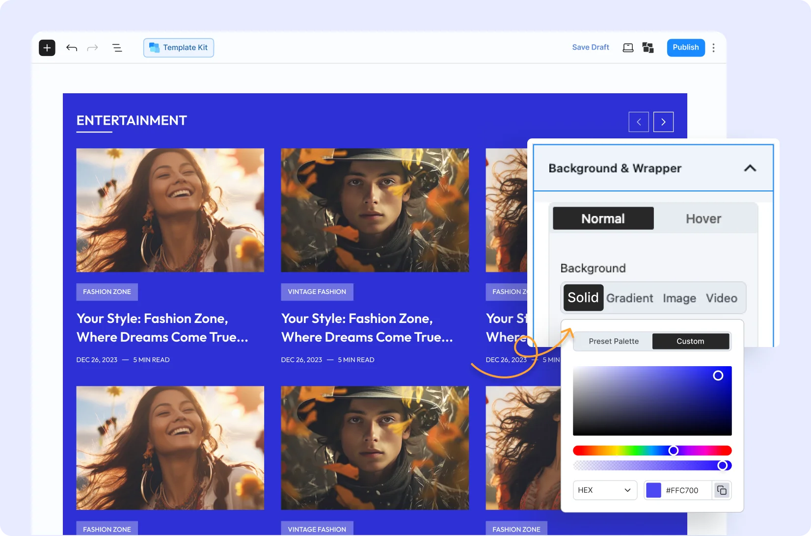
Engaging Backgrounds
Enhance sections or layouts by adding background colors, images, or a video that continuously plays in a loop.

Responsive Across Devices
Customize and adjust the appearance of the row-column section across desktops, tablets, and mobile devices with ease.
Flex Properties
Effortlessly control positioning and alignment (switch from left to right and top to bottom) – flexibility to craft perfect and dynamic layouts.

Sticky Columns
Grab attention towards a specific column by making it sticky up to a certain portion – so it remains visible as users scroll the page.

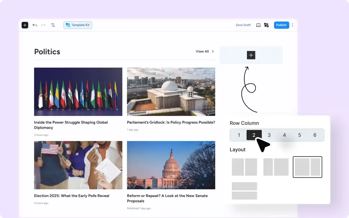
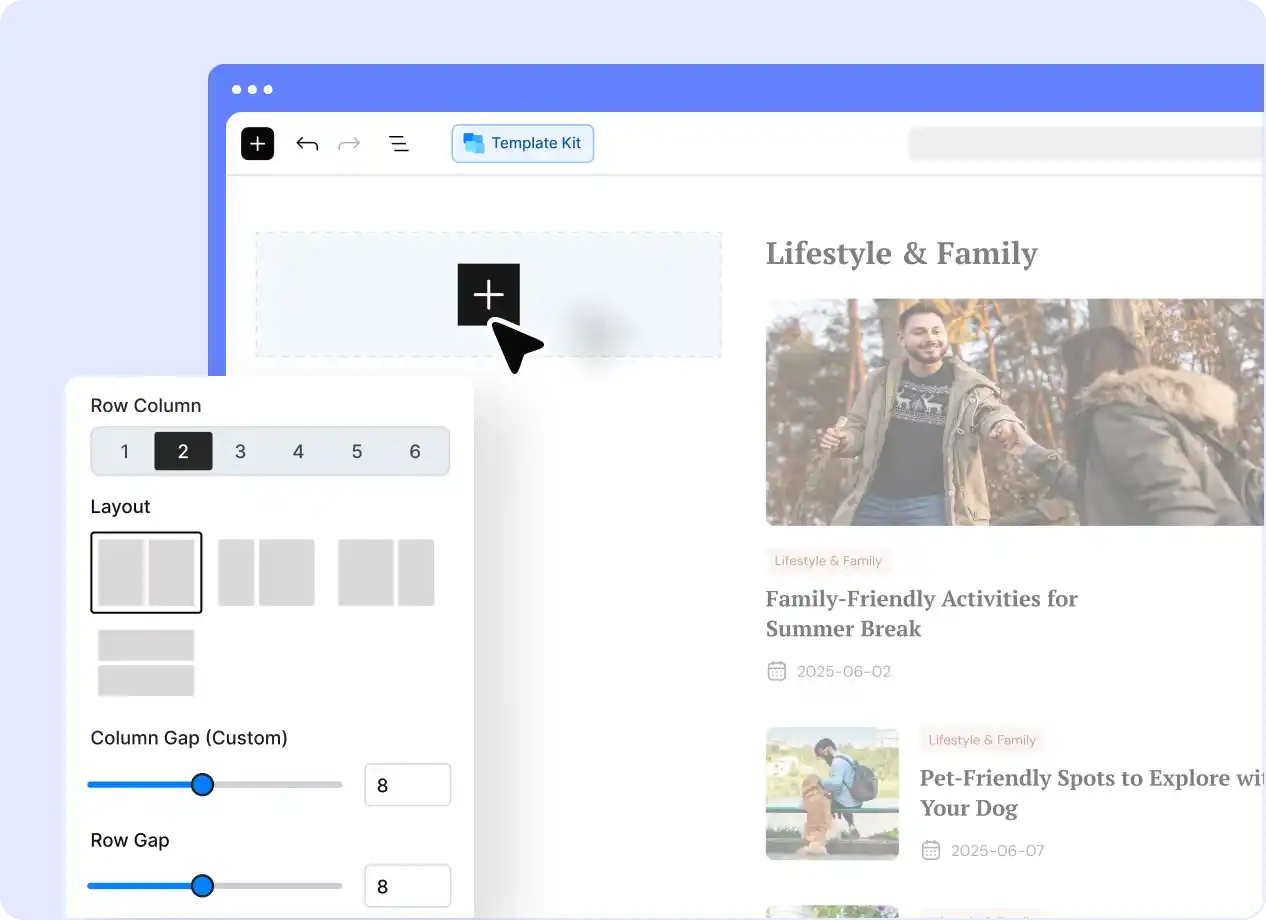
Set the Perfect Layout Structure
Drag and drop the block, then choose your desired number of rows and columns to display your content exactly as you want.
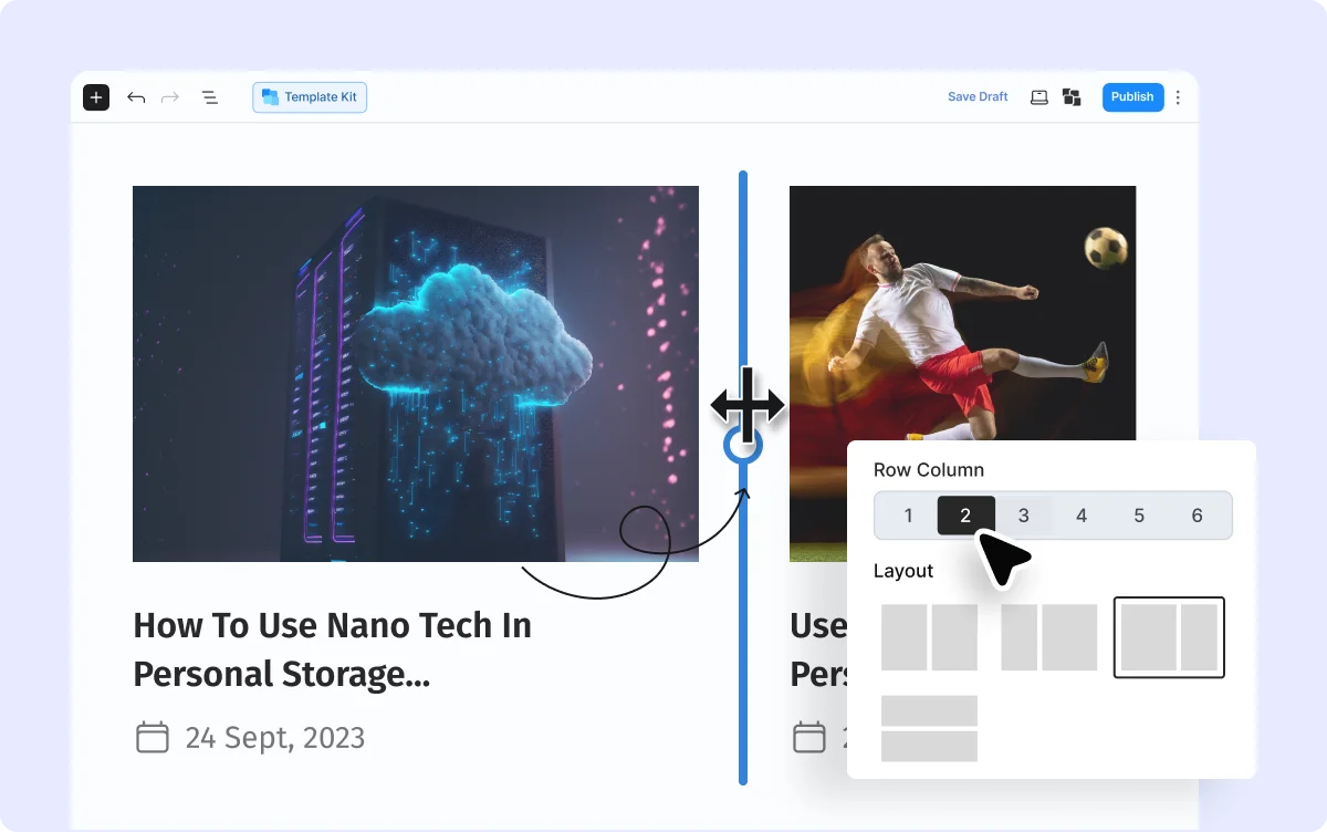
Easily Adjust Your Columns
Adjust the column width by dragging and increase the number of columns in a single click – allowing you to shape your layout on the fly.
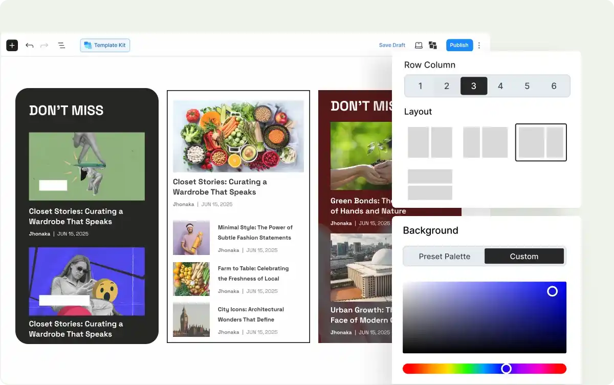
Style Each Column Separately
Enjoy complete styling control and effects to make each section different from others and visually appealing.
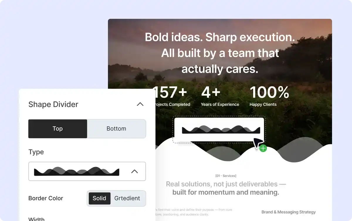
Add Creative Shape Dividers
Enhance the visual appearance of your layouts by adding decorative shapes between rows and columns, transforming your classic look into an attractive one.
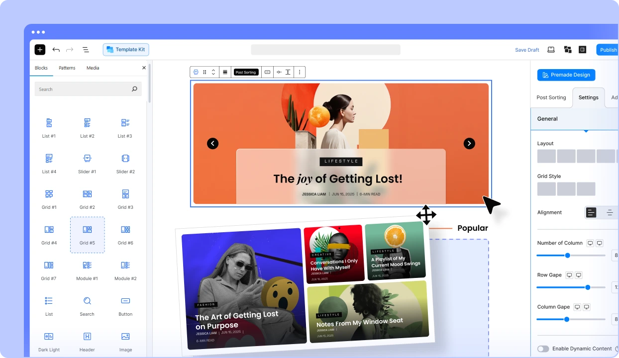
Everything You Need to Build Your News, and Magazine Sites
Get started with the most feature-packed Post Grid & Gutenberg Blocks to make professional-looking websites faster.
Frequently Asked Questions
Explore these frequently asked questions about Row and Column that you might be curious about. So, you can make a quick decision about whether you want to buy it.
Feel free to contact our support team in case you have more questions.