Are you trying to make a better web page to advertise or showcase your content, services, and products? One such thing that may be handy is an element offered by PostX – Shape Divider.
Shape Divider is a design element or tool to create visually appealing and dynamic section dividers on web pages. It allows you to add unique shapes, patterns, or lines that separate different content sections, giving your website a more engaging and modern look.
But how to separate sections using a shape divider?
- Well, first, create a page and add the Row block.
- Then from the setting, select “Shape Divider.”
- Add shape style to the top/bottom.
- Finally, you can add color, flip it, or adjust the width and height.
It’s just the summary. You can do different things using shapes, and in this article, we’ve properly explained how to use a WordPress shape divider. So, keep on reading.
How to Use a WordPress Shape Divider?
Now it’s time to explain a step-by-step guide on using Shape Divider. PostX offers multifunctional website section dividers. So if you aren’t using PostX, install and activate the PostX.
? Get PostX Pro to unlock all exciting features and make amazing Websites
Step 1: Login and Create a Post/Page
First, Log in to your WordPress dashboard and then look for the “+ New” button at the top. Now hover the cursor there and, according to your preference, add a Post or Page.
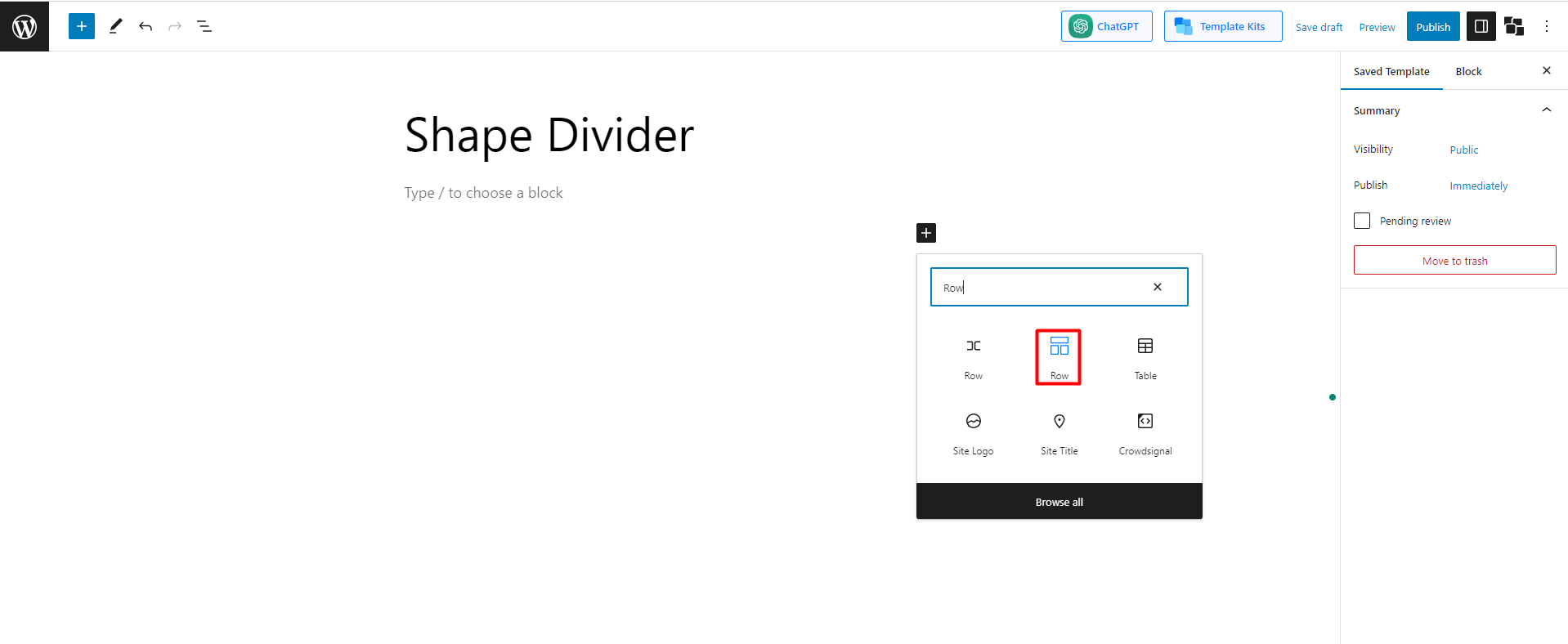
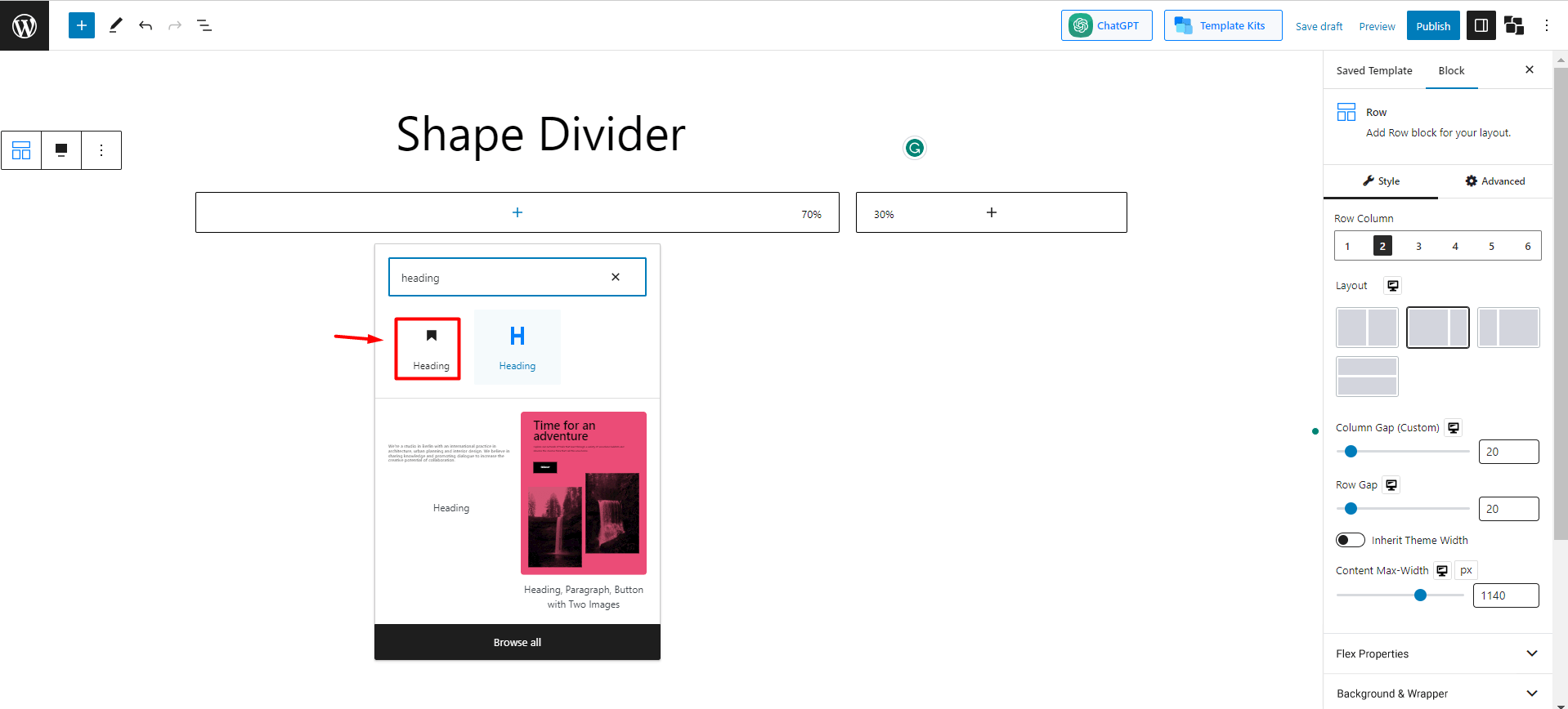
Step 2: Add the Row-Column Block
Now click the “+” button, and a search box will appear to add a block. Then in the search box, type “Row,” and you’ll see the row-column block icon. Consider the following image if you need clarification.
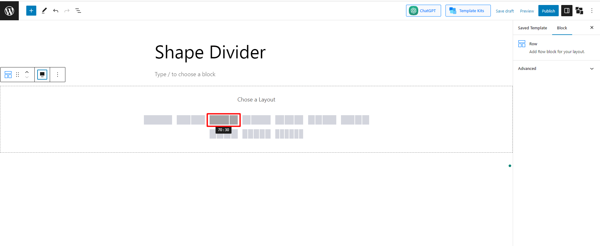
Step 3: Choose Any Template
Now you’ll be asked to choose any layout. There are 10 preset layouts. Choose any of them as your preference. I am going with the 70:30 layout.
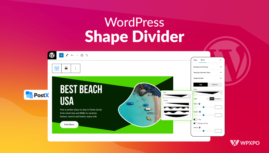
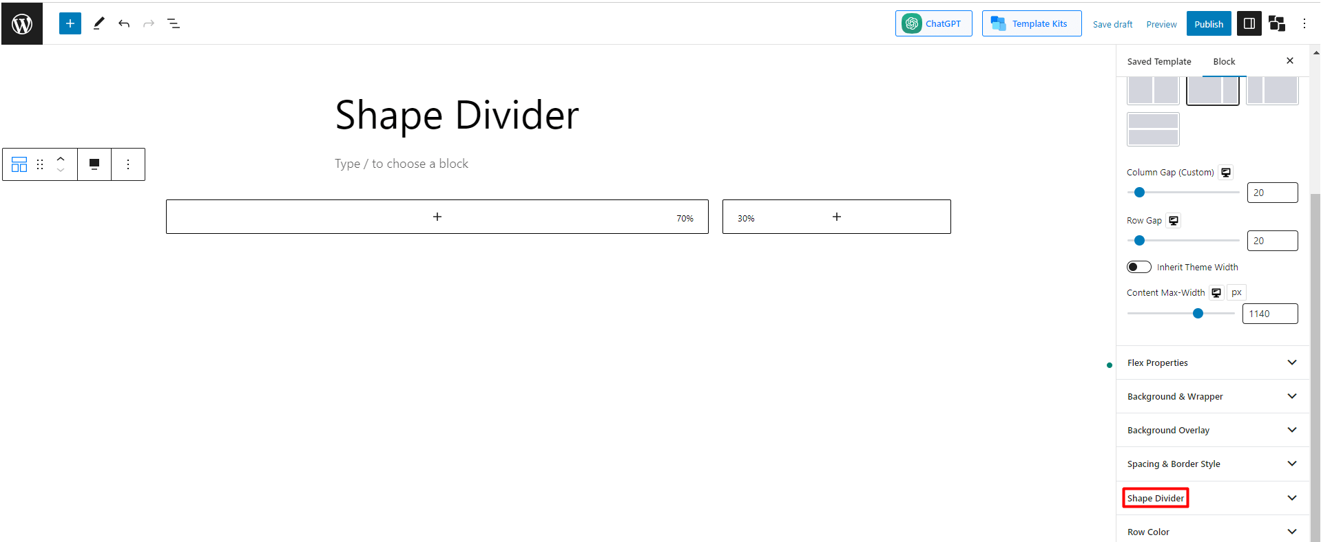
Step 4: Select the Shape Divider Setting
After creating the layout, you’ll find different options to customize the row in the setting. One of the options you’ll find is “Shape Divider.” Check the image to find it more easily.
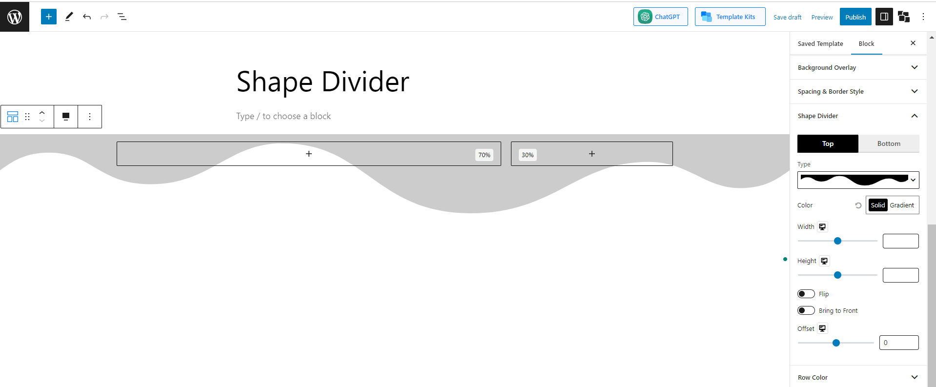
Step 5: Explore the Shape Divider Settings
Now we’re into the main segment. After selecting the “Shape Divider” button, you’ll find different setting options under it.
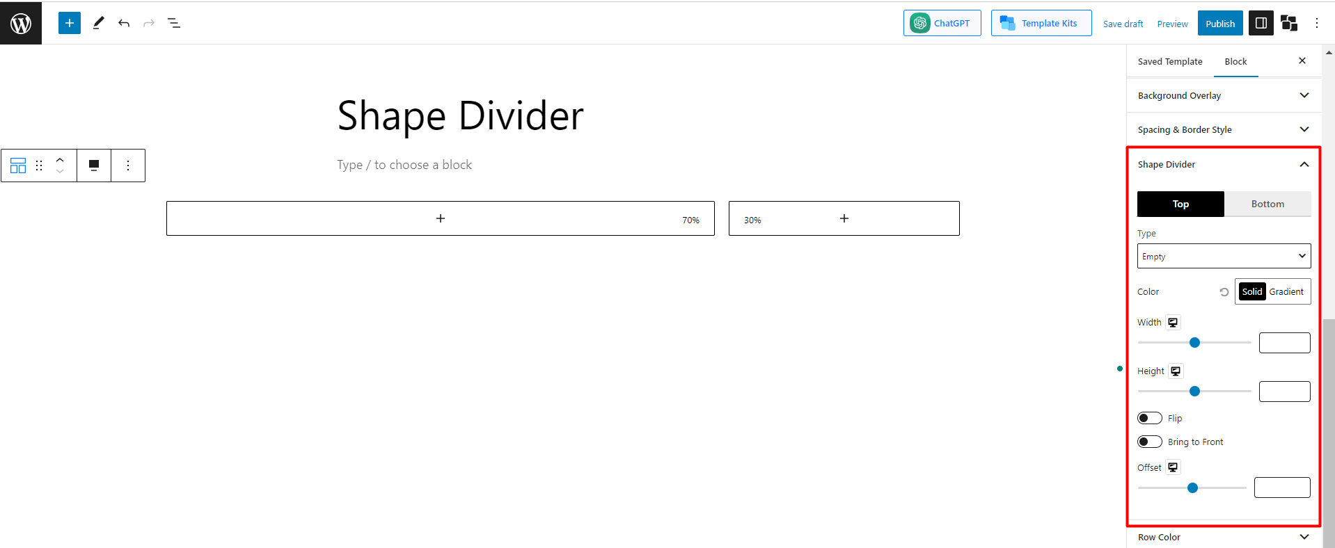
According to the image, we can see there are 9 initial customizable fields available. Now let’s have some ideas about the main functions.
1. Position and Type
In the very first setting, you’ll have to select the position. There are 2 options for you. You can select the top, bottom, or both. Let’s start with the top position. After that, you’ll have to select the type. There are 8 preset shapes available.
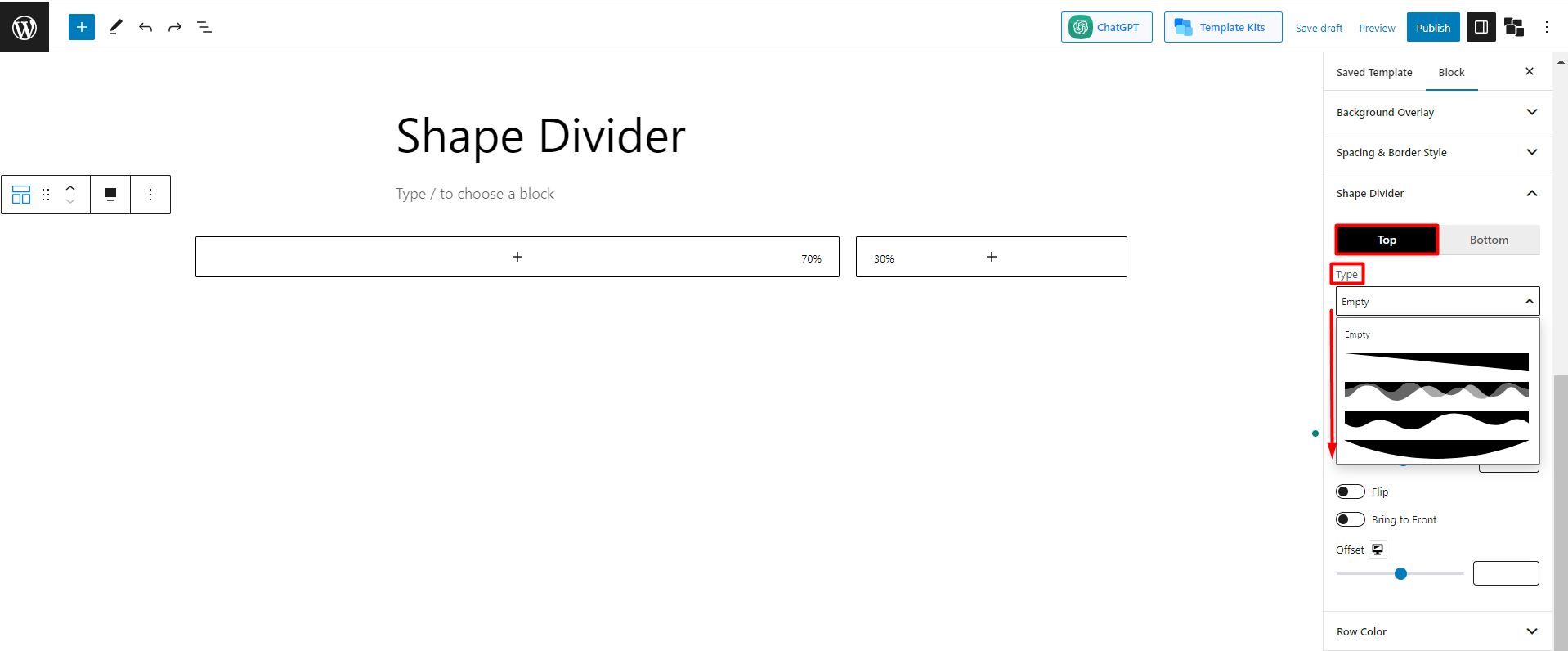
You can pick any one of them to design your page. Let’s explore a few of them.
If you pick the 1st preset, it’ll appear as:
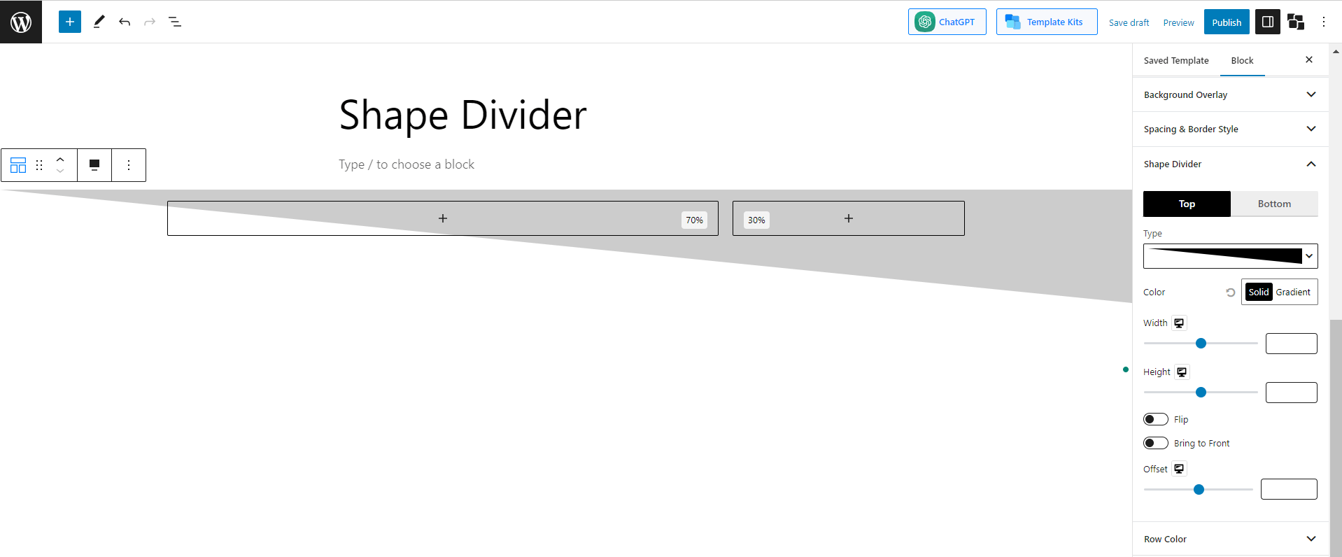
If you select the 3rd preset, it’ll appear as:
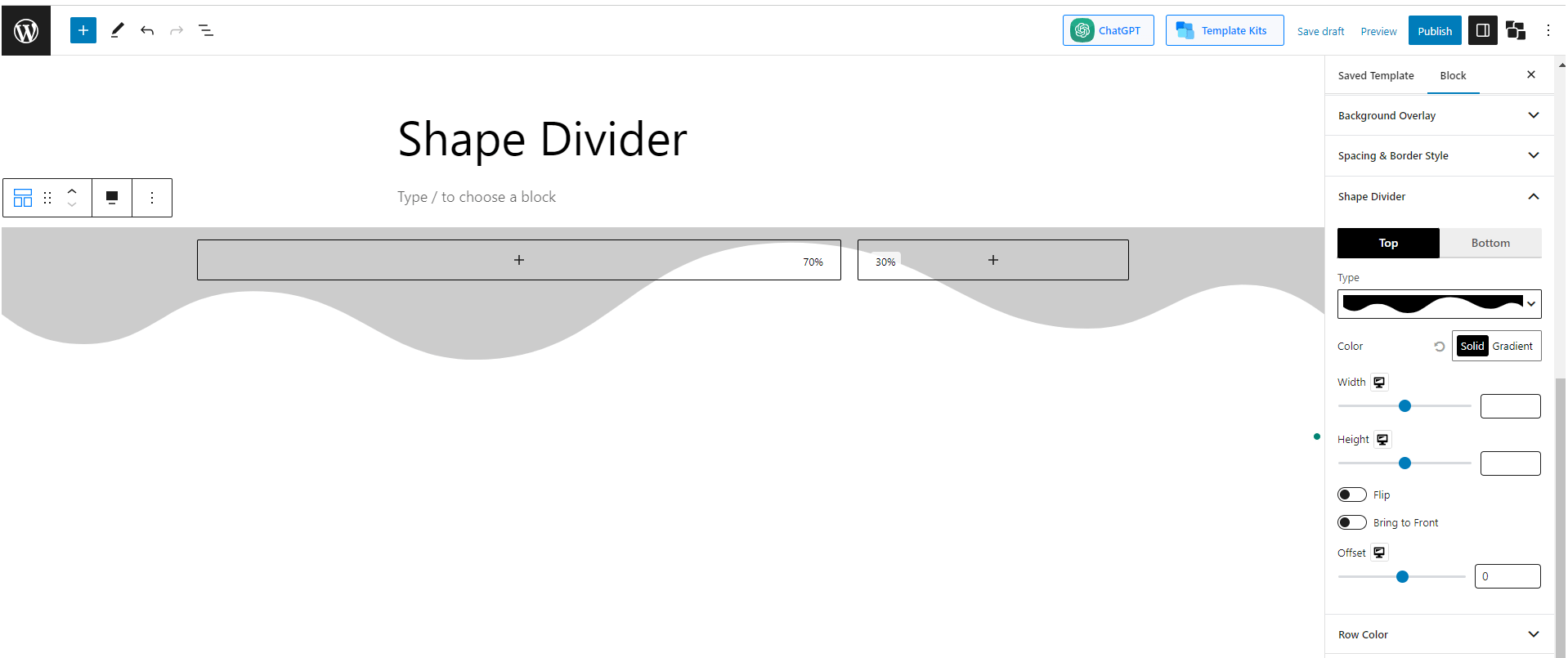
And if you select the last pre-set it’ll appear as:
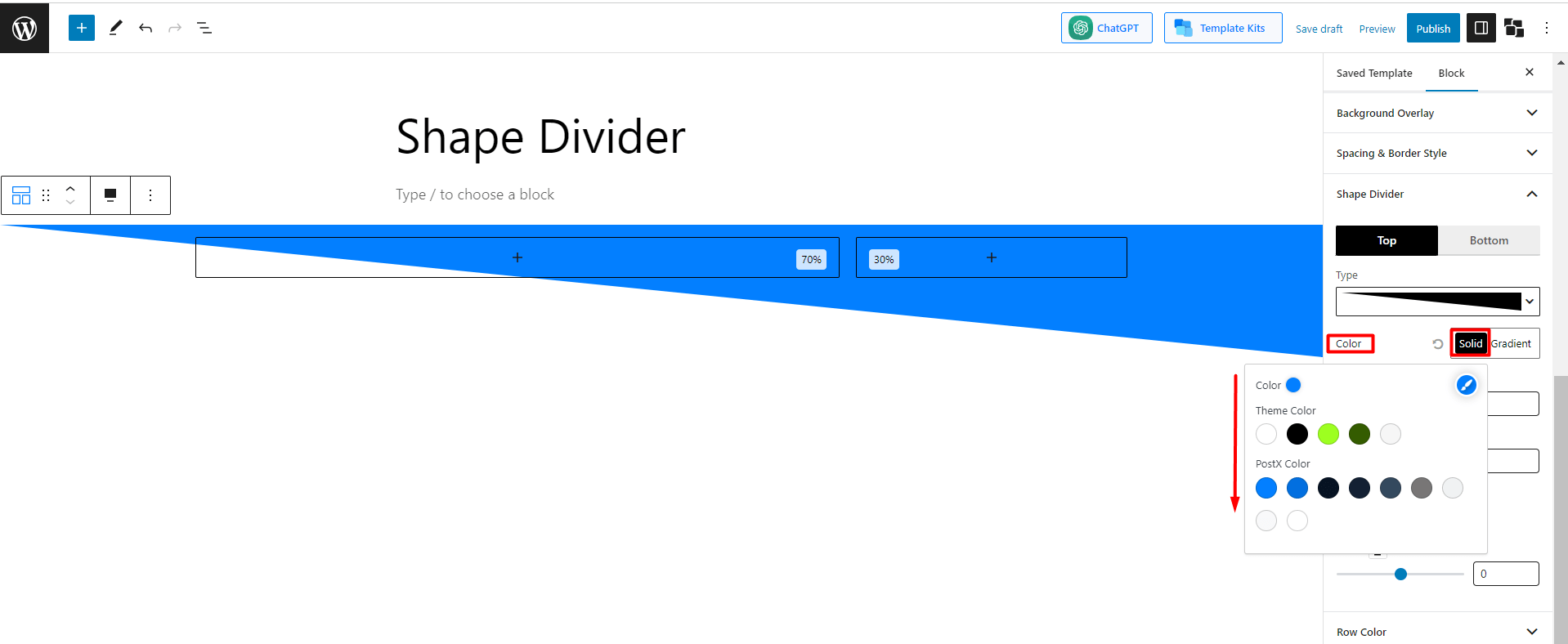
2. Color
The next and other important function is the color setting. You can change the color of the shape according to personal preferences. Luckily there are options to select both the “Solid and Gradient. “Let’s see an example.
You’ll find different solid color options when you pick the “Solid” color setting. Pick any of them. Or, you can click the color picker (the brush icon) to open the color palette and choose your desired colors. Let’s go with the blue color and see how it appears:
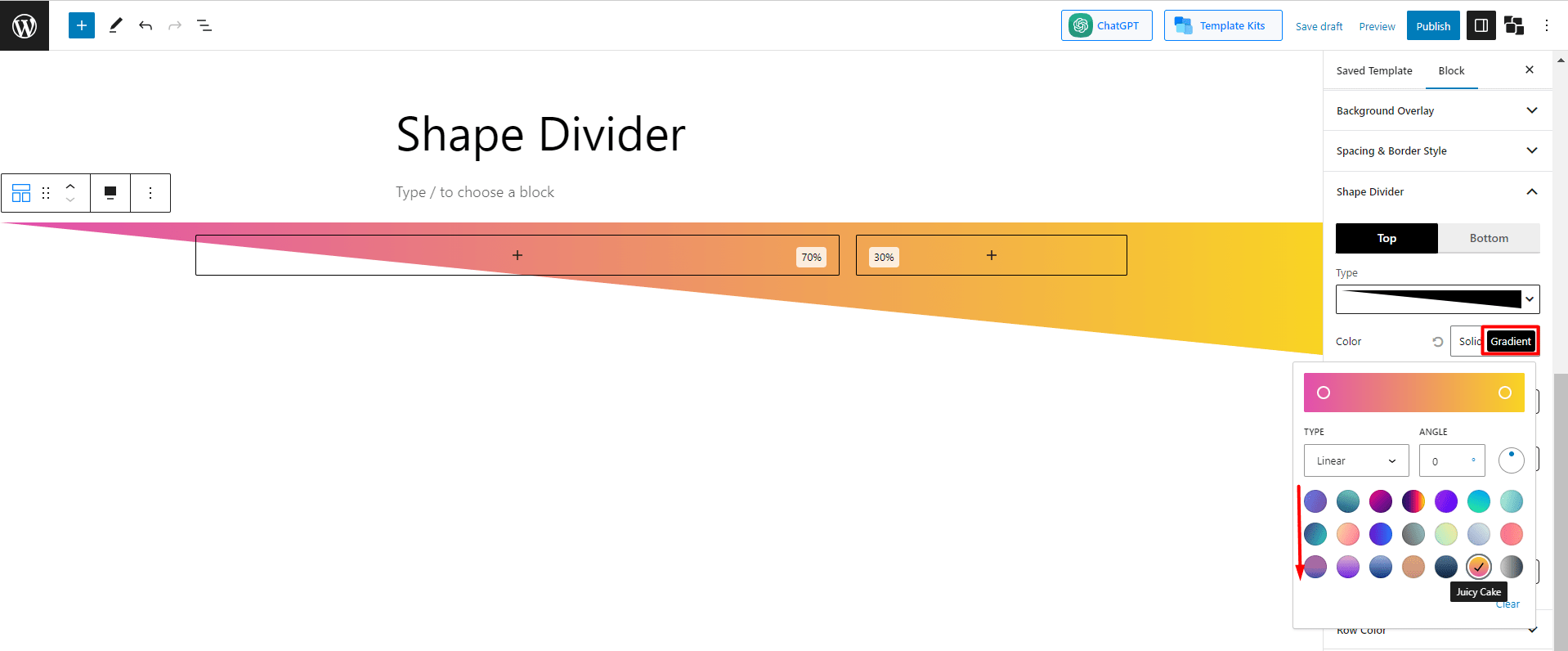
Now, let’s go with the Gradient setting, and like the previous one, you’ll find some gradient colors. I’ve selected the “Juicy Cake” color, and here’s how it appears:
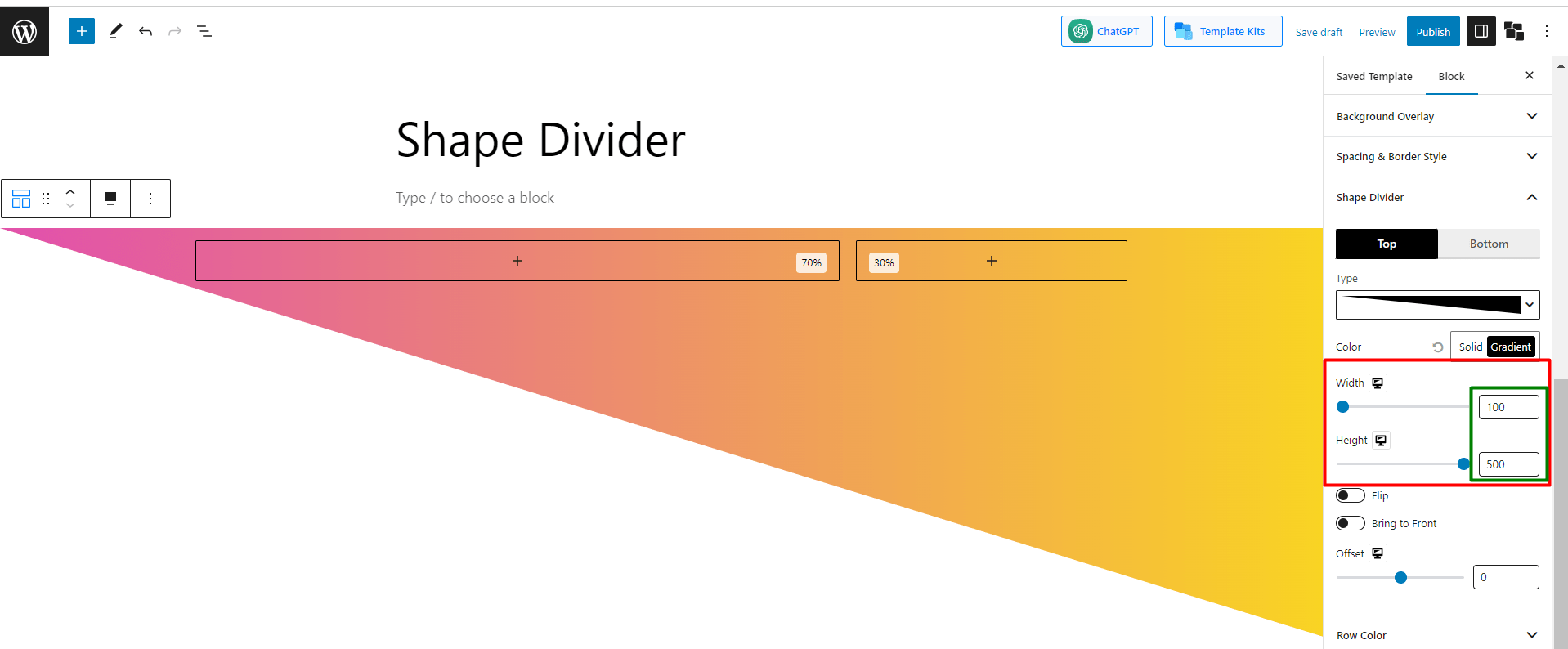
3. Width and Height
The next options you’ll find are width and height. You can easily change the width and height according to your wish. For example, let’s keep the “width 100 and height 500” and see how the shape appears –
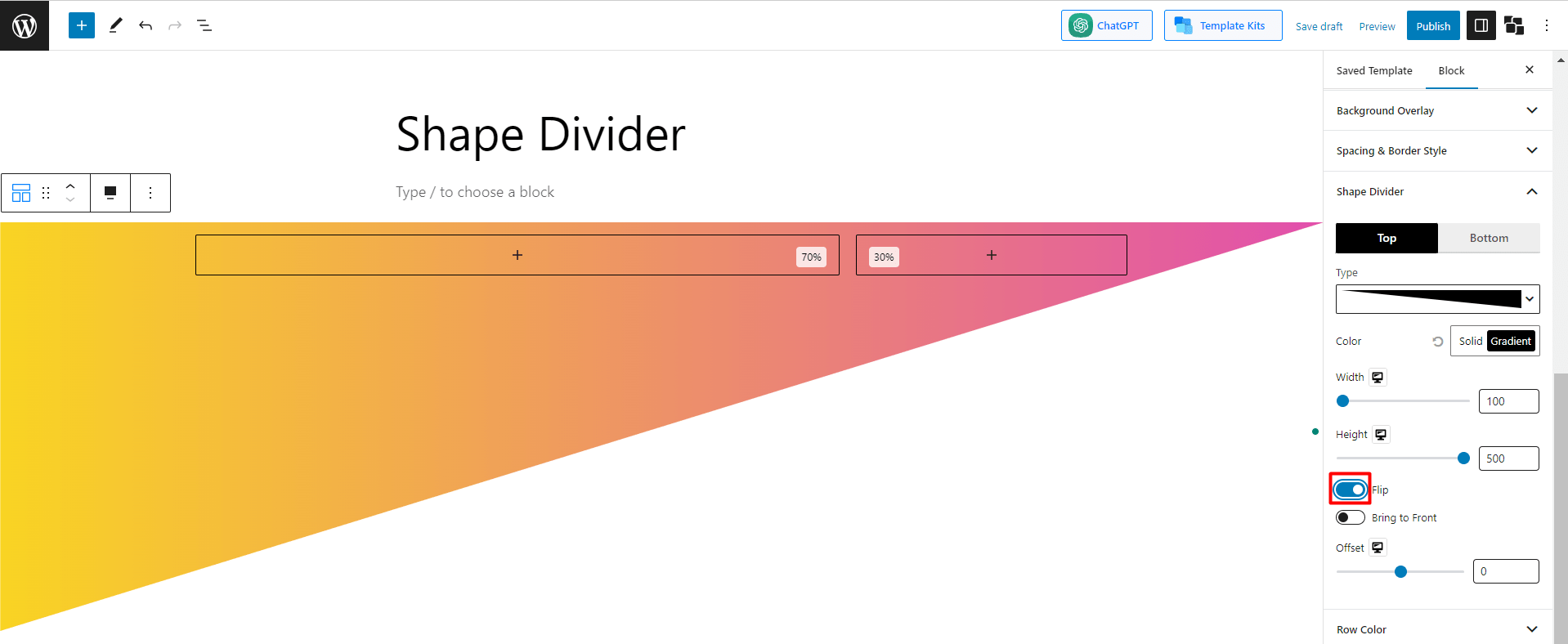
4. Flip, Bring to front, and Offset
There are 3 more settings left that are specially used for further customization. Let’s explore a bit about them.
There is an option called “flip.”, By default, it is disabled. If you enable it, the shape will flip its position. Here’s how it’ll appear.
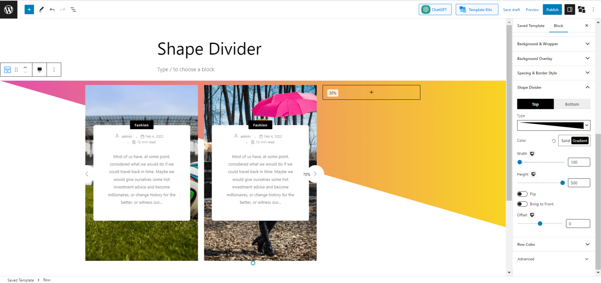
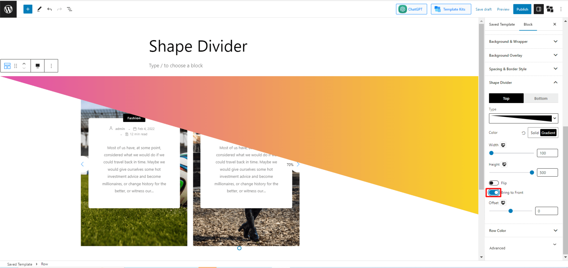
The next option is “bring to front.” The function of this setting is if any block overlaps the shape, you can select whether the shape will be upfront or the block. By default, the option is disabled, which means if you add any block, it’ll appear in front of the shape.
But if you want the shape to be brought to the front, enable the option. Let’s see how it looks, then.
That’s everything about the dividers. I think by now you have understood the functionalities of it. However, to give you a better idea, let’s create a project together using Shape Divider by PostX.
Practical Use of Shape Divider
As you’ve already understood the process of using a shape divider, this time, we’ll go straightforwardly and guide you to create any project using the Shape Divider powered by PostX.
Step 1: Create a Row Blok and Add Choose a 70:30 Layout
In the previous section about “How to use a shape divider?” we’ve shown how to add the PostX row block and select a layout. Just follow steps 1, 2, and 3 of the “How to use a shape divider?” section, and this step will be done.
Step 2: Select the Heading Button
Now click on the first block and add the “Heading” block of PostX. In the heading, we will add something related to a Gym in Miami.
Step 3: Add Paragraph and Button Under Heading
Now under the heading, we’re adding a paragraph button to write something exciting about the gym to attract people.
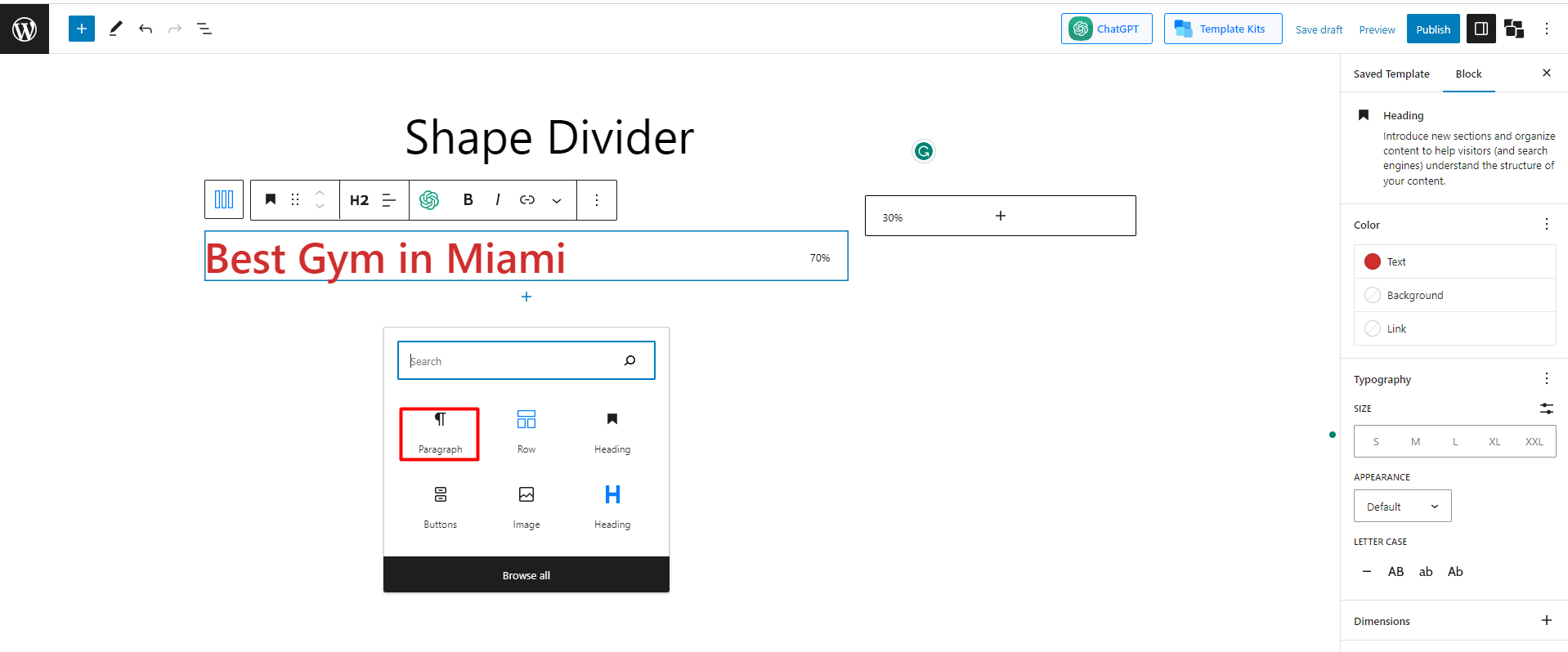
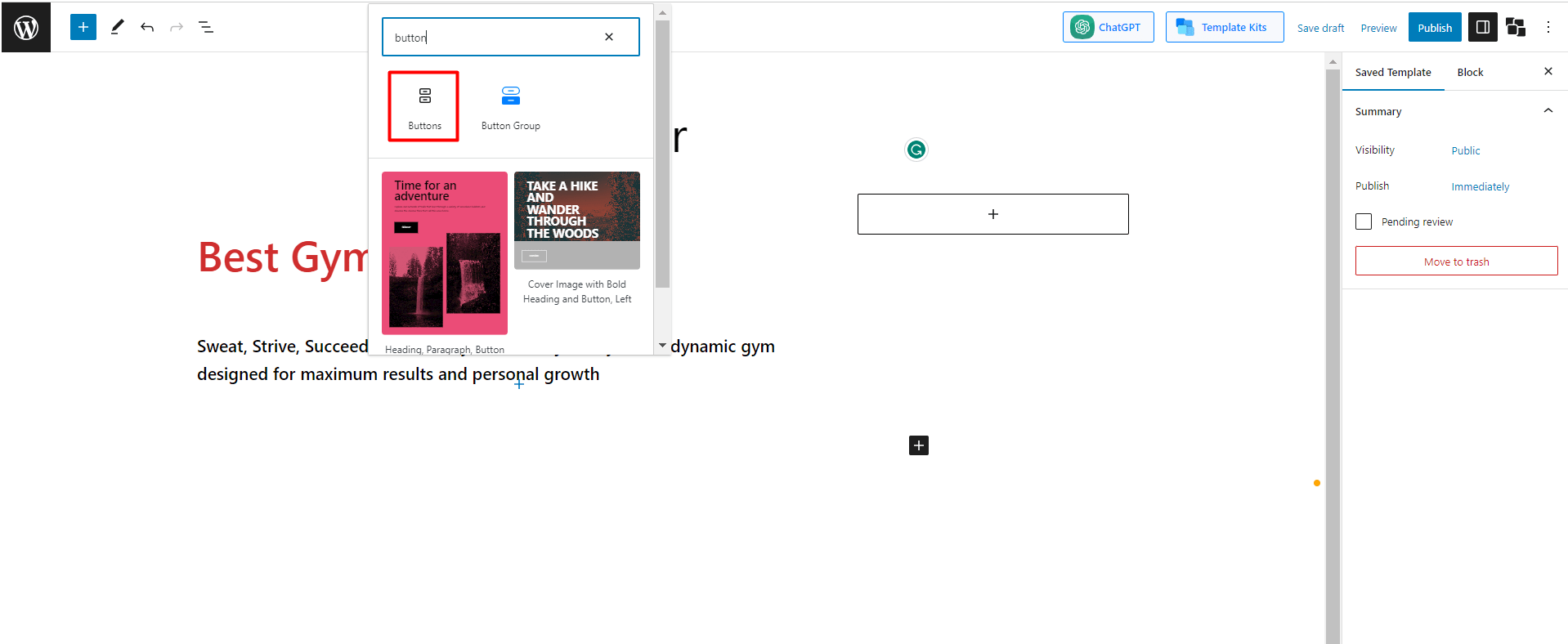
Now add a button under the heading. For that, search for a button and add it.
Now, design it with a particular color and text. Let’s check what we did.
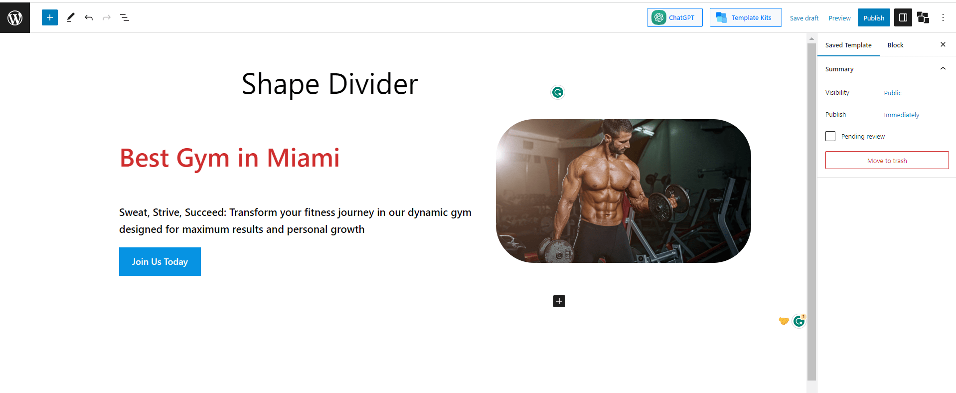
Step 4: Add Image
Now on the empty block on the right side, we’ll add a catchy gym image to make it look professional.
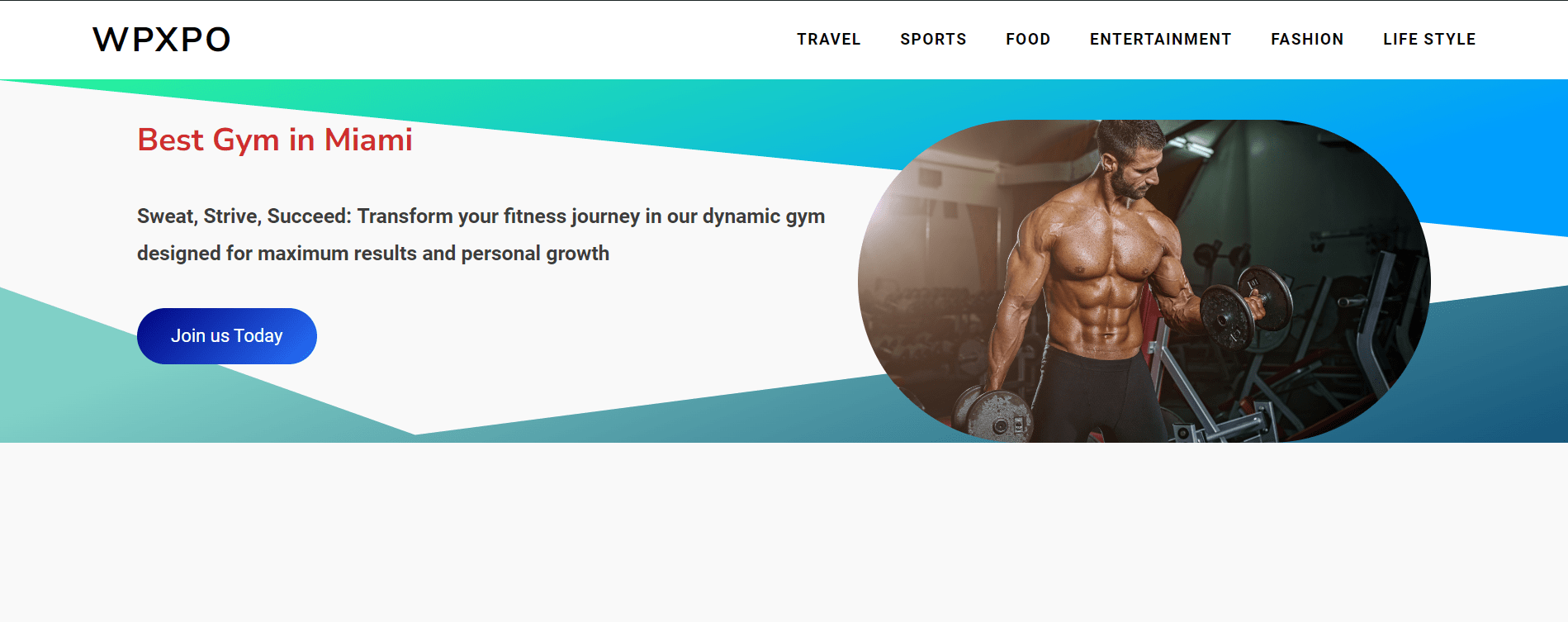
Step 5: Add Shape Divider and Design it
Finally, add the shape divider following the steps I’ve given below. Here we will add the shape divider for both the top and bottom parts and use gradient colors. Let’s see the final version.
Final Words
That’s everything about Shape Divider. Shape Dividers offer a range of customizable options, such as selecting different shapes, adjusting their size and position, and choosing colors or gradients to match your website’s aesthetic.
By adding Shape Dividers to your WordPress site, you can enhance its visual appeal, create a sense of originality, and make your content stand out with creative and captivating section divisions.
So, we think you’re now clear on everything about the element shape divider.
? Get PostX Pro to unlock all exciting features and make amazing Websites