If you are familiar with rows and columns, you already have a good start for making cool layouts in WordPress. Rows and columns are like the building blocks for your webpage design.
Let’s talk about the PostX row/column block. It might seem a bit tricky at first but don’t worry. This guide will make it super easy, even if you’re new to WordPress.
Video Tutorial: Row/Column Block
If you would prefer to watch a tutorial on row/column blocks, we have prepared a helpful video for you:
Adding the PostX Row/Column Block
Let’s start with adding the row/column block of PostX.
First, let’s get the basics out of the way.
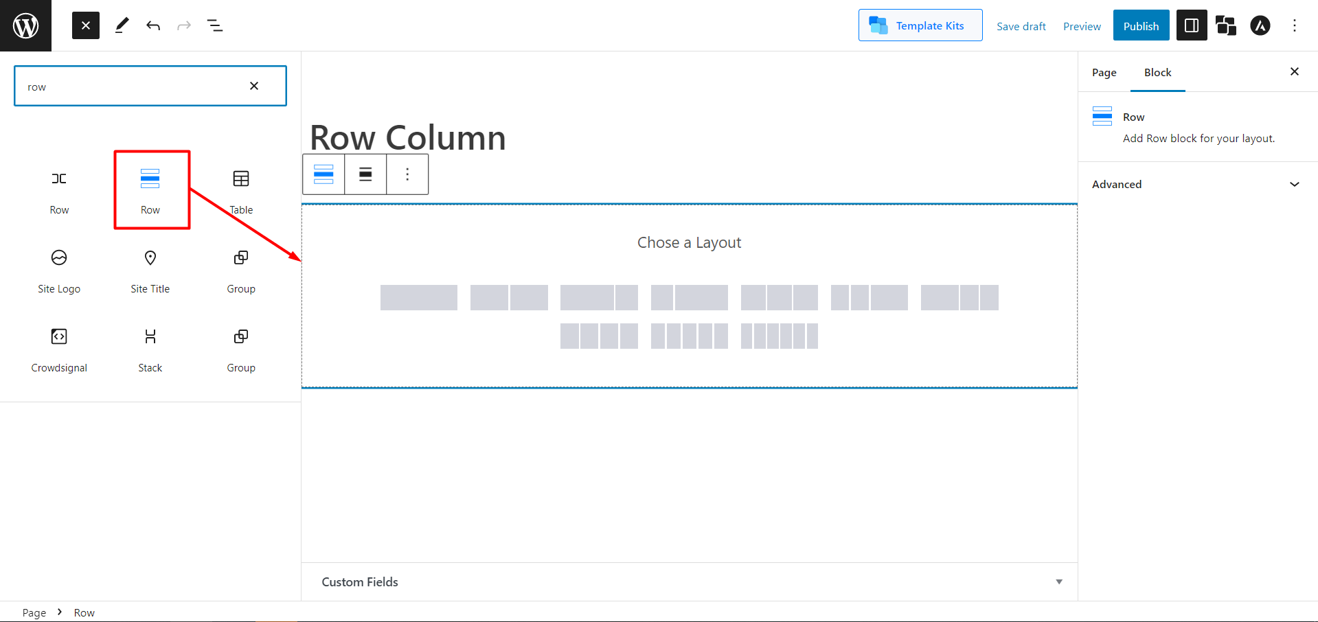
- To start a new page, go to the WordPress dashboard and select “Pages,” then click “Add New“.
- Look for the plus sign (+) at the top left of the toolbar and click on it. You’ll see a list of different blocks.
- Find the “Row” block by either scrolling or typing “Row” into the search bar.
- Click on it, and the block will be added to your page editor.
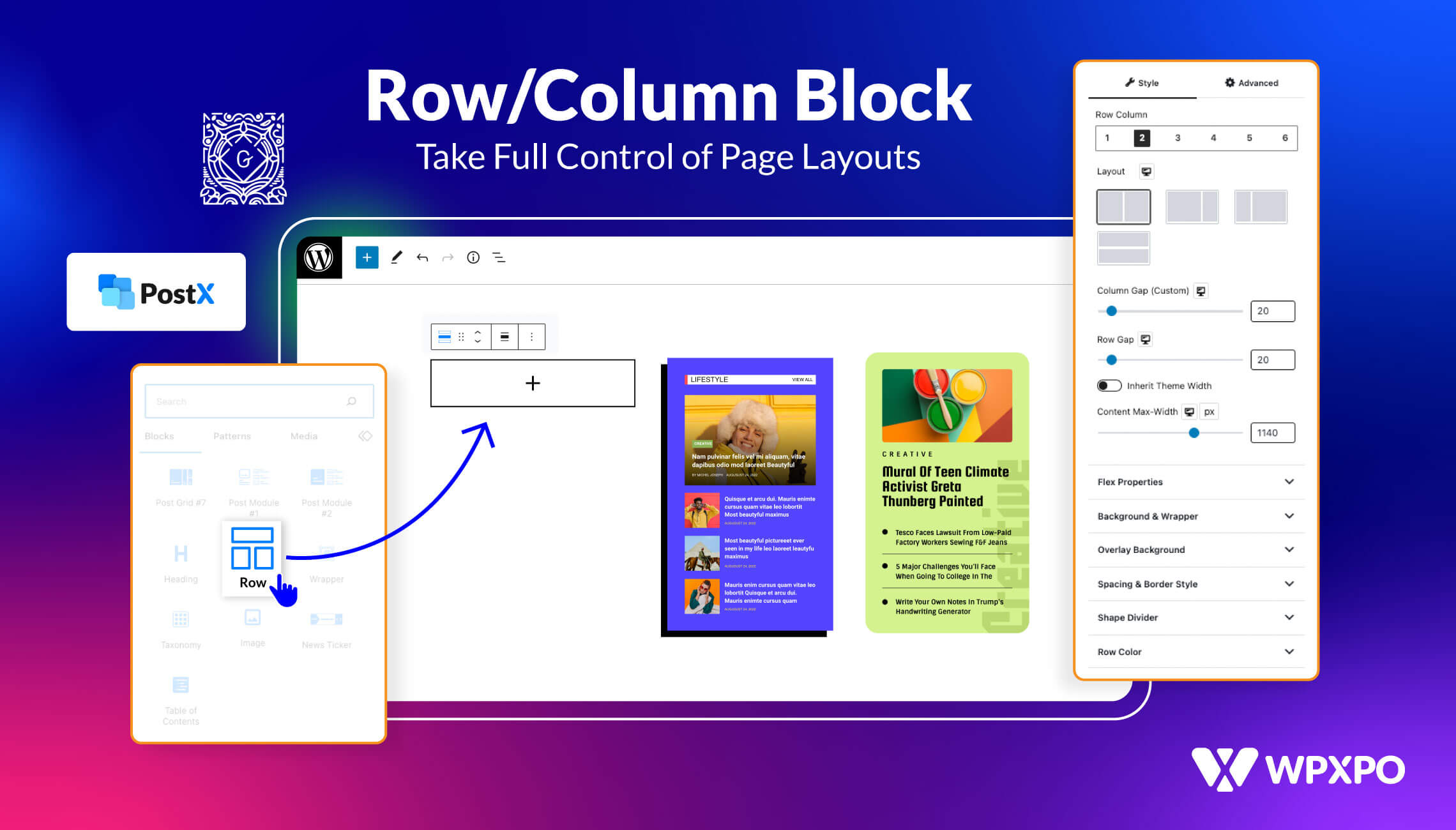
Basic PostX Row/Column Options
Once you add the Row/Column block, you can choose any of the predefined layouts. Don’t worry; you can customize them later.
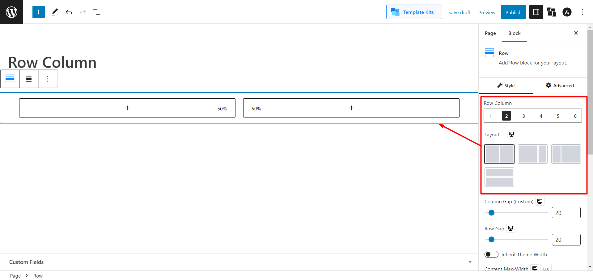
Choose the layout that suits your style. For now, let’s keep it simple and choose the 50:50 layout option. This means each row will take up half the space on the page.
Also, from the layout settings, you can decide the layout for the row/column block.
If you want to adjust how wide the columns are visually, you can do that too with the container adjuster.
It is easy to manage the gap between rows and columns. Just slide the bar to adjust the Row Gap and Column Gap.
If your theme already has a default width, you can make things easier by enabling the “Inherit the Theme Width” option. This means you won’t have to worry about adjusting widths and gaps individually.
Now let’s move to other, in-depth, exciting features and settings PostX Row/column block includes.
Advanced PostX Row/Column Options
In the PostX Row/column block, you’ll get your hand on Rows/Columns and their individual settings.
Let’s do a rundown of the settings before discussing them in detail. So, in the block’s Row settings, you will get the following features and customization options:
- Flex Properties
- Background & Wrapper
- Background Overlay
- Spacing & Border Style
- Shape Divider
- Row Color
And in the block’s column setting, you’ll get the following:
- Background & Wrapper
- Background Overlay
- Spacing & Border Style
- Column Color
- Sticky Column
Let’s discuss flex properties.
Flex Properties
Flex is a powerful layout component that you can use to align child elements of a container horizontally or vertically based on your preference.
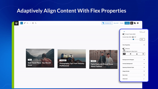
Flex works by defining a container and then setting properties that control how the child elements of that container should be laid out. This includes the spacing, alignment, size, and order.
Using the PostX Row/column block, users can choose from various flex properties to customize their site.
Flex Properties Settings
Now let’s see what the settings of PostX’s flex properties are.
As we’ve learned, flex properties actually align the contents. You can choose a horizontal or vertical Flex option from the Column setting. And in the Row settings, you can align your contents vertically.
[N.B: You must have enough content width to make it work.]
Also, in both Column and Row settings, there’s a toggle bar to reverse your contents. In Column, if you enable Reverse, the contents will switch places Vertically. And in Row, it will do the same horizontally.
Background and Wrapper
With this setting, you can change the background colors. But with PostX, you will always get something more. No more playing just with colors; you can add images and even videos. And not just in the background; you can even use images instead of colors when you hover.
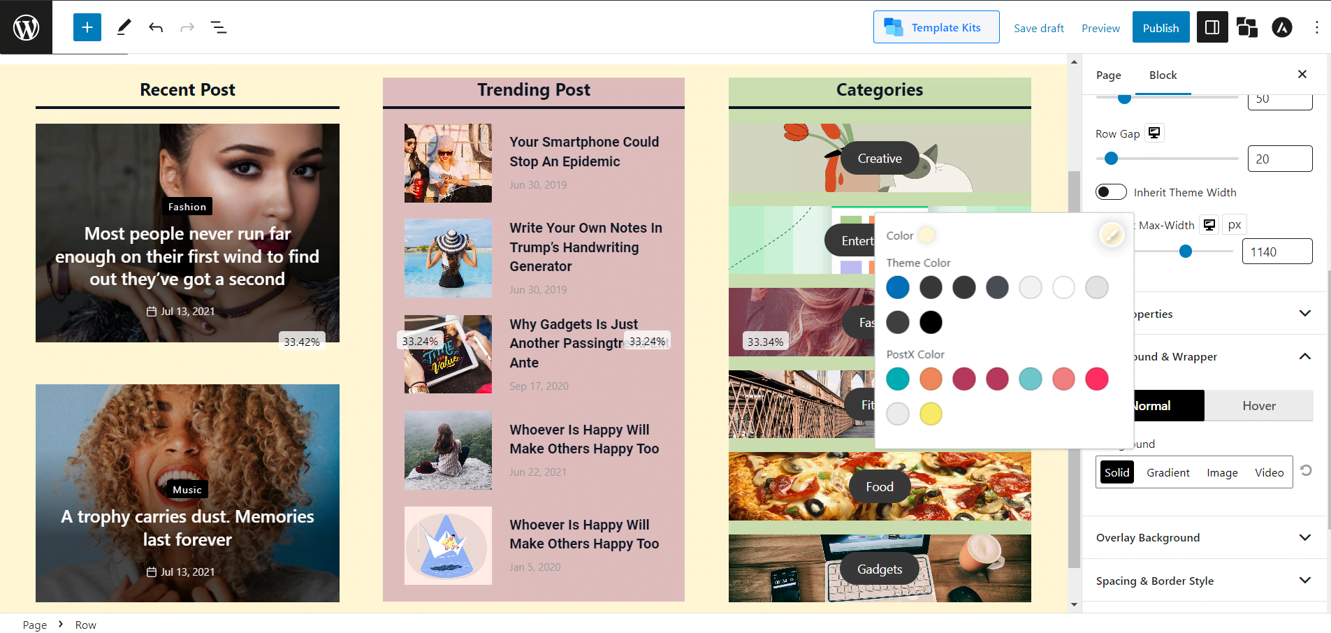
Solid Background Color:
Gradient Background Color:
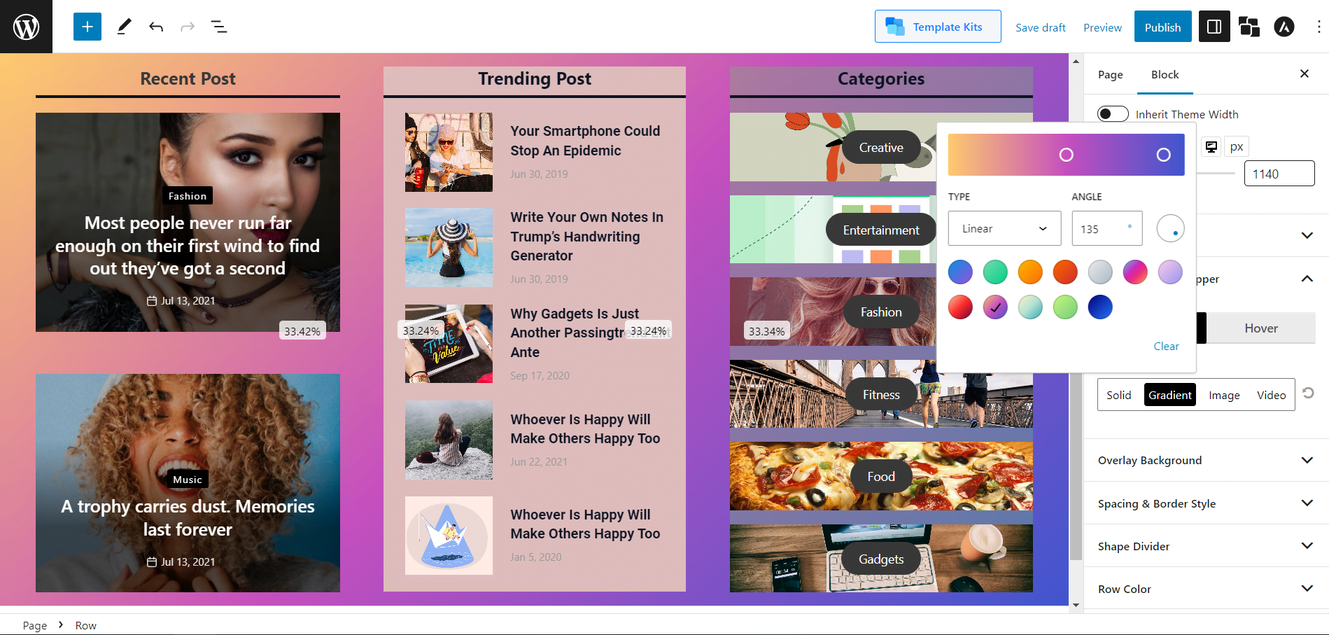
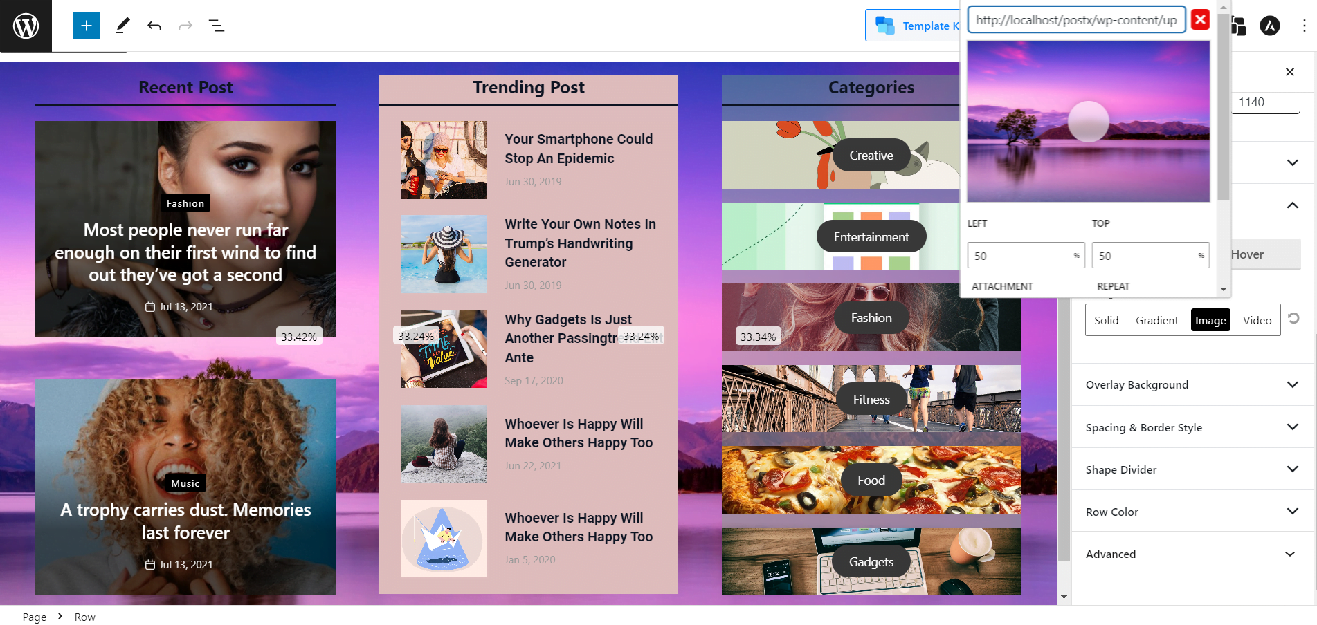
Image Background:
Also, adding different backgrounds for rows and columns is possible, which gives you more freedom to make your site content appealing.
Row Color
You can change a typographical setting for the Row section of the Row/Column block. Also, you can adjust the Typography, link hover color, and other settings for rows.
Column Color
You can change a typographical setting for the Column section of the Row/Column block. Also, you can adjust the Color, Link Color, Link Hover Color, and Typography of Columns.
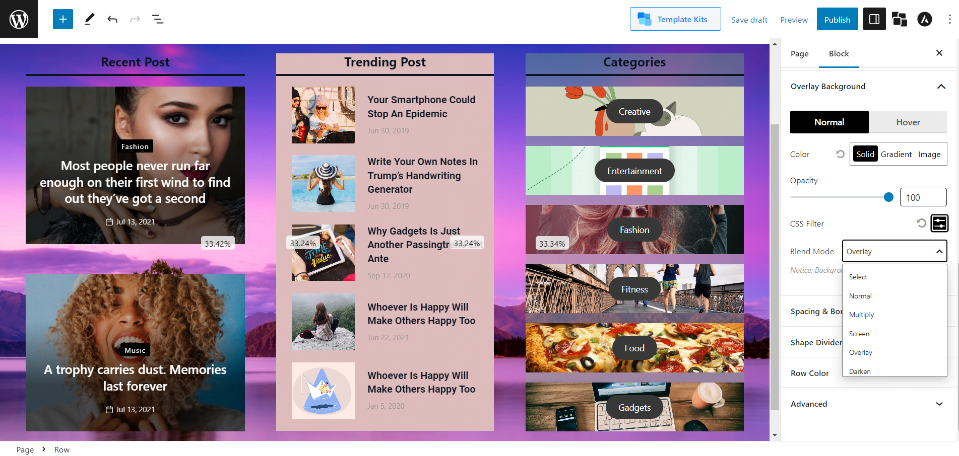
Background Overlay
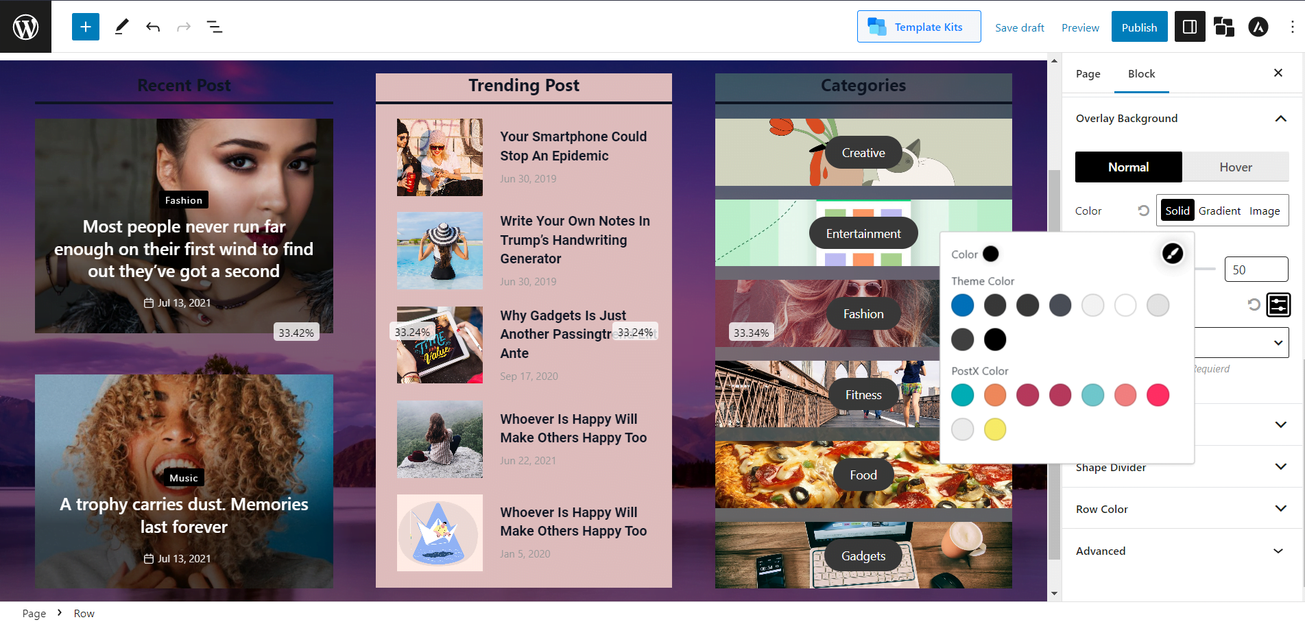
Background overlay is an image or text placed over a background image to create a layered effect. It can be used to add depth and visual interest to a website or graphic design. It can also be used to highlight particular design elements, such as a relevant image or a logo.
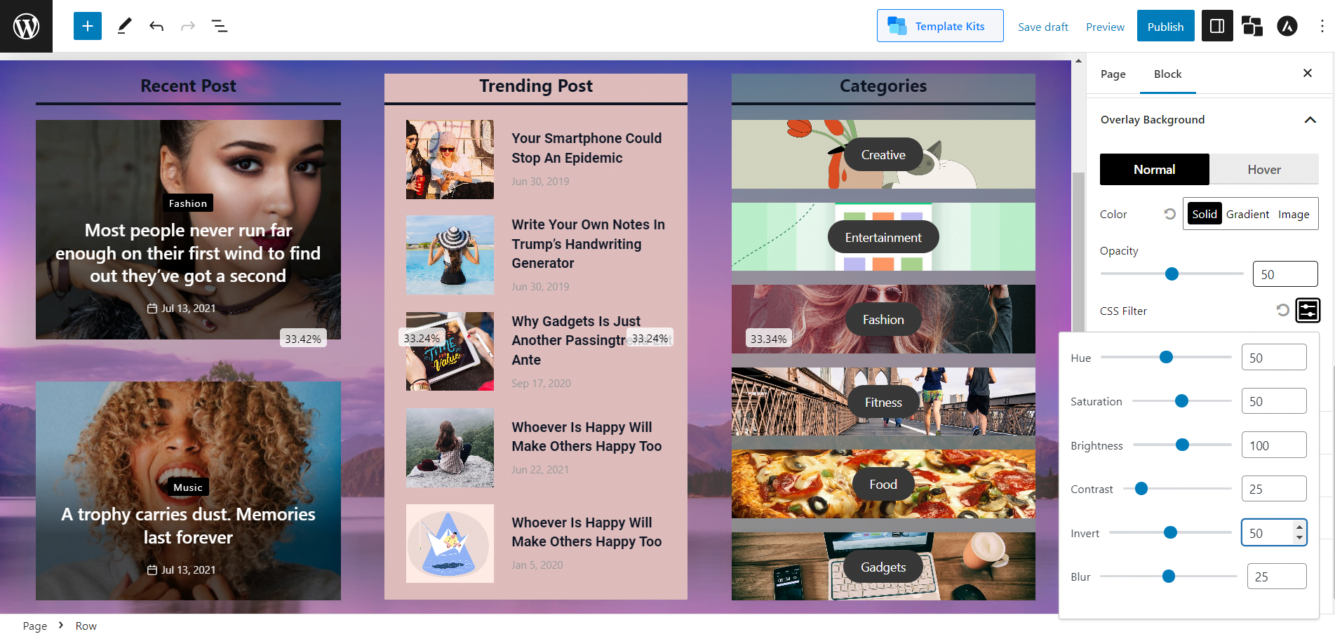
This setting lets you use the overlay effect. And PostX lets you add overlay background in the background and even on hover. And you can change the opacity with a slider. Also, you can change the brightness, saturation, contrast, blur, and invert to make your overly more customized.
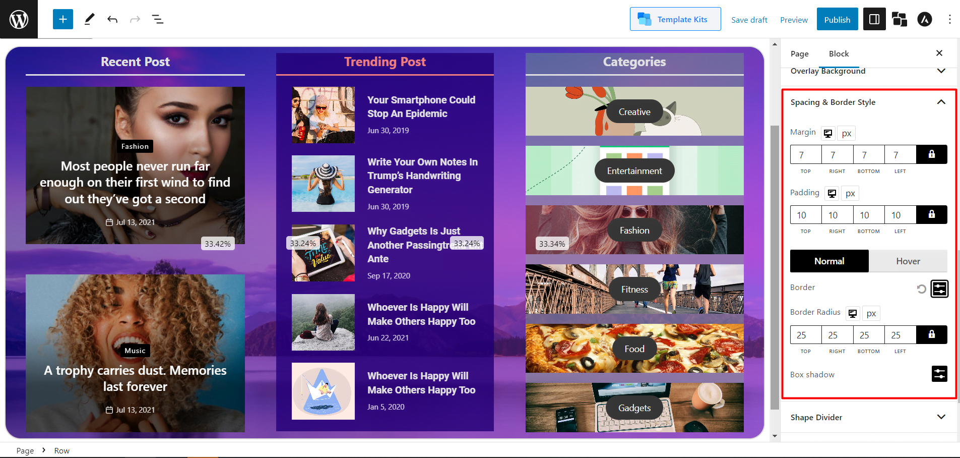
Spacing and Border Style
It’s a very intuitive thing to understand. The basic spacing and border settings with much more customizability. You can change the default Margin and padding. Also, you can change the Border color and Border Radius for both normal and hover. And PostX also lets you select the color of Box Shadow. You will get these settings for both Rows and Columns.
Shape Divider
Shape dividers are a great way to give your section a unique and professional look. You can place graphic shapes at the top or bottom of your content section.
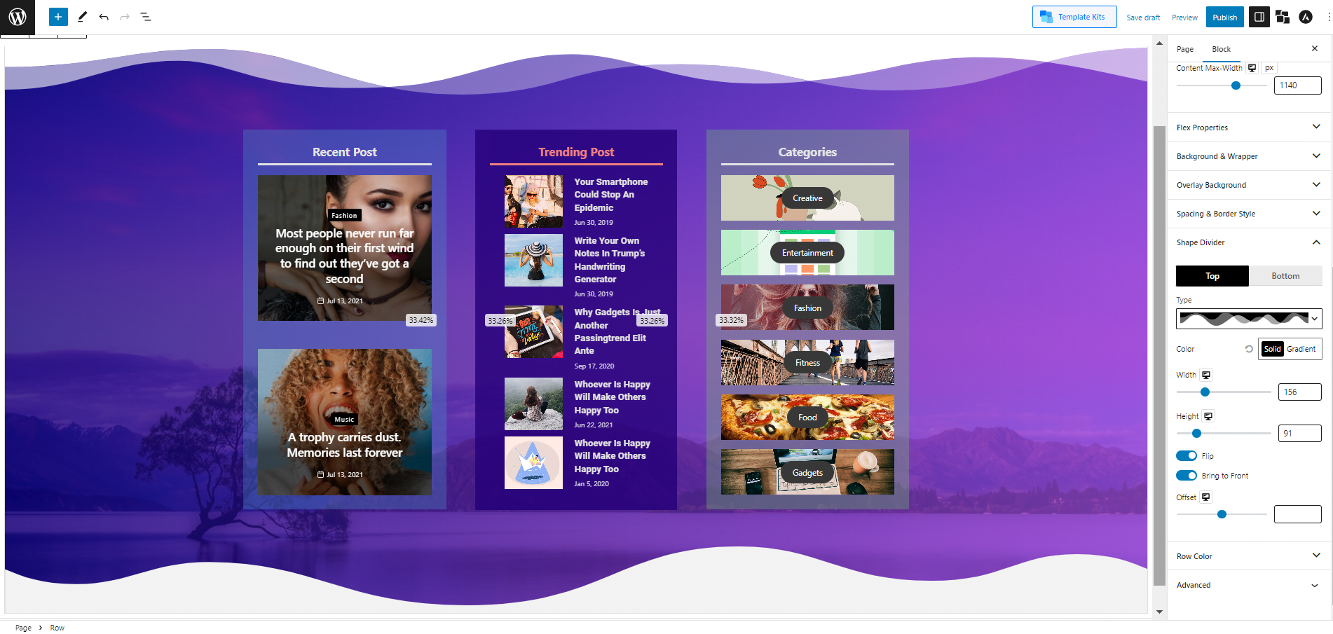
And PostX, which is known for its unparalleled customizability, not just brought a Shape divider feature in the Row/Column block; you can do a lot of customizations.
Currently, there are 8 shapes to choose from for both the top and bottom. You can change their Color and adjust their Width and Height. You can also enable the Flip option, which inherently makes the 8 premade shapes into 16. Also, by default, the Shape Divider is in the background, but you can enable the option to bring them to the front.
Sticky Column
PostX also lets your column be sticky. It works similarly to the sticky post feature of WordPress. Just here, the column sticks to the front. You can enable the Sticky Column and adjust its Gap from this setting.
Documentation Guide
Find the complete and in-depth documentation for the PostX Row/Column block right here!
Conclusion
PostX Row/Column block is invaluable for creating stunning and easy-to-navigate websites. You can easily customize your website to meet your needs with the diverse options available. Now that you know the basics of the Row/Column, it’s time to get creative and create the perfect layout for your website. Unleash your creativity and allow PostX Row/Column to help you create an engaging and efficient website that will capture the attention of your viewers.