Embedded YouTube videos in WordPress often appear too wide, too narrow, or improperly aligned on mobile devices. This usually happens because of theme container settings, iframe dimensions, or responsive layout conflicts.
You can change the size of embedded YouTube videos in WordPress by:
- Adjusting iframe width and height
- Using WordPress block alignment settings
- Placing videos inside Group or Columns blocks
- Applying responsive CSS
- Using Gutenberg plugins like PostX
This guide explains each method step-by-step, including responsive resizing for desktop, tablet, and mobile devices.
Quick Ways to Resize Embedded YouTube Videos in WordPress
| Method | Responsive | Beginner Friendly | Requires Code |
|---|---|---|---|
| Gutenberg Width Settings | Partial | Yes | No |
| iframe HTML | Limited | Yes | Minimal |
| CSS Responsive Wrapper | Yes | Medium | Yes |
| Group/Columns Block | Yes | Yes | No |
| PostX Row Block | Yes | Yes | No |
Reasons for Embedding YouTube Videos in WordPress
You might be wondering the reason for embedding YouTube videos in WordPress. Yes, you can just paste the shareable link in your writing. But embedding lets you have more control over the behavior of the video.
- Better User Experience & Engagement: Embedded YouTube videos let your visitors watch them directly from the blog, keeping them on your site. It reduces your site’s bounce rate.
- SEO Benefits: Reducing the bounce rate eventually helps you from an SEO perspective. Also, having multimedia content on a site sends a positive signal to search engines.
- Customizable Appearance: You can change the size and behavior of embedded videos. It will enhance the impression and visual appeal to your visitors.
- SEO Friendly: Embedding YouTube videos can help your SEO, but indirectly. It increases topical authority and enriches your page with multimedia.
You can go for the tutorial to get the ultimate visual instructions.
How to Change the Size of an Embedded YouTube Video in WordPress
Embedded YouTube videos do not always fit perfectly inside a WordPress layout. Depending on your theme, content width, or screen size, videos may appear too large, too narrow, or misaligned on mobile devices.
Fortunately, WordPress offers multiple ways to resize embedded YouTube videos. Below are the most effective methods to resize YouTube embeds in WordPress.
Method 1: Use the Built-in Width Options
WordPress includes a few default alignment settings for the YouTube Embed block. These options are useful when you need a quick layout adjustment without modifying code.
After selecting the YouTube Embed block, a toolbar appears with three width options:
- None: Keeps the video aligned with the main content width.
- Wide Width: Expands the video beyond the default content area.
- Full Width: Stretches the video across the full screen width.
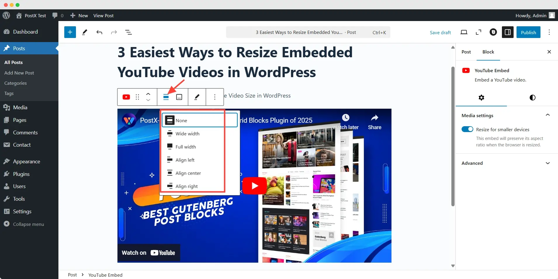
These settings work well for basic layouts, especially on full-width blog designs. However, they provide limited control over responsiveness and custom sizing.
If you need more precise adjustments, the following methods offer better flexibility.
Method 2: Change the Size Using Custom HTML
Editing the iframe embed code is one of the simplest ways to manually change the size of an embedded YouTube video.
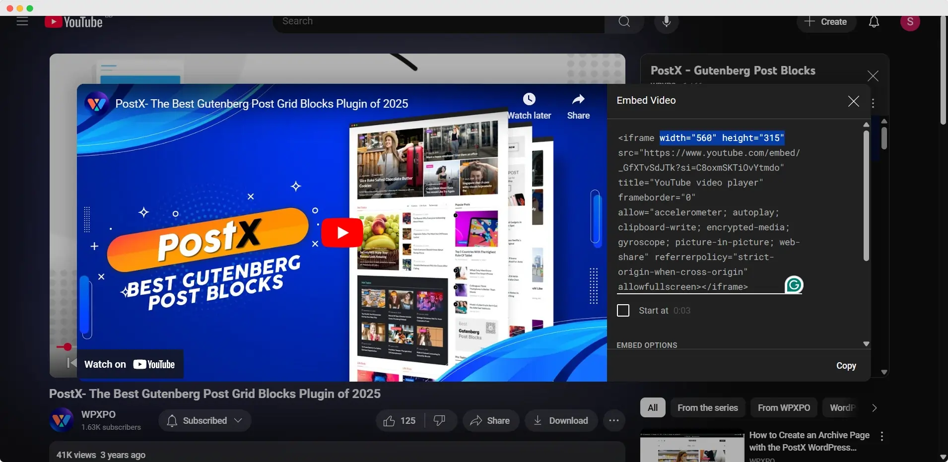
Step 1: Copy the YouTube Embed Code
Open the YouTube video you want to embed. Then:
- Click the Share button
- Select Embed
- Copy the generated iframe code
YouTube will provide a default embed size, which you can modify later.
Step 2: Paste it into WordPress
Inside the WordPress editor:
- Add a Custom HTML block
- Paste the iframe code
- Switch to Preview mode to check the video
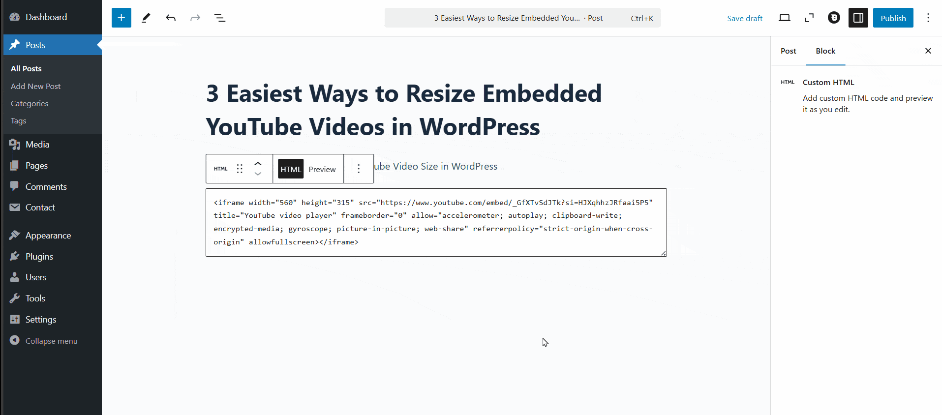
Step 3: Edit the width and height
Inside the iframe code, you will find values similar to this: width="560" height="315"
Adjust these values to resize the video based on your layout requirements.
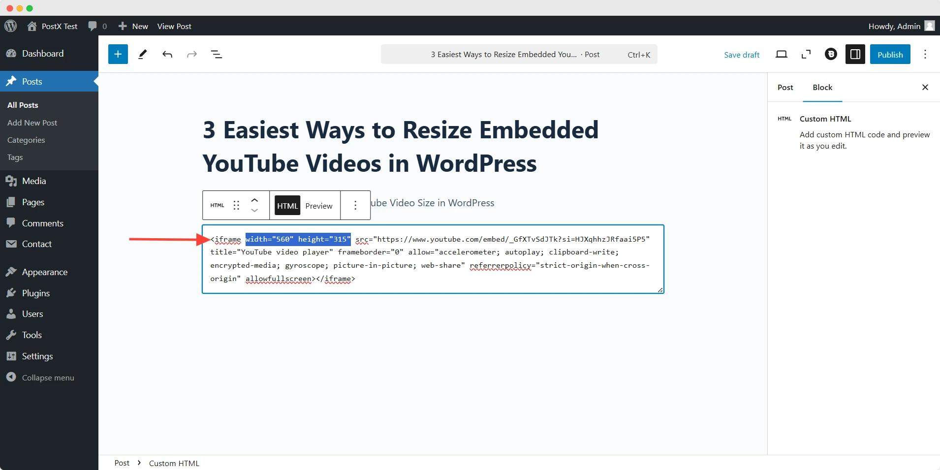
This method gives you direct control over the embedded video dimensions without relying on additional plugins.
💡 Pro Tip
You can also customize the video size directly from YouTube’s embed settings before copying the iframe code.
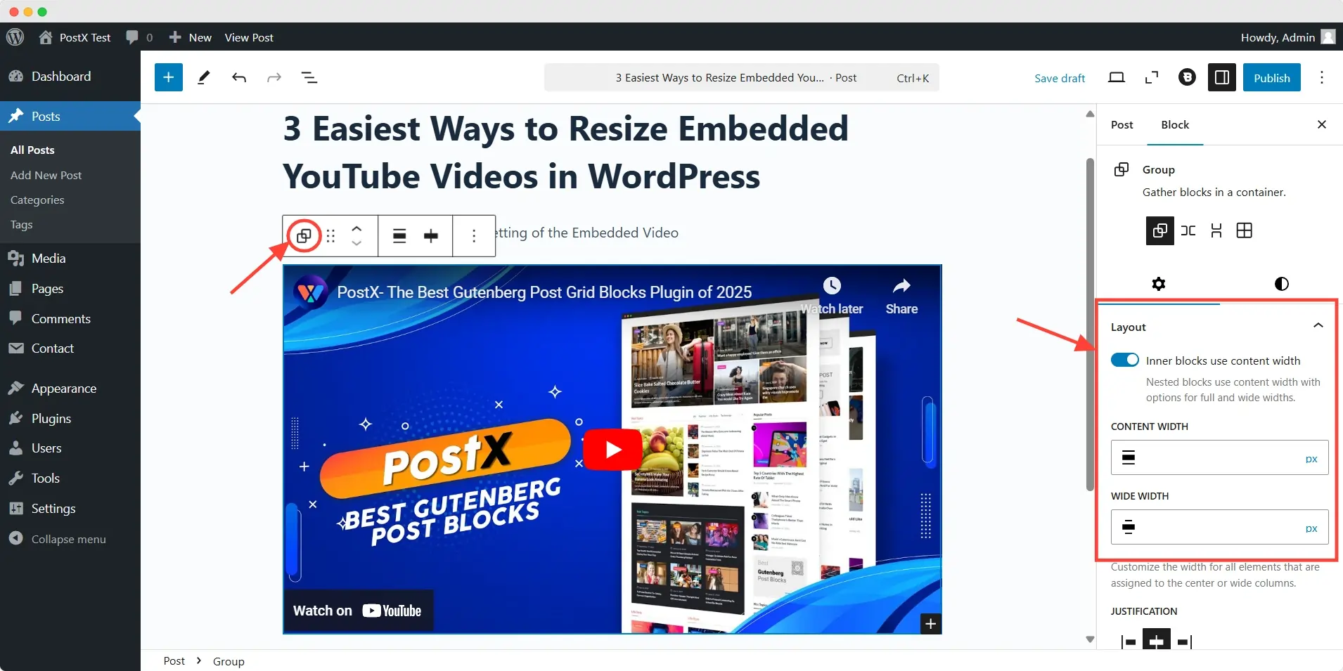
Method 3: Resize the Embedded Video from the Group/Column Settings
If you want better layout control without touching code, placing the video inside a container block is an effective solution.
The idea is simple: instead of resizing the video itself, you control the width of the surrounding container.
Step 1: Create a Group or Column Block
In the WordPress editor:
- Insert a Group or Columns block
- Place the YouTube Embed block inside it
- Paste the video URL and click Embed
Step 2: Adjust the container width
Select the Group block and open the settings panel on the right side.
Under the layout settings, modify the Content Width value using pixels or percentages. This changes how much space the embedded video occupies inside the page layout.
Step 3: Use columns for better positioning (Bonus Trick!)
For more control, use a three-column layout and place the video in the middle column.
This approach helps:
- Center videos more precisely
- Create balanced spacing
- Improve visual alignment on wider screens
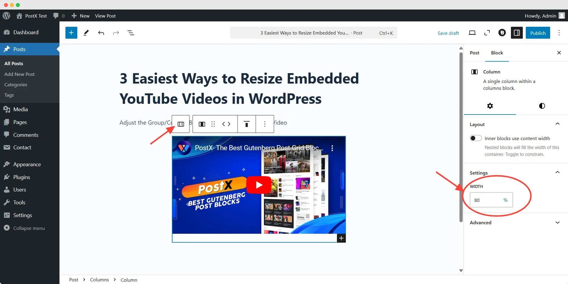
Container-based resizing works especially well for magazine layouts, landing pages, and custom Gutenberg designs.
💡 Pro Tip
Enable responsive resizing options if your theme or block settings support them. This helps maintain proper scaling across mobile and tablet devices.
Method 4: Use Responsive CSS for Better Control
When you need consistent video sizing across desktop, tablet, and mobile devices, responsive CSS provides the most reliable solution.
Instead of using fixed dimensions, responsive CSS allows the video to scale automatically based on screen size.
Add the following code to your custom CSS section:
.video-container {
  position: relative;
  width: 100%;
  aspect-ratio: 16 / 9;
}

.video-container iframe {
  width: 100%;
  height: 100%;
  border: 0;
}
Then wrap your iframe embed inside a container like this:
<div class="video-container">
  <!-- YouTube iframe here -->
</div>
This method helps:
- Maintain the correct 16:9 aspect ratio
- Prevent videos from overflowing on smaller screens
- Improve mobile responsiveness
- Create cleaner full-width layouts
Responsive CSS is particularly useful when the default WordPress embed settings are not enough for your design requirements.
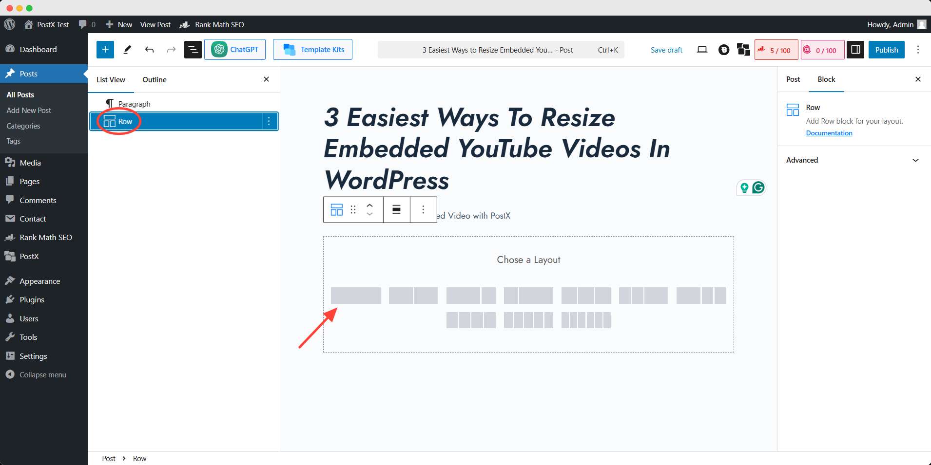
Method 5: Adjust the Size of the Embedded Video with PostX
If you want more advanced layout flexibility inside Gutenberg, PostX provides additional control over video sizing and responsiveness.
Its Row/Column block makes it easier to manage content width across different devices without writing custom CSS manually.
PostX is a dedicated WordPress plugin for building news, magazine, and blogging websites with Gutenberg blocks. You can try this plugin to revamp your site and enhance your visitors’ experience.
Step 1: Install and activate PostX
To get started, you have to install the PostX plugin from the WordPress plugin directory. Follow the official documentation for the installation process and ensure everything goes smoothly.
Step 2: Add a Row Block & Embed the Video
Inside the editor:
- Insert the PostX Row block
- Embed your YouTube video inside the block
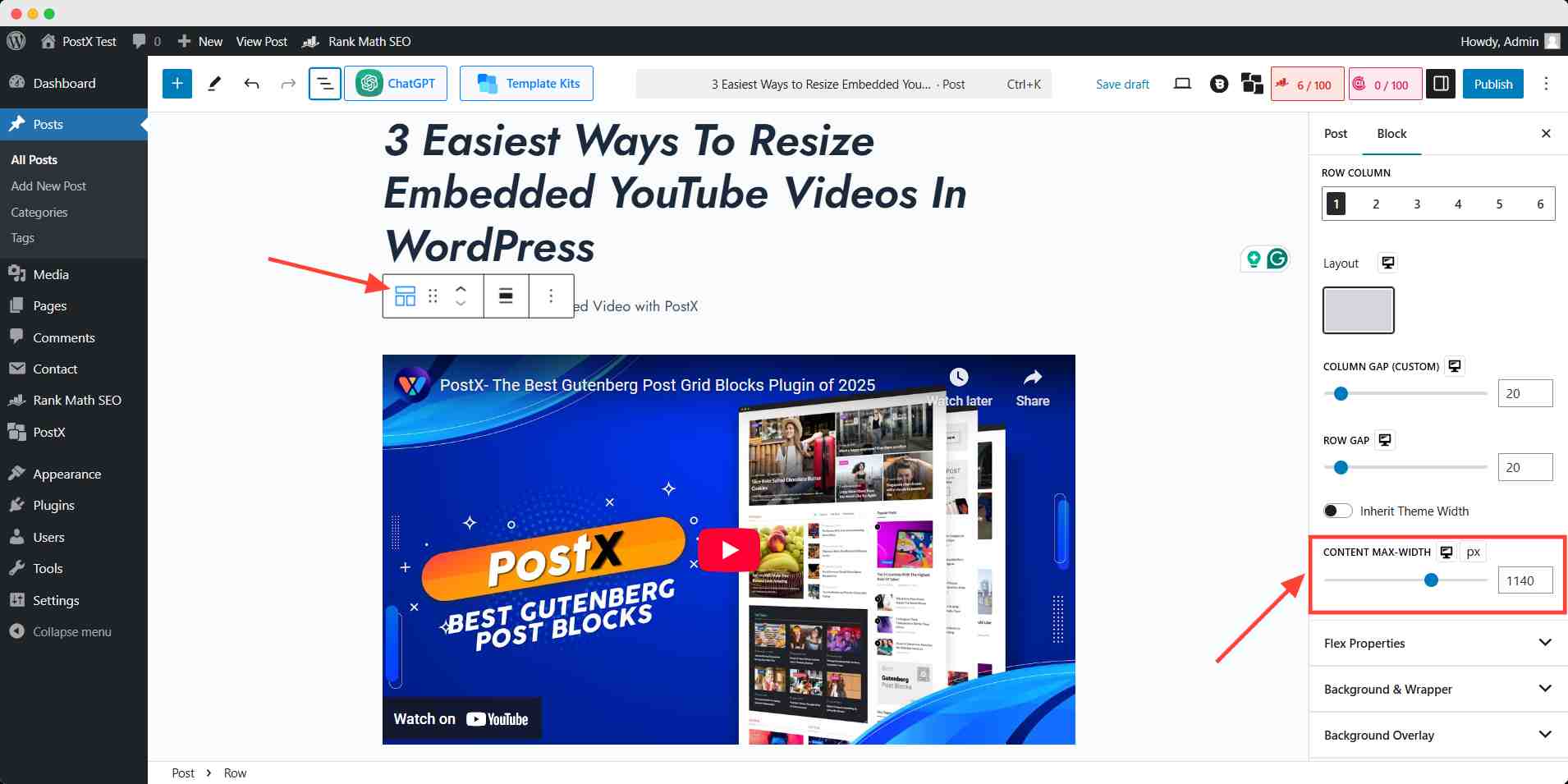
Step 3: Set the width of the video with PostX Settings
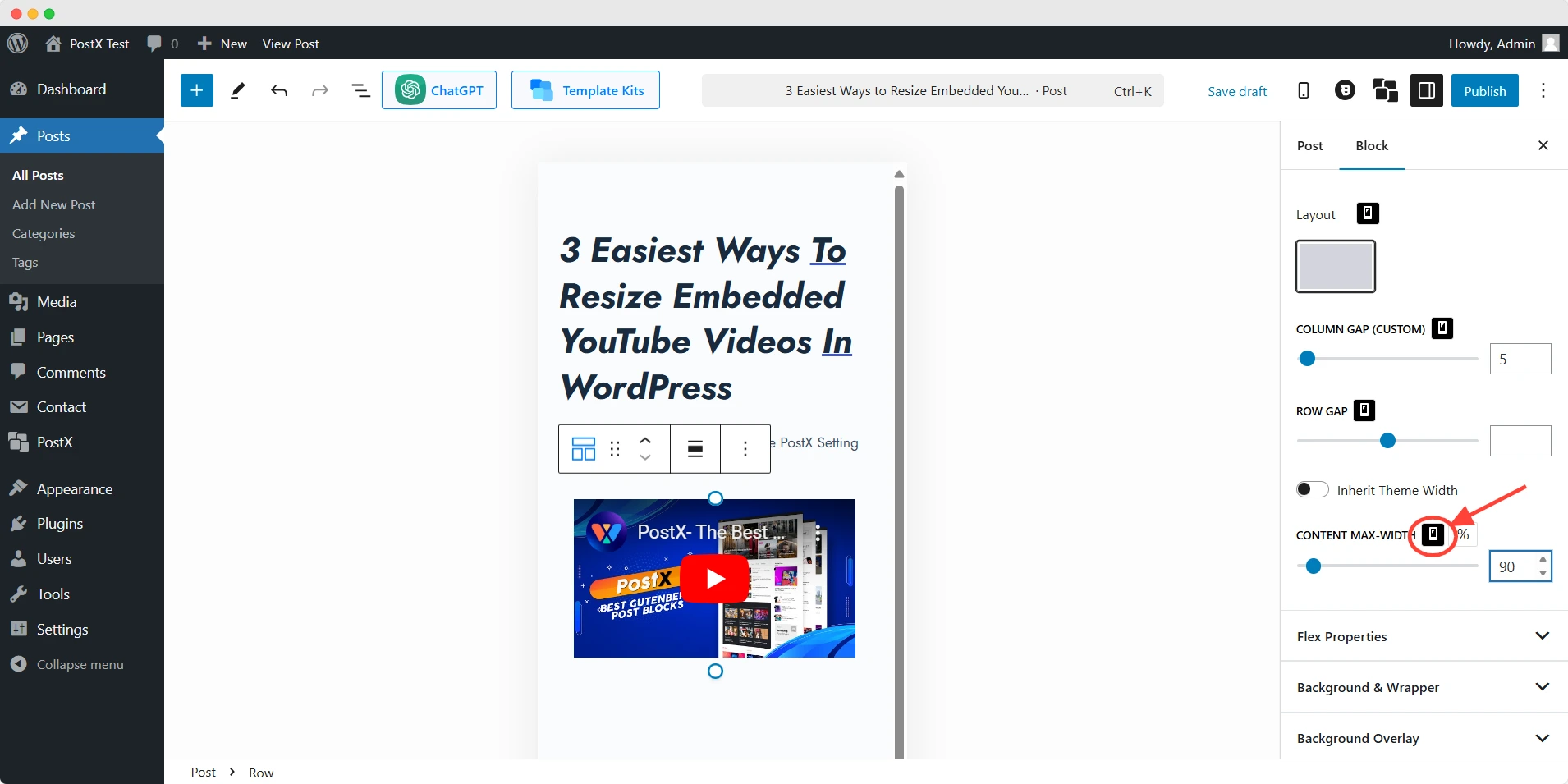
Now, select the Row Block where the video is embedded. Open the Settings panel from the right sidebar, and scroll down to find the Content Max-Width under Layout.
Here, you can input your desired pixel or percentage value to resize the video to fit perfectly within your design.
Step 4: Check mobile and tablet views
Use the responsive preview controls to switch between:
- Desktop
- Tablet
- Mobile
Then adjust the layout for each screen size separately.
This approach gives you more precise responsive control compared to the default WordPress YouTube Embed block.
Why PostX?
PostX makes customization effortless. It helps you structure and style your blog exactly how you want. Explore and see the difference! 🚀
Recommended Practice while Changing YouTube Video Size
When changing an embedded YouTube video size, follow these best practices to ensure a smooth user experience:
| Best Practice | Why It Matters |
|---|---|
| Maintain a 16:9 aspect ratio | Prevents stretched or distorted videos |
| Test responsiveness | Ensures proper display on mobile and tablet |
| Match video width with content layout | Improves visual balance |
| Avoid excessive embeds | Helps page speed and Core Web Vitals |
| Use lazy loading | Reduces initial page load time |
| Check theme compatibility | Prevents layout conflicts |
Common Mistakes When Resizing Embedded YouTube Videos
When resizing embedded YouTube videos, it is important to maintain responsiveness and performance across different devices. Small configuration mistakes can lead to layout issues, poor mobile experience, or slower page loading times.
Here are some of the most common problems to avoid:
| Mistake | Why It Causes Problems | Better Approach |
|---|---|---|
| Using fixed pixel widths on mobile | Videos may overflow or break smaller layouts | Use percentage-based widths or responsive CSS |
| Breaking the 16:9 aspect ratio | Videos can appear stretched or distorted | Maintain a consistent aspect ratio across devices |
| Ignoring theme container widths | Videos may not align properly with page content | Match the embed width with your theme layout |
| Embedding too many videos on one page | Can slow down page loading and affect UX | Limit embeds or use lazy loading |
| Using autoplay unnecessarily | Impacts user experience and page performance | Let visitors play videos manually |
| Forgetting responsive testing | Videos may look fine on desktop but break on mobile | Preview layouts on desktop, tablet, and mobile |
| Relying only on default embed settings | Limits control over sizing and responsiveness | Combine block settings with CSS or layout containers |
| Not optimizing for Core Web Vitals | Heavy embeds can affect performance metrics | Use lightweight layouts and responsive embeds |
Avoiding these issues helps create cleaner layouts, better mobile responsiveness, and a smoother viewing experience for visitors.
💡 Pro Tip
Want to enhance your blog’s visual appeal? PostX lets you use video as featured images, creating an immersive, next-gen experience for your visitors. Try it out! 🚀
Conclusion
Resizing embedded YouTube videos in WordPress becomes much easier once you understand how different layout methods work.
Built-in alignment settings are useful for quick adjustments, while iframe editing, responsive CSS, and container blocks provide more precise control.
For advanced Gutenberg layouts and device-specific responsiveness, tools like PostX offer additional flexibility without relying heavily on custom code.
Choose the method that best matches your workflow, theme structure, and responsiveness requirements.
FAQs
What is the Best Size for an embedded YouTube video in WordPress?
The ideal size of an embedded YouTube video depends on your site’s layout. The recommended practice is maintaining a 16:9 aspect ratio. YouTube’s default dimension gives the proper viewer experience.
Why Is My Embedded YouTube Video Not Resizing Properly in WordPress?
You should check theme compatibility if you face difficulties in resizing YouTube videos. You should also look for additional custom CSS or HTML code that prevents the resizing.
What Does Lazy Loading Do?
Lazy loading delays the loading of images, videos, and other media until they are needed. It only loads media when the user scrolls to it. It speeds up your site, reduces load time, and improves SEO. It’s ideal for pages with lots of media, like blogs or product pages.
Does Embedding YouTube Videos Slow Down Your Website?
Embedding too many YouTube videos can slow down your site by loading extra scripts. To minimize this, use lazy loading (enabled by default in WordPress 5.7+), limit the number of embeds, or use a lightweight embed method.
How Do I Embed a YouTube Video in WordPress?
You can embed any YouTube video in several ways. For example:
1. Paste the Link Directly
2. Using the YouTube Block (Gutenberg Editor)
3: Use iframe Embed Code
Why Embedded Videos Look Small in WordPress?
Most likely causes of this issue are: theme container width, max-width CSS, legacy iframe size, cached styles, and page builder conflicts.
How Does an Embedded YouTube Video Affect Page Load Time?
Videos can slow down your website if not optimized properly. Here’s how to ensure smooth performance:
✅ Use Lazy Loading
✅ Host Thumbnails Locally
✅ Limit Autoplay & Extra Features
