

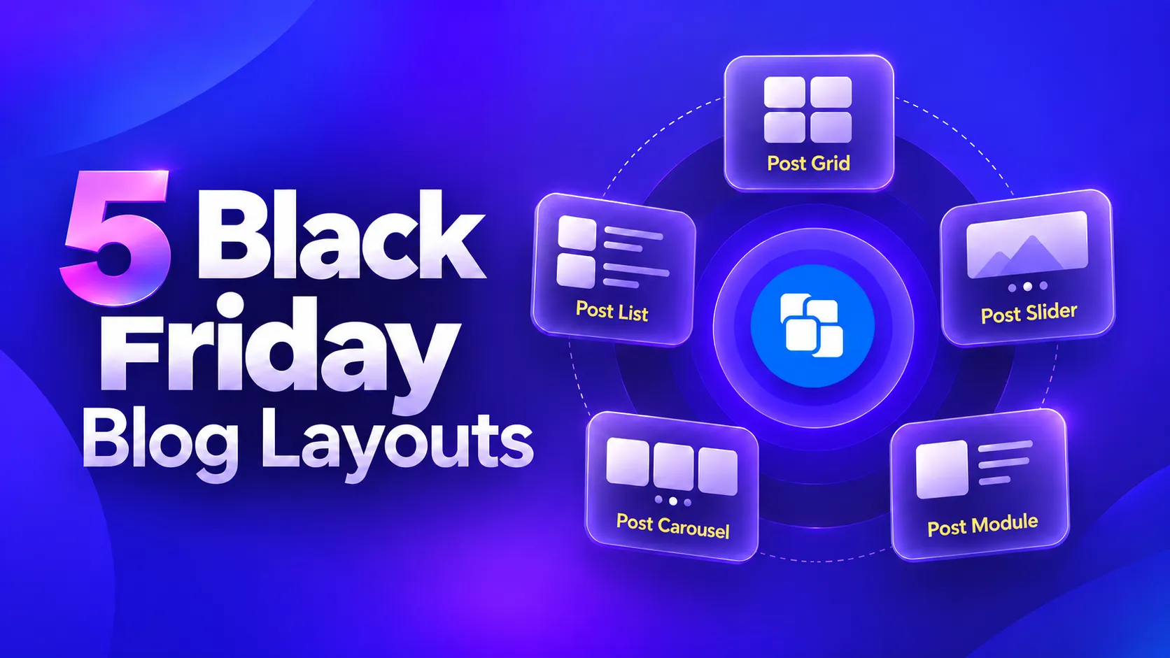
Black Friday usually means publishing more content than usual, and a standard blog archive can get crowded fast. The right layout makes those posts much easier to browse.
Five common blog post layouts can cover most Black Friday content needs. Use a post grid for deal roundups and comparisons, a post list for guides and updates, and a post slider when one announcement or featured post deserves more attention.
A post carousel works well for related seasonal posts that readers can browse horizontally, while a post module creates a more editorial, magazine-style section with clear content hierarchy.
All five are demonstrated here using PostX, a Gutenberg post grid plugin.
| Layout Type | Best for | PostX Blocks | Design Variations |
|---|---|---|---|
| Post Grid | Deal roundups and category walls | 7 | 22 |
| Post List | Guides and long-form seasonal content | 4 | 17 |
| Post Slider | One hero announcement | 1 | 4 |
| Post Carousel | Rows of related deals | 1 | 4 |
| Post Module | Magazine-style mixed content | 2 | 10 |
Why Blog Layout Decides Whether Seasonal Content Gets Read
Layout decides whether seasonal content gets read because readers arrive with one of two intents, and only one display serves each. A reader who wants to compare needs a grid. A reader who wants to understand needs a list. Match every piece of content to the display that fits its intent, and the same twelve posts stop competing with each other.
Black Friday compresses a month of publishing into a week, so everything competes for attention at once. A reader who lands on a wall of identical cards leaves, because nothing on the page says which card is worth their time.
Most sites need two display types, not one. A slider carrying your main announcement above a list of guides handles focus and reading in the same page.
Grid, list, slider, carousel and module are the working vocabulary of nearly every post layout plugin, so the layout decision comes first and the plugin second.
Our PostX vs The Post Grid comparison covers the two most common options.
1. Post Grid: Best for Deal Roundups and Category Walls
A post grid shows many items at once, which makes it the natural fit for seasonal roundups. “Twenty Black Friday deals worth checking” is a comparison task.
A grid lets readers scan prices and headlines against each other instead of scrolling past them.

PostX ships seven grid blocks, with 22 layout variations between them. The seven carry 4, no separate layouts, 5, 4, 3, 2 and 4 designs respectively. That spread is why a homepage grid and a category archive grid can look nothing alike while using the same family.
Post Grid 3 gives you the most to work with if you want a grid that does not look like everyone else’s.

Post Grid 2 is the one to pass over if layout choice matters to you, since it ships a single built-in design with nothing to switch between.

Vertical Grids Come From Post Grid 6 and Post Grid 7
Post Grid 6 and Post Grid 7 are the two blocks that include vertical layouts, which is what makes them useful for seasonal work.
A vertical grid stacks items downward the way a category page does, so a roundup reads as one continuous column of deals rather than a wide band of small cards.

Grid 6 ships two layouts and Grid 7 ships four, so between them you have six options to work with.
When to Use a Grid
Reach for a grid when the reader’s intent is to compare. They arrived with a shortlist to narrow, or a category to browse. They want to see options next to each other rather than read about them one at a time. Concretely, a grid earns its place on:
- A roundup of many similar items. Twenty deals, thirty gift guides, a “best of” list. The volume is the point, and a grid is the only layout that shows volume without becoming unreadable.
- A category or tag archive. Readers scanning for something they half-remember. Density helps them here, because they are pattern-matching, not reading.
- A homepage seasonal band. Above the fold, where you need ten posts visible rather than three.
- A deal comparison page. Where the reader is checking two options against each other and the visual proximity does the work.
Do not use a grid for a single announcement. One item in a seven-block grid looks like a mistake, and you have a layout built for exactly that job.
The seasonal trap is using one grid for everything. A grid of guides asks readers to scan essays, which is the wrong ask. Keep grids for the content that genuinely compares.
The limitation is columns. A three-column grid that looks generous on a laptop turns into cramped thumbnails on a phone. Set the responsive column count before you publish, or your roundup becomes unreadable on exactly the devices most shoppers use.
See the Post Grid designs in action →
For a category-style grid built from taxonomy terms rather than posts, our walkthrough on creating a category grid covers the setup.
2. Post List: Best for Guides and Long-Form Seasonal Content
Lists stack content vertically, one item after another, and that restraint is the point. Black Friday buying guides, gift ideas with real explanation, and “is this deal actually worth it” posts all need room to breathe.
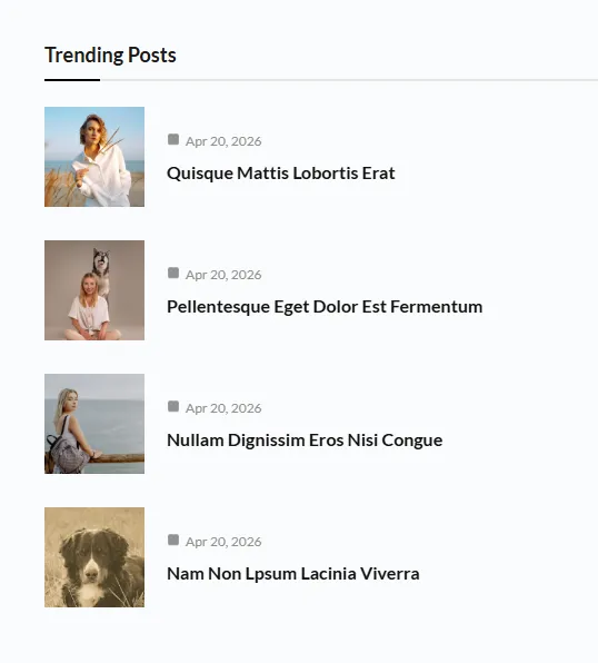
A list gives each item a headline, a short excerpt and a clear next step, in that order.
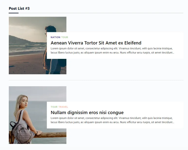
PostX has four list blocks, with 17 layout variations between them. The four carry 4, 4, 5 and 4 designs, so the choice between them comes down to look rather than quantity, with Post List 3 the one that does something different.
Zigzag Layouts Live Inside Post List 3
Post List 3 is the block to reach for when a plain vertical stack looks too uniform. Its five layouts include two zigzag styles.
Zigzag alternates the vertical position of consecutive items instead of lining them up in a straight column.
That offset rhythm suits seasonal content better than it does ordinary posts, because roundup items differ in weight.

One lead deal can sit forward while the smaller items step back, which gives a deal page visual structure without a module block.
Two styles means you have a real choice rather than a single effect, and both sit inside Post List 3’s layout options.
There is no separate zigzag block in PostX, so if you are looking for one, that is why you cannot find it.
When to Use a List
Reach for a list when the reader’s intent is to understand. They arrived with a question, not a shortlist, and they want to read rather than compare. Concretely, a list earns its place on:
- A buying guide that needs explaining. “Is this discount actually worth it” and “how to spot a fake deal” posts. The reader has to read three paragraphs to get the answer, which thumbnails cannot carry.
- A gift guide with a reason behind each item. When every entry says why it made the cut, you need room for that sentence. A grid gives you a headline and nothing else.
- A how-to or explainer roundup. Several short guides in order, where the sequence is the argument.
- A resource page you expect to rank and keep. Lists age better than grids, because the content is doing the work rather than the layout.
Do not use a list for a homepage band or a category wall. Ten guides stacked vertically with excerpts is a very long page, and readers bounce before the third item.
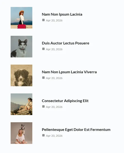
Zigzag is worth reaching for when the list is long enough that the eye needs help staying in place. On a list of three items it is decoration, and on a list of twelve it genuinely reduces the scanning effort.
The limitation is space. A list will not compress. Ten items means a long page, which is fine for a guide and wrong for a homepage. Put grids above it.
Browse the Post List design styles →
3. Post Slider: Best for One Hero Announcement
A slider shows a single post at a time, so it forces focus. That is why it works for the one announcement that matters most.

Use it for your Black Friday start date, your biggest discount, or the post you want every visitor to see before anything else.
Two blocks, and they are not variations on the same thing. Post Slider 1 is a single built-in design with no separate layouts, while Post Slider 2 carries 8 of them.

Those 8 split into four slider designs and four carousel designs, which is why the carousel section below is a separate block rather than a variant of this one.
On Post Slider 1, the presentation is controlled by toggles rather than layouts. You get arrows, dots and autoplay, plus per-element settings for title, excerpt, category and read more.
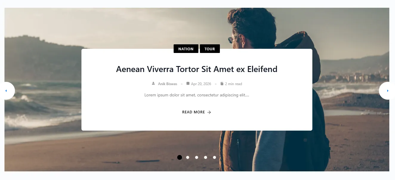
Strip those down to an image and a headline if you want pure visual impact.
When to Use a Slider
Reach for a slider when exactly one post outranks everything else. The reader’s job is to notice it, and one-at-a-time delivery is the only layout that guarantees nobody sees the second item before the first. Concretely, a slider earns its place on:
- Your Black Friday start date or the biggest discount. The one announcement that must not be missed. This is the single clearest use case in the whole seasonal calendar.
- A homepage hero band. Above the grid, not instead of it. A slider plus a grid handles focus and volume in the same page.
- A limited-time offer that will expire. A countdown paired with one post, where rotating through three offers would dilute the urgency.
- A featured post you want to keep pinned. One item at the top of an archive, changing when you publish something better.
Do not use a slider where volume matters. A slider holding twelve posts means eleven are hidden behind an arrow most readers will never press, and you have already lost the seasonal traffic you were trying to capture.
If you find yourself wanting two announcements to share the spotlight, that is a carousel’s problem, not a slider’s.
The limitation is capacity. One item at a time means everything else waits. A slider hides your other content.
That makes it a poor choice for a section that needs to show twelve posts, and a strong choice for a hero band above them.
See how Post Slider 1 looks in a real page →
The Post Slider 1 documentation walks through each settings tab, from the toggles for arrows and dots to the per-element display options.
4. Post Carousel: Best for Rows of Related Deals
A carousel looks like a slider but behaves differently, and the distinction decides when to use it. Where a slider shows one item and hides the rest, a carousel shows several side by side in a scrollable row.

Readers see the shape of the whole set before they choose, which is what you want when the items are siblings.
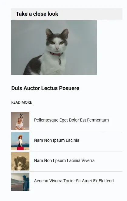
There is no separate Post Carousel block in PostX. The carousel is Post Slider 2, which carries eight layout variations split into four slider layouts and four carousel layouts.

Choose a carousel layout and you get multiple items in a row with arrow and swipe navigation, plus controls for animation fade, autoplay, dots and arrows.
If you want the build steps rather than the layout reasoning, this walkthrough covers adding a post carousel in WordPress.
That makes it the right layout for a horizontal shelf of related seasonal posts: ten gift guides, a category row, or a set of deal announcements that belong together.

When to Use a Carousel
Reach for a carousel when the items are siblings and there are too many for a grid but too related to stack. The reader needs to see that the set exists and how big it is, then pick one. Concretely, a carousel earns its place on:
- A category row beneath the hero. “Top gift guides”, “Editor’s picks”, a labelled shelf of related posts that continues past the fold.
- Deal announcements that belong together. Five Black Friday posts published the same morning. They are interchangeable, and a row communicates that better than a stack.
- A related-posts strip at the end of an article. Keeping readers on your site after they finish a guide.
- A homepage band that needs volume without a full grid. When seven posts will not fit the design but four visible cards will not fill it either.
Do not use a carousel for items of different importance. A row implies the items are equivalent, so putting your most important post next to four filler posts devalues the one that matters.
Check what is visible without swiping before you publish. If the first two items are weak, the reader has already decided the row is not worth the gesture, and no arrow will bring them back.
The limitation is discoverability. Items past the first screen stay hidden until someone swipes, and many readers never do. Keep the first few items genuinely strong, because that visible strip is doing the selling.
Browse the carousel styles inside Post Slider 2 →
The Post Slider 2 documentation covers the layout options in detail, including the settings that control how many items appear and how the row behaves on touch devices.
5. Post Module: Best for Magazine-Style Mixed Content
Modules are the least familiar option here, which is why “post module layout” is barely contested by anyone else in WordPress search.

They are also the strongest choice for publishers who want their seasonal section to read like a magazine rather than a list of links.
A module groups posts into distinct visual blocks with their own internal hierarchy. A lead story can sit beside two smaller ones, and a section can carry its own heading.
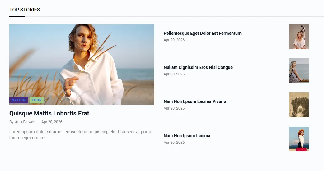
The page gets a designed rhythm rather than a uniform grid of cards.
PostX ships two module blocks with 10 layout variations between them. The difference between them is the difference between “these posts are the same shape” and “these posts are different sizes on purpose.”
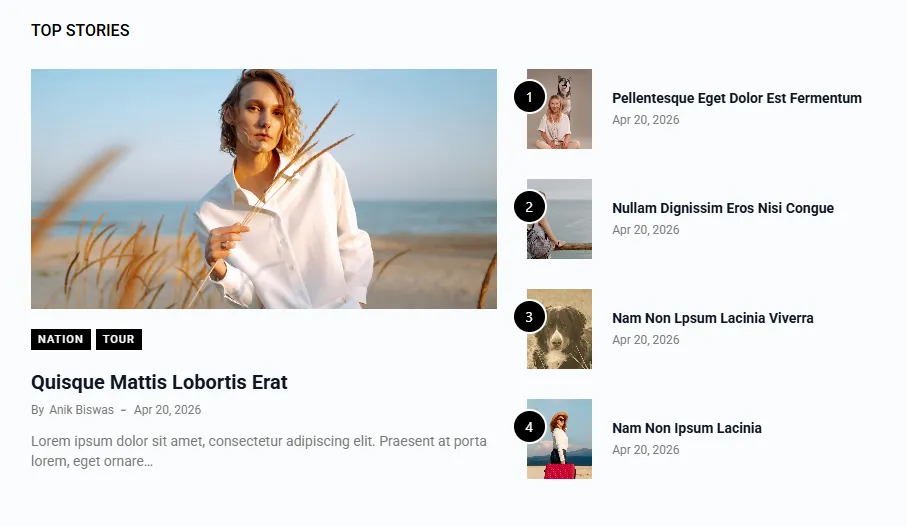
Five designs each, so neither block is a stripped-down option. The choice between them is about which hierarchy you are building, not about how many designs you get.
When to Use a Module
Reach for a module when your content is not uniform and you want the page to look composed rather than assembled.
That is the deciding question. If every post deserves the same size, a grid is the right answer, and a module is wasted effort. Concretely, a module earns its place on:
- A homepage you will keep through November and December. Editorial weight is what modules are for, and a homepage is the one page that needs it most.
- A category landing page with a clear lead story. One post genuinely outranks the rest, and you want that visible without a separate slider.
- A mixed seasonal hub. Deals, guides and announcements on one page, where a grid would flatten all three into the same card.
- A magazine or news format. If your site publishes with an editorial voice rather than a catalogue, modules match how the content is actually structured.
Do not use a module for a single sale page or a one-off landing page. You will spend longer composing it than the page will earn, and a grid of four deals does the same job in ten minutes.
Modules also need maintenance. A module composed for Black Friday will need rearranging in December when the leads change, and that is a real ongoing cost for a page that only matters for four weeks.
The limitation is setup time. Modules reward deliberate composition, and they take longer to get right than dropping in a grid.
For a one-off sale page it’s overkill. For a homepage or a category landing page you’ll maintain through November and December, it’s the layout that keeps looking intentional after week three.
See the Post Module designs for yourself →
If you’re designing a whole publishing setup rather than one section, our guide to starting an online magazine and publishing it profitably covers where modules fit alongside templates and starter sites.
How to Choose the Right Layout for Seasonal Content
Choose by the shape of your content, not by how a layout looks in a demo. Roundups of similar items want a grid. Guides want a list. One important announcement wants a slider. Match your content to its job:
| If your seasonal content is… | Use | Because |
|---|---|---|
| A roundup of many similar items | Post Grid | Readers scan and compare side by side |
| An in-depth guide or explainer | Post List | Each item gets a headline, excerpt, and next step |
| One announcement that must dominate | Post Slider | One item at a time forces focus |
| Several items that belong side by side | Post Carousel | The whole set stays visible without scrolling |
| A section that should feel like a magazine | Post Module | Mixed block sizes create visual hierarchy |
Combine Two Layouts for a Stronger Seasonal Section
Most seasonal sections need two layouts, not one. A Post Slider carrying your main announcement above a Post List of guides handles both the focus job and the reading job.
A Post Module hero above a Post Grid of deal roundups handles hierarchy and volume at once.
Forcing one layout to do both jobs is what makes seasonal sections look crowded.
If you want the wider plugin picture before committing, our Black Friday landing page guide covers how seasonal pages are structured beyond the post layout layer.
FAQs About Black Friday Blog Layouts
Short answers to the questions publishers ask most when planning a seasonal section.
Q: What Is the Difference Between a Post Slider and a Post Carousel?
A slider shows one post at a time. A carousel shows several side by side in a scrollable row. In PostX these are two blocks: Post Slider 1, and Post Slider 2, whose eight layouts split into four of each.
Q: Which Post Layout Works Best for a Black Friday Deal Roundup?
A post grid. Roundups are comparison tasks, and a grid lets readers scan headlines and images against each other. PostX has seven grid blocks, and the pricing table lists all seven in both tiers.
Q: Are Post Grid and Post List Blocks Free in PostX?
Yes, both families are confirmed in the free tier. The free-versus-Pro comparison table lists all seven Post Grid blocks and all four Post List blocks in both columns, so a full roundup and guide section can be built without paying.
Q: Do I Need PostX Pro to Use the Slider and Carousel Blocks?
The blocks ship with the plugin, but the ready-made layouts inside them are a Pro feature. WPXPO does not publish a per-block tier for these two, so confirm with the vendor before planning around them.
Q: Does PostX Have a Post Carousel Block?
No. There is no block called Post Carousel. The carousel layouts are four of the eight layout variations inside Post Slider 2, which is why searches for “post carousel layouts in WordPress” land on a slider.
Q: Which PostX Blocks Have Vertical Grid Layouts?
Post Grid 6 and Post Grid 7. Both blocks include vertical layouts, which stack items downward the way a category page does. Between them they offer six layouts.
Q: What Is a Zigzag Layout in WordPress?
A zigzag layout alternates the vertical position of consecutive items instead of stacking them in a straight column. In PostX the two zigzag styles are part of Post List 3’s five layouts.
Q: How Many Post Layouts Should a Black Friday Section Use?
At least two. A slider for your single biggest announcement above a grid of deal roundups covers both the focus job and the volume job. Forcing one layout to do both is what makes seasonal sections look crowded.
Pick the Layout Before the Season Starts
Black Friday content gets harder to restructure once it’s live, because changing layout means republishing sections while traffic is arriving. Decide now which jobs your seasonal content has, then match each one to a layout.
Most sites need a grid for roundups and a list for guides.
Add a slider when you have one announcement that outranks the rest, a carousel when related posts belong side by side, and modules when you want the section to look designed rather than assembled.
Publish the roundups and guides first, look at what the section actually needs, and add the remaining layouts from there.