The Global Styles feature in WowAddons allows you to easily customize the visual appearance of your WooCommerce product add-ons.
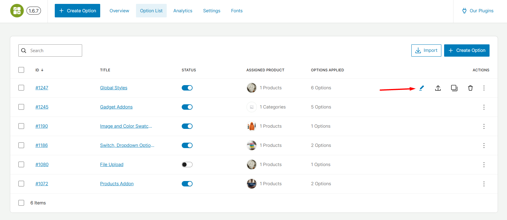
How to Access Global Styles
Navigate to your WordPress admin section and go to the WowAddons dashboard. From the Option List tab, click on the Edit icon for which you want to set the Global Styles.
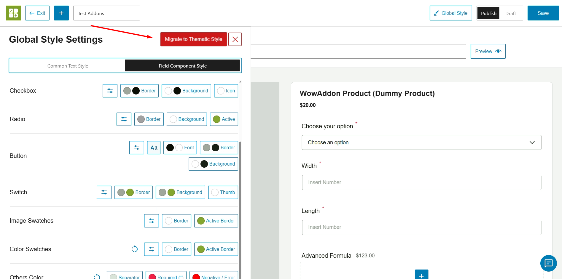
You are directed to the Addons editor page. Here, click on the Global Styles button on the top right. It opens up all the available settings of Global Styles.
Note: If you had an older version of WowAddons and updated to the new version – you will notice this option “Migrate to Thematic Style”. Click this option to access the new Global Styles.
Global Style Settings (New Update)
After migrating to the new Global Styles, you should see this interface:
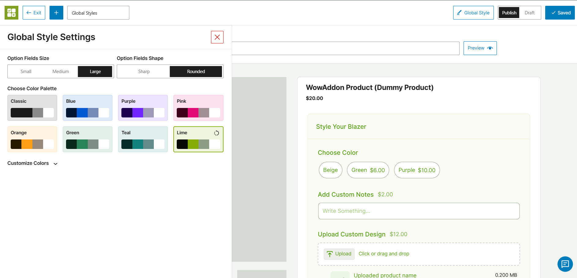
The Global Styles panel is divided into three main sections for complete design control:
1. Option Fields Size & Shape
Customize the physical dimensions and borders of your input fields to match your theme’s UI.
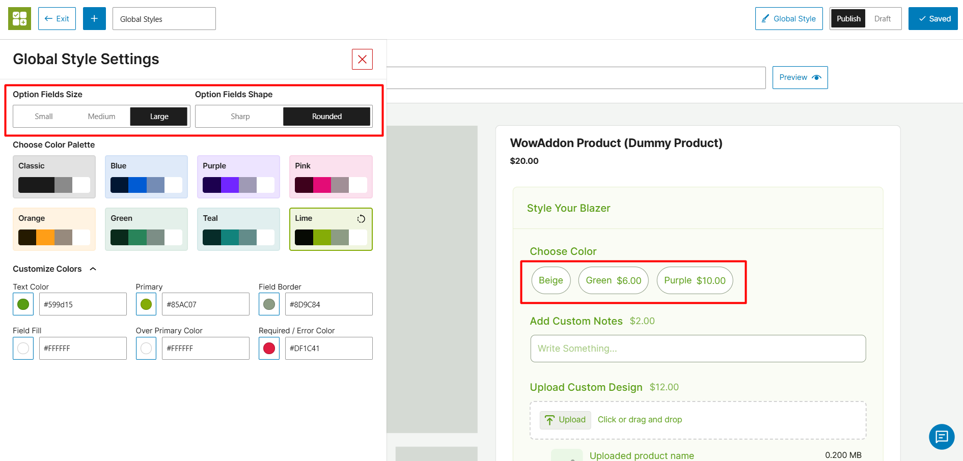
- Option Fields Size: Choose between Small, Medium, or Large to adjust the overall size of the add-on fields.
- Option Fields Shape: Select Sharp for crisp, square corners, or Rounded for a softer, modernized look.
2. Choose Color Palette
Instantly transform the look of your add-ons with pre-built color themes. This is the fastest way to align the add-ons with your brand identity.
Available Palettes: Click on any of the pre-set themes to apply them instantly. Options include Classic, Blue, Purple, Pink, Orange, Green, Teal, and Lime. (This list of choices may change according to new updates)
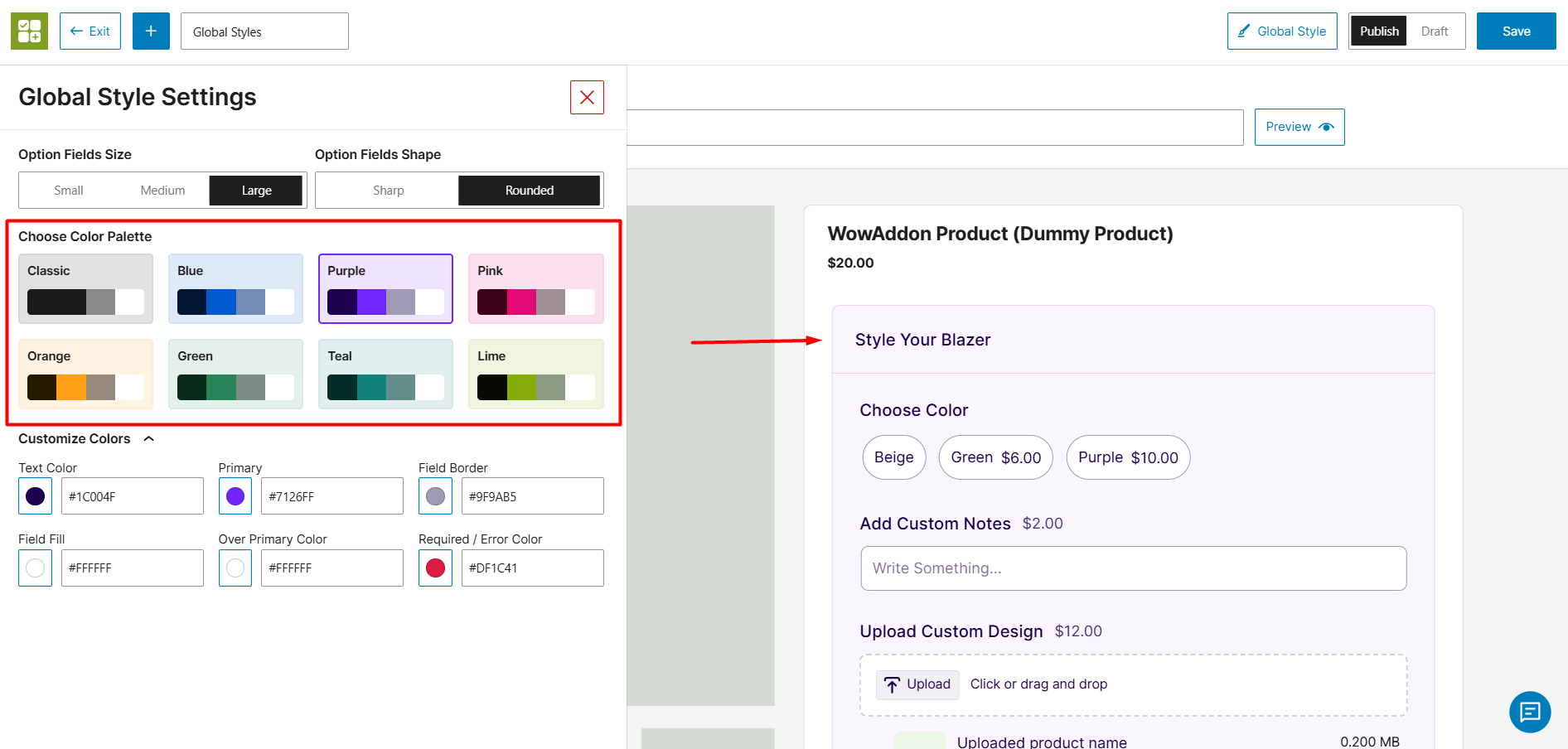
3. Customize Colors
You can further customize colors for different components of addons. You can put the exact hex code or choose the color from the color wheel.
The color settings are as follows:
- Text Color: Changes the font color for the overall texts on the addons.
- Primary: Adjusts the primary accent color – the active state of radio buttons, checkboxes, or highlighted borders.
- Field Border: Changes the color of the outline surrounding the addon fields.
- Field Fill: Customizes the background color inside the input boxes.
- Over Primary Color: Sets the color of the elements (like checkmarks, switch addon) that sit directly on top of your Primary color.
- Required / Error Color: Sets the color used for mandatory field asterisks or validation warnings.
Find out about the different product fields below: