

Writing a great blog isn’t just about creating valuable content. The way that content is presented matters just as much.
When visitors land on a blog, they usually scan the page before they decide to read. If the layout looks cluttered, the text is hard to read, or navigation is confusing, many readers leave without exploring further.
On the other hand, a clean and well-structured design encourages people to stay, read more, and engage with the content.
That’s why blog design plays an important role in the overall user experience.
To better understand what makes a blog easy to read, I analyzed 10 high-performing website blogs from different industries. Instead of reviewing the quality of their content, I focused on the design elements that improve readability, build trust, and keep readers engaged.
In this article, I will share what I found and highlight the 16 blog design elements that appeared most consistently across these successful websites. Before starting, let’s know the basics of blog design elements.
What Are Blog Design Elements?
Blog design elements are the visual and functional parts of a blog that shape the reading experience. They help readers move through a page, find information quickly, and enjoy the content without distractions.
These elements include featured images, typography, heading hierarchy, content layout, table of contents, author information, and call-to-action (CTA) sections. Each element has a specific purpose and works together to create a clear and organized page.
As a result, readers can understand the content more easily and navigate the blog with less effort.
In simple terms, when a blog has a clear design, readers can read the content more easily because the page is well organized.
Why Are Blog Design Elements Important?
A well-designed blog does more than look attractive. It helps readers enjoy the content.
Clear typography, proper spacing, and a logical heading structure make articles easier to scan and read. Trust-building elements such as the author name, publication date, and author bio give readers confidence in the information they are reading.
At the same time, features like related posts, email subscription forms, and well-placed CTAs encourage visitors to stay longer and explore more content.
In short, effective blog design improves readability, user experience, engagement, and conversions. That’s why the best-performing blogs invest as much effort in design as they do in writing quality.
Research Overview
The goal of this research was simple: to find the blog design elements that successful websites use to create a better reading experience.
Instead of judging the quality of the content, I focused on how each blog presents it. I looked at the visual and functional elements that help readers navigate pages, understand information more easily, and stay engaged.
To make the research more balanced, I selected blog websites from different industries, including business, technology, lifestyle, sports, travel, food, gaming, health, news, and multi-niche content.
This allowed us to identify design patterns that work across different types of websites.
Blogs I Analyzed
I analyzed 10 well-known blog websites that regularly publish high-quality content and attract large audiences. Although these websites cover different topics, they all focus on delivering a strong reading experience through thoughtful blog design.
| Blog Website | Categories | Monthly Visitors By Ahrefs (Estimated) |
|---|---|---|
| https://www.entrepreneur.com/ | Business | 667,200+ |
| https://techcrunch.com/ | Technology | 1,100,000+ |
| https://www.harpersbazaar.com/ | Lifestyle | 2,600,000+ |
| https://www.skysports.com/ | Sports | 9,700,000+ |
| https://www.wikihow.com/ | Multi-Niche / How-To | 1,100,000+ |
| https://www.nomadicmatt.com/ | Travel | 93,000+ |
| https://natashaskitchen.com/ | Food | 5,700,000+ |
| https://kotaku.com/ | Gaming | 445,000+ |
| https://blog.myfitnesspal.com | Health & Fitness | 113,700 |
| https://www.bbc.com/ | News | 93,000,000 |
Note: News publications are also a type of blog because they regularly publish article-based content. For this research, I considered them news blogs and evaluated their article page designs.
Research Methodology
For each website, I reviewed representative blog articles and evaluated the same set of 16 design elements. Rather than scoring the visual style, I examined whether each element was present, how it was implemented, and how it contributed to the overall reading experience.
The research focused on practical design choices that improve readability, usability, trust, engagement, and content discovery. By comparing these elements across different industries, I also identified the patterns that appeared most consistently among high-performing blogs.
Evaluation Criteria
To keep the analysis consistent, every blog was evaluated using the same five criteria.
| Criteria | What I Evaluated |
|---|---|
| Readability | Typography, heading hierarchy, content width, white space & paragraph spacing |
| Navigation | Table of contents, mobile responsiveness, internal related posts |
| Trust & Credibility | Author name, published date, author bio |
| Engagement | Featured image, reading time indicator, social share buttons, inline content images & videos |
| Retention & Conversion | Email subscriber box, CTA placement |
Using this framework, I evaluated each blog based on the 16 design elements. The findings are presented in the following sections.
Key 16 Blog Design Elements I Analyzed
After reviewing all 10 blog websites, I identified 16 design elements of their blogs that directly impact the reading experience. While every website has its own style, these elements appeared repeatedly across different industries.
Some improve readability, while others help build trust, increase engagement, or encourage readers to explore more content.
Below, I will explain each element, why it matters, and provide the best practices.
1. Featured Image
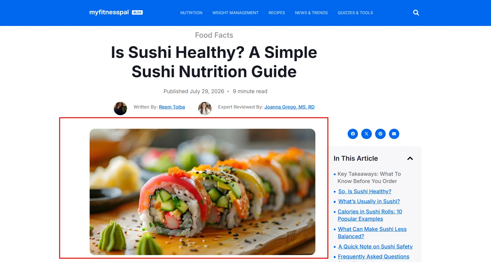
A featured image is the main visual displayed at the beginning of a blog post. It gives readers a quick idea of the topic and encourages them to continue reading.
Based on my research, most of the blog websites used a featured image and placed it directly below the title and displayed it in a 16:9 or 1.91:1 aspect ratio.
The images were high quality, relevant to the content, and wide enough to fit the content area. This approach creates a strong first impression and improves the overall reading experience.
2. Typography
Typography is how text is presented on a blog. It includes the font size, font style, line height, and color contrast.
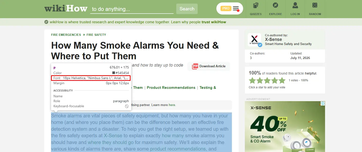
It plays an important role in readability because readers spend most of their time reading the text. In this research, I have observed that all 10 blogs used clean and readable typography.
Most blogs used a body font size between 16px and 20px, a line height of 1.5 to 1.8, and sans-serif fonts such as Arial, Helvetica, or similar typefaces.
I also found that almost every blog used dark text on a light background for making long-form content easier to read.
3. Heading Hierarchy
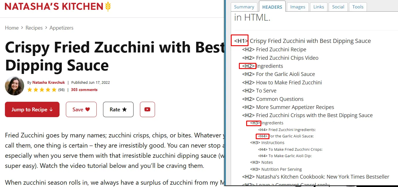
A heading hierarchy organizes a blog into clear sections. It uses H1, H2, and H3 headings to structure the content. This helps readers scan the article and find information quickly. It also improves readability.
Based on my analysis, all blogs followed a clear heading hierarchy. Every blog used one H1 for the article title and also used 5 to 15 H2 headings for main sections.
They also used H3 headings to explain topics in more detail. This structure made long articles easier to read and navigate.
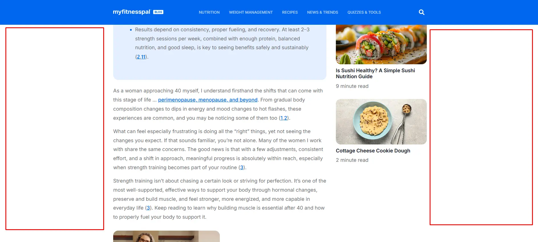
4. Content Width
Content width is the width of the main reading area on a blog page. It affects how comfortable the content is to read. A narrow content area reduces eye movement and helps readers stay focused.
From my observations, most blogs kept the content width between 700px and 900px on desktop screens. They also left enough empty space on both sides of the content. This layout made long articles easier to read and gave the page a clean appearance.
5. White Space & Paragraph Spacing
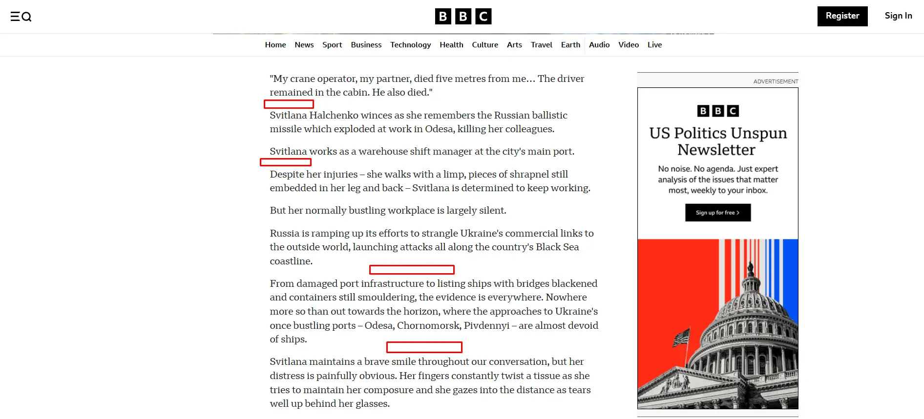
White space is the empty space between paragraphs, headings, images, and other page elements. It makes a blog look clean and easy to read.
Good spacing also helps readers move from one section to the next without feeling overwhelmed.
Throughout our evaluation, I found that all 10 blogs used enough white space throughout their articles. Most paragraphs contained 2 to 4 lines, with 20px to 40px of space between paragraphs and sections.
This layout improved readability and made long articles easier to scan.
6. Table of Contents
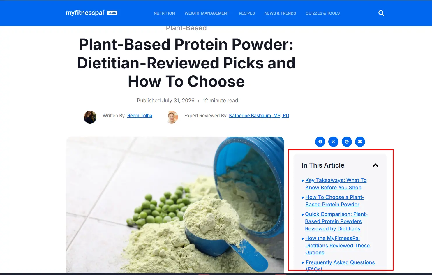
A table of contents (TOC) lists the main sections of a blog and helps readers jump to the information they need.
It improves navigation, especially in long articles.The analysis showed that some blogs used a table of contents.
Most TOCs appeared near the beginning of the article or as a sticky sidebar on desktop screens. They usually included 5 to 15 section links.
This made it easier for readers to scan the article and move to any section with a single click.
7. Mobile Responsiveness
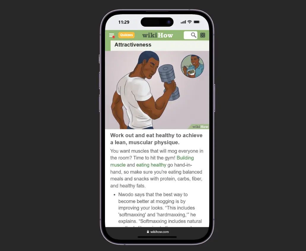
Mobile responsiveness allows a blog to adjust its layout for different screen sizes. It helps readers enjoy the same experience on desktops, tablets, and smartphones.
In my research, I have observed that all 10 blogs were fully responsive. Text, images, buttons, and menus automatically resized to fit smaller screens.
Most blogs used a single-column layout on mobile devices and kept the body font size between 16px and 18px. This made the content easy to read without zooming or horizontal scrolling.
8. Author Name
The author name shows who wrote the article. It helps readers identify the writer and increases trust in the content.
During my research, I have discovered that 5 out of 10 blogs displayed the author’s name near the top of the article. Most blogs placed it below the title and next to the published date.
Some blogs also linked the author’s name to a profile page. This simple element makes the content more transparent and helps readers recognize the author’s expertise.
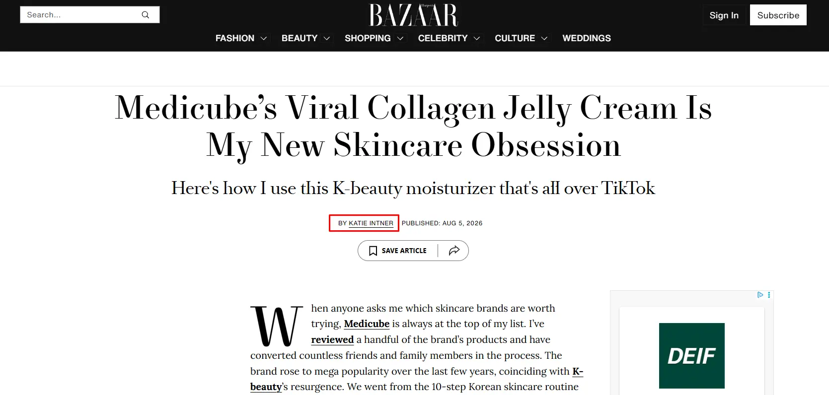
9. Published Date
A published date shows when a blog post was published or last updated. It lets readers know whether the information is current and relevant.
My analysis found that 10 out of 10 blogs displayed a published or updated date.
Most blogs placed it below the article title and next to the author name.
Many websites also showed the last updated date to let readers know when the content had been reviewed.

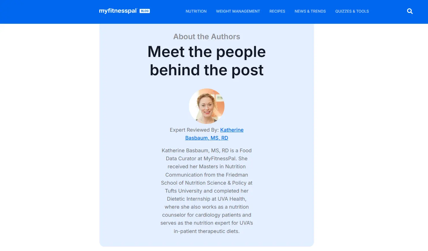
10. Author Bio
An author bio is a short section that introduces the writer at the end of a blog post. This allows readers to learn about the author’s background and expertise.
This builds trust and shows why the author is qualified to write on the topic. According to my research, 4 out of 10 personal blogs included an author bio.
Most blogs displayed it below the article, along with the author’s photo, job title, short description, and social media links.
This section also encouraged readers to explore more content from the same author.
11. Reading Time Indicator
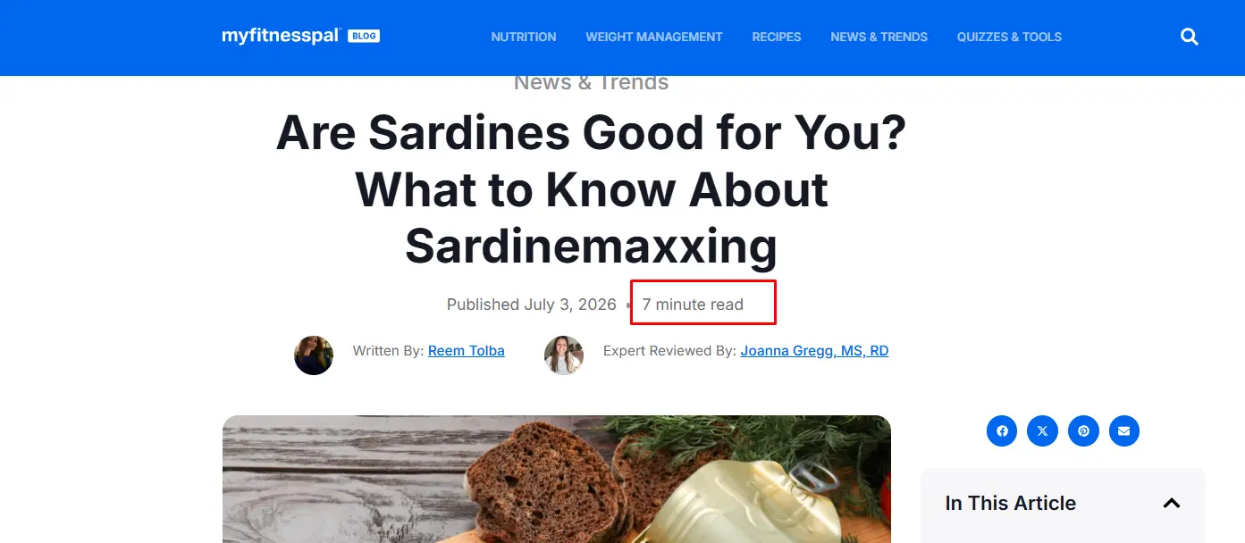
A reading time indicator shows the estimated time needed to finish an article. It helps readers decide whether they have enough time to read the content.
During research, I found that a few blogs displayed a reading time indicator.
Most blogs placed it below the article title and next to the published date or author name. The reading time usually ranged from 5 to 20 minutes, depending on the article length.
This small feature sets reader expectations and encourages them to start reading.
12. Social Share Buttons
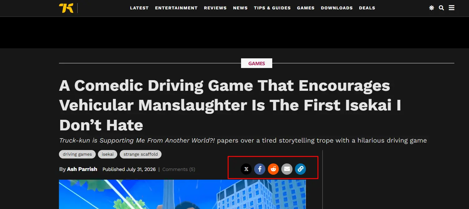
Social share buttons allow readers to share a blog post on social media with a single click. This enables readers to share content on social media and bring more visitors to the website.
In my research, 6 out of 10 blogs included social share buttons. Most blogs placed them below the article title, while some displayed floating buttons on the side of the page.
The most common platforms were Facebook, X, LinkedIn, Pinterest, and Email. Most blogs displayed 4 to 6 sharing options to make it easy for readers to share the content.
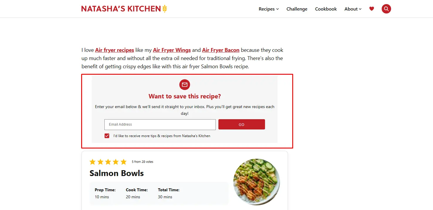
13. Email Subscriber Box
An email subscriber box allows readers to sign up for newsletters and receive future updates. It helps blogs build a loyal audience and increase returning visitors.
In my research, I have overviewed that maximum blogs include an email subscriber box. Most blogs placed it below the article or between content sections.
The subscription form usually included an email field, a CTA button, and a short message explaining the benefits of subscribing.
This simple section makes it easy for readers to stay connected with the blog.
14. Internal Related Posts
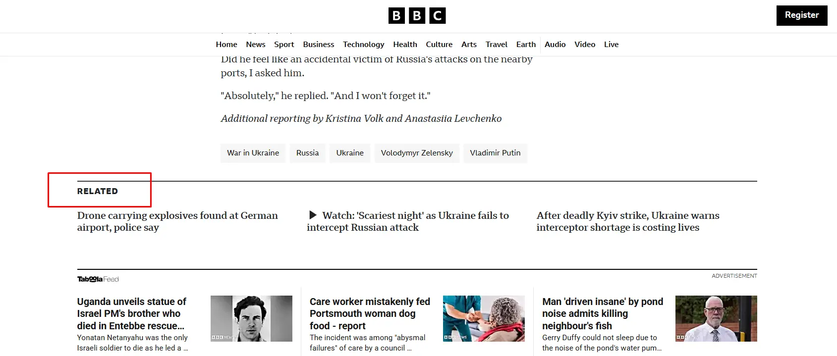
Internal related posts recommend other articles on similar topics. It allows readers to discover more content and spend more time on the website.
After analyzing all the blogs and I observed that 10 out of 10 blogs displayed related posts.
Most blogs placed this section at the end of the article, while a few also added related links within the content.
I found that 3 to 6 related posts were the most common. Each recommendation included a featured image, article title, and link.
15. CTA Placement
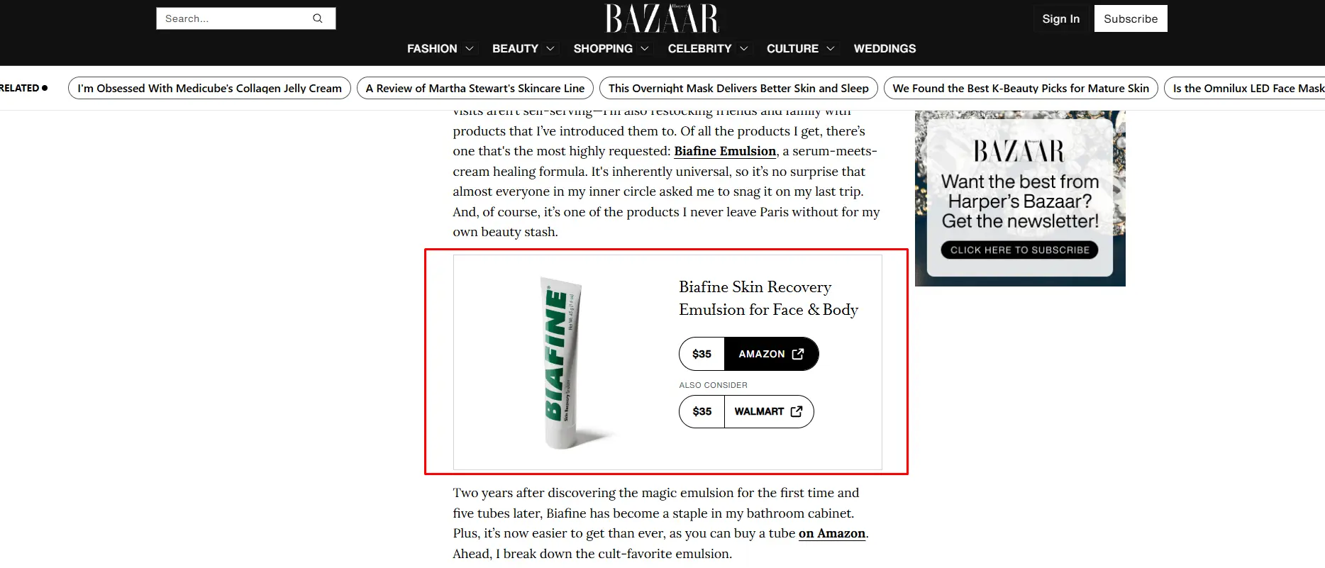
A call-to-action (CTA) encourages readers to take the next step after reading a blog post. It may invite them to subscribe, explore a product, or visit another page.
A well-placed CTA can increase engagement and conversions. My analysis found that all blogs included at least one CTA. Most blogs placed CTAs within the content or near the end of the article.
Many CTAs used a button, banner, or product card with clear and action-oriented text to attract readers’ attention.
16. Inline Content Images & Videos
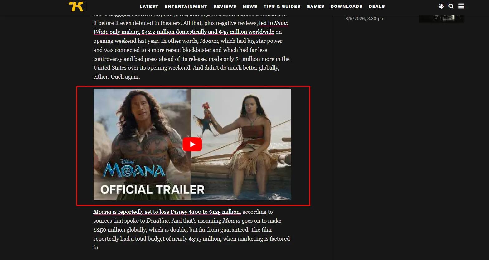
Inline content images and videos appear between sections of a blog post. They help explain ideas, support the content, and keep readers interested.
They also break up long blocks of text, making articles easier to read. In my research, all 10 blogs used inline images, while some included videos. Most long-form articles contained 3 to 10 images, depending on the topic.
Food and tutorial blogs used the highest number of images and videos because they help readers understand each step more clearly.
Blog Design Element Comparison Table
To better understand which design elements are most common among successful blogs, I compared all 10 websites using the same evaluation criteria. While every blog has its own style and purpose, many design patterns appear consistently across different industries.
The table below summarizes how common each design element appeared in my research and its overall importance in creating a better reading experience.
| Design Element | Usage Across 10 Blogs | Importance |
|---|---|---|
| Featured Image | 10/10 | High |
| Typography | 10/10 | High |
| Heading Hierarchy | 10/10 | High |
| Content Width | 10/10 | High |
| White Space & Paragraph Spacing | 10/10 | High |
| Table of Contents | 2/10 | Low |
| Mobile Responsiveness | 10/10 | High |
| Author Name | 5/10 | Medium |
| Published Date | 10/10 | High |
| Author Bio | 4/10 | Low |
| Reading Time Indicator | 1/10 | Low |
| Social Share Buttons | 6/10 | Medium |
| Email Subscriber Box | 6/10 | Medium |
| Internal Related Posts | 10/10 | High |
| CTA Placement | 10/10 | High |
| Inline Content Images | 10/10 | High |
Helpful Resource: Build Blog Designs with Ready-Made Templates
Building a blog from scratch takes time. You need to design every section and test every feature. This process also increases the project cost. For many website owners, this can be a challenge.
A WordPress blog website Builder like PostX makes this process much easier. It offers 250+ ready-made blog templates and powerful design elements as a gutenberg block. If you use WordPress, you can build professional blog pages without writing code.
Many of the design elements discussed in this research are available in PostX. You can also customize them to match your website.
With PostX, you can easily create:
- Responsive blog layouts for desktop and mobile devices
- Featured images and clean content layouts
- Typography and heading hierarchy
- Table of contents
- Author information and published dates
- Reading time indicator
- Social share buttons
- Email subscription sections
- Internal related posts
- Flexible CTA sections
- Inline images and multimedia support
These features make it easier to build your blog website that follows many of the design best practices discussed in this research.
Useful Resources:
- PostX Plugin: https://www.wpxpo.com/product/postx/
- Ready-Made Templates: Visit Here
- Documentation: https://www.wpxpo.com/docs/postx/
Final Thoughts
After analyzing 10 high-performing website blogs across different industries, one thing became clear: great blog design is about making content easy to read and easy to navigate.
No matter the niche, the best blogs consistently use clear typography, logical heading structures, enough white space, and mobile-friendly layouts. These elements help readers focus on the content instead of struggling with the design.
I also found that trust-building features such as author information, publication dates, and author bios are common across most successful blogs.
At the same time, engagement elements like inline images, related posts, email subscription forms, and well-placed CTAs encourage readers to stay longer and explore more content.
While every blog has its own audience and goals, the core design principles remain the same. A clean, user-friendly layout creates a better reading experience, builds trust, and increases engagement.
If you’re designing or improving a blog, start with these 16 design elements. Even small improvements can make your content easier to consume and more valuable to your readers.